灸泽 —— 灸春堂品牌IP设计


武汉/平面设计师/146天前/826浏览
版权
灸泽 —— 灸春堂品牌IP设计
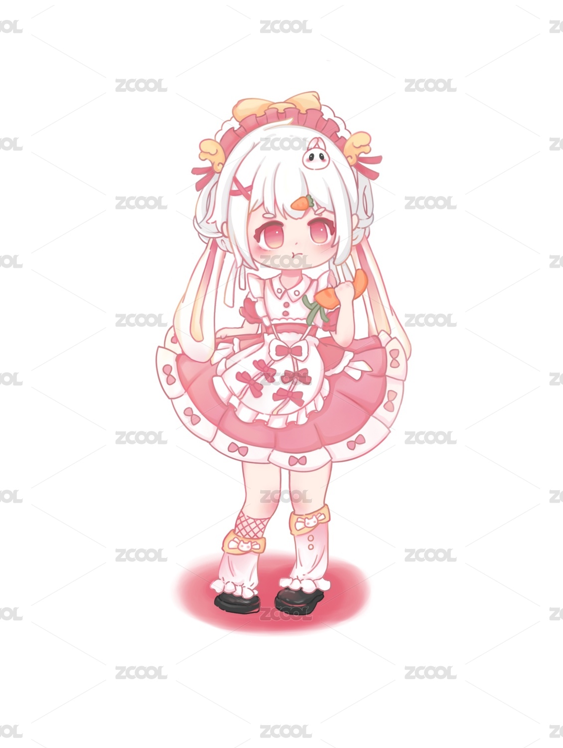
The Jiu Chuntang brand IP “Jiuzé” is a long-term brand asset created in response to industry homogenization and the growing sense of distance between traditional Chinese medicine brands and younger audiences. Drawing inspiration from Báizé, the mythical creature in The Classic of Mountains and Seas symbolizing the “healer” and the “sage,” the IP naturally aligns with the cultural attributes of traditional Chinese medicine and can be seamlessly extended into content such as seasonal wellness, moxibustion education, and health science. By creatively reinterpreting the traditional concept of “healing the world by carrying a medicine gourd” into “healing the world through moxibustion,” Jiuzé adopts an artemisia-filled gourd as its exclusive symbol, binding it closely to the brand’s moxibustion identity and reinforcing its role as a “guardian of traditional Chinese moxibustion.” With a personality positioned as a “gentle, healing sage,” the character features a rounded form and fur that transitions from white to red, conveying a sense of warmth and healing from cold to warmth while embodying the brand spirit of “bringing benevolence and protection to every household.” As a visual symbol that helps the brand break out of conventional boundaries, Jiuzé shortens the distance to younger audiences and becomes the core vehicle through which Jiu Chuntang communicates the wisdom of Eastern wellness.
灸春堂品牌 IP “灸泽”,是基于行业同质化、传统中医品牌与年轻群体有距离感的痛点打造的长期品牌资产。其以《山海经》中象征 “医者、智者” 的白泽为原型,既契合中医文化属性,也能自然延伸至节气养生、艾灸科普等内容,同时将 “悬壶济世” 创新为 “悬葫灸世”,以艾叶葫芦作为专属符号,绑定品牌艾灸属性,强化 “中医艾灸守护者” 的身份识别。IP以 “温润疗愈的智者” 为人格定位,体态圆融、毛色从白渐红,既传递 “寒转温” 的疗愈感,也承载 “泽佑万家” 的品牌精神;它既是品牌破圈的可视化符号,拉近与年轻用户的距离,成为灸春堂传递东方养生智慧的核心载体。


16
举报
声明
17
分享
相关推荐


评论你的想法~
表情
喜欢TA的作品吗?喜欢就快来夸夸TA吧!
推荐素材


你可能喜欢


相关收藏夹


登录注册
16登录即可同步推荐记录哦
17登录即可加入我的收藏
评论登录即可评论想法
分享分享