Skittles・跳跳糖


东京/平面设计师/46天前/6728浏览
版权
Skittles・跳跳糖

ABOUT THE PROJECT
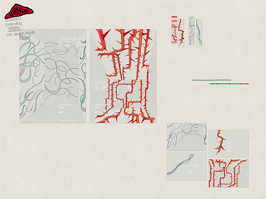
《Skittles・跳跳糖》
创作的初衷源于一种具体而直接的味觉经验——柠檬味的跳跳糖在口中持续炸开。细小颗粒不断跳动与碰撞,几乎没有停顿,感受被切分为一连串短促而密集的瞬间:刺激出现、迅速消散。味觉在这一过程中呈现出带有节奏的颗粒跳动感。这种带有强烈色彩联想与感官密度的体验,也构成了“Skittles”这一命名所指向的整体感知。
本项目尝试将这一味觉体验转译为视觉。画面从“爆开”的瞬间出发,图形被不断打散与错位,在版面中形成持续变化的分布关系,模拟跳跳糖在口腔中跳动时的节奏与密度。高饱和的柠檬黄作为最直接的感知入口,多彩色的加入则用于打破单一,使画面在统一基调中呈现出更丰富的层次变化,接近味觉被反复触发时的状态。
项目以海报为主要载体,并延展至一系列视觉应用。不同媒介中的变化延续同一套表达逻辑,使这种短暂而高频的感受在视觉中被展开被留存。
Skittles · Popping Candy
originates from a direct and specific sensory experience — lemon-flavored popping candy continuously crackling in the mouth. Tiny granules jump and collide with almost no pause, breaking the sensation into a series of short, dense moments: stimulation emerges, quickly fades, and is triggered again. In this process, taste is no longer continuous, but instead takes on a rhythmic, granular quality. This heightened, color-driven intensity also informs the perception implied by the title “Skittles.”
This project translates that sensation into a visual language. The compositions are built around the idea of “bursting” — elements are scattered, shifted, and redistributed across the layout to create a sense of constant movement. A vibrant lemon yellow anchors the visuals as the primary flavor cue, while a spectrum of colors adds variation and intensity, echoing the layered, high-energy feeling of the candy.
Developed primarily as a poster series, the project extends into a range of visual applications. Across formats, the same visual logic is carried through, turning a brief, explosive taste into something that can be seen, felt, and remembered.


94
创作信息
举报
声明
60
分享
相关推荐


评论你的想法~
表情
喜欢TA的作品吗?喜欢就快来夸夸TA吧!
推荐素材


你可能喜欢


相关收藏夹


登录注册
94登录即可同步推荐记录哦
60登录即可加入我的收藏
评论登录即可评论想法
分享分享