其他/设计爱好者/291天前/220浏览
版权
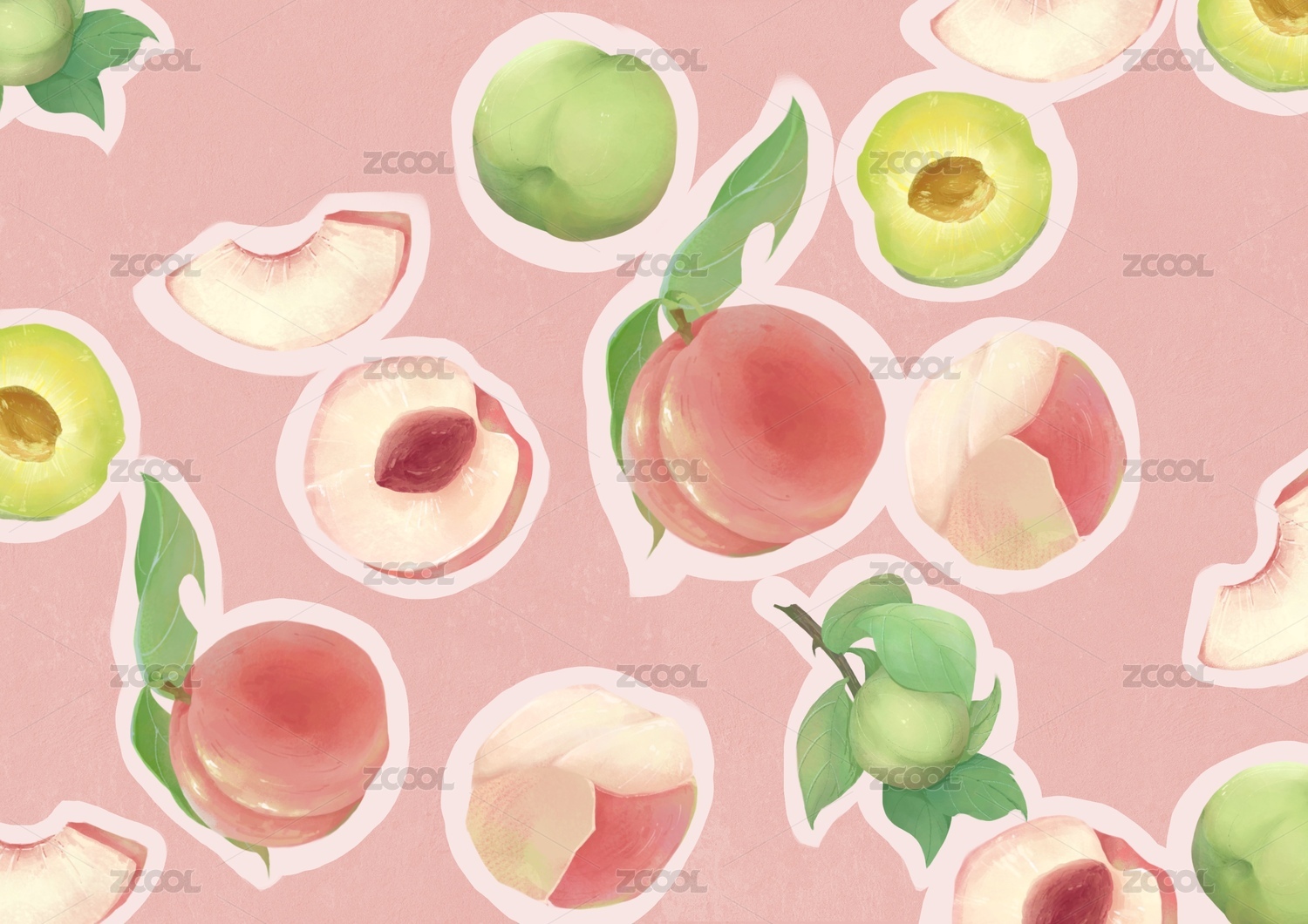
车贴采用手绘涂鸦风格,设计理念与小糯米的目标人群高度契合。
主要受众是年轻消费者,他们追求潮流与个性表达。同时,车主群体中女性和宝妈也占据相当比例。
整体配色倾向于视觉柔和、和谐的多巴胺色调,呼应平静生活的基调。然而,生活也需要惊喜与张力,因此设计中大胆融入了撞色元素——小糯米车主既能温柔融入日常,亦可自信闪耀个性。
画面主题正如产品本身:小巧车身,蕴藏满满能量。
系列包含四组配色方案:粉、绿、蓝以及撞色设计,分别对应主题:潮流盛夏、萌趣乐园、电力粉、青空漫游。
正如这组绚丽的车贴所展现的,生活的美妙色彩,远不止于车身之上,更在每一天的点滴之间。
The car stickers adopt a hand-painted graffiti style, and the design concept is highly consistent with the target audience of Xiaonuomi.
The main audience is young consumers, who pursue trends and individual expression. Meanwhile, women and stay-at-home mothers also account for a considerable proportion among car owners.
The overall color scheme leans towards visually soft and harmonious dopamine tones, echoing the tone of a peaceful life. However, life also needs surprises and tension. Therefore, the design boldly incorporates color-blocking elements - the owner of the Little Glutinous Rice car can not only gently blend into daily life but also confidently shine with personality.
The theme of the picture is just like the product itself: a compact body, brimming with energy.
The series features four color schemes: pink, green, blue and color-blocking design, corresponding to the following themes respectively: Trendy Summer, Cute and Fun Park, Electric Pink and Blue Sky Roaming.
Just as this set of splendid car stickers shows, the wonderful colors of life are far more than just on the car body, but also in the little things of every day.
-
DESIGN BY-JINYOUZAI
24
Report
声明
1
Share
相关推荐
in to comment
Add emoji
喜欢TA的作品吗?喜欢就快来夸夸TA吧!
You may like
相关收藏夹
Log in
24Log in and synchronize recommended records
1Log in and add to My Favorites
评论Log in and comment your thoughts
分享Share


