M-TEETH(萌牙家北美区) | 品牌设计


福州/平面设计师/1年前/794浏览
版权
M-TEETH(萌牙家北美区) | 品牌设计


Client: M-TEETH
客户:萌牙家
After achieving success in the domestic market, Mengyajia Oral Care has decided to enter the North American market. Different from the mainland market, the oral care market in North America has developed earlier and is more mature. Therefore, it is necessary to further optimize the brand design, from product selection to visual language. The brand's rapid development in the past has benefited from its embrace of youthfulness, full utilization of the influence of mobile Internet social media, in - depth cultivation of medical popular science, and emphasis on the connection with users. This represents a different marketing understanding from traditional oral care brands. However, its shortcoming is that the popular visual marketing for the general public sometimes easily deviates from a sense of professionalism. Based on these differences and characteristics, we focus the design on optimizing the brand's light - medical professional attributes and internationalization.
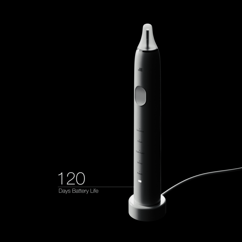
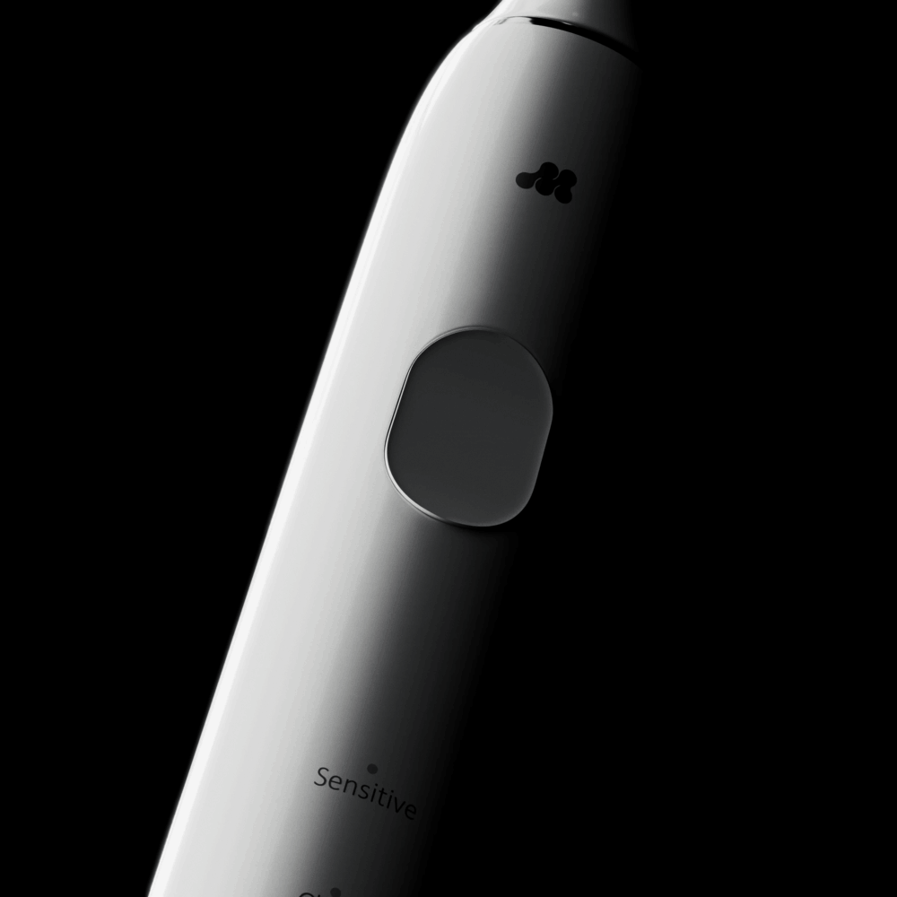
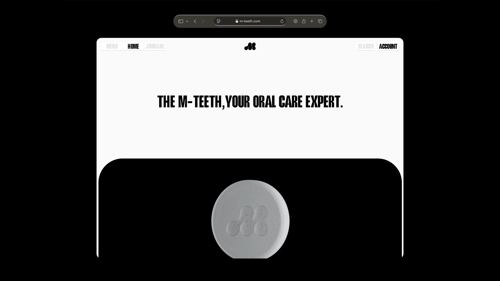
In terms of logo design, we retain the initial letter "M" of Mengyajia as the basis, simulating the shape of molecular connections. This is to achieve both quick understanding and reading by consumers and to reflect the characteristics of a brand in the light - medical field. Besides brand logo identification, the overall use of black and white colors and sans - serif fonts ensures that consumers can have a clear reading experience when obtaining information through various channels.
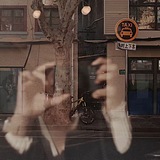
In addition to the brand's official media channels, Mengyajia also attaches great importance to the influence of KOLs on the brand. Therefore, we are also deeply involved in the visual production and control of the brand, from official media to KOLs.
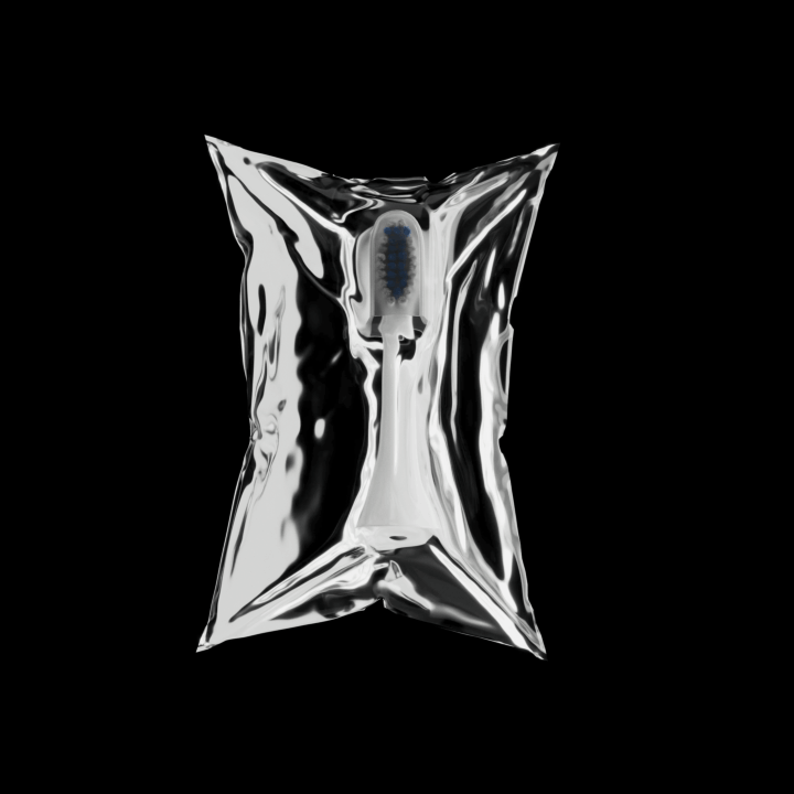
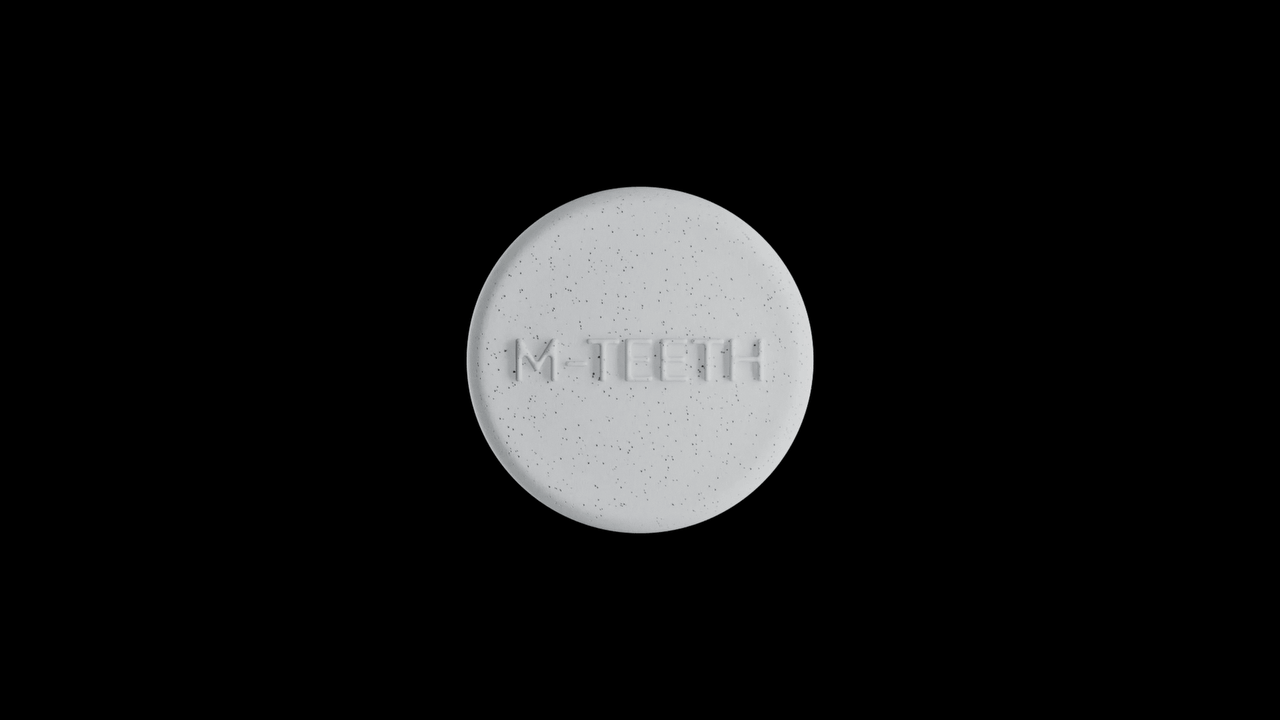
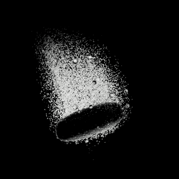
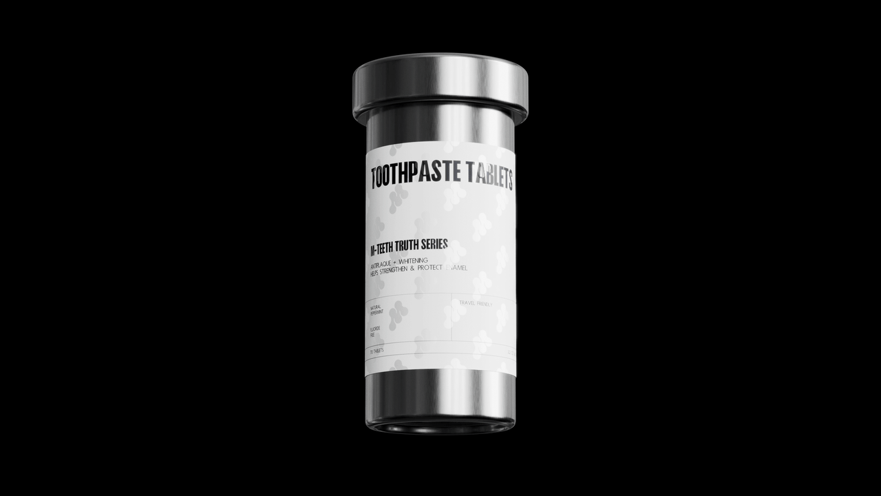
In recent years, influenced by the concept of plastic - restriction and environmental protection in North America, most hotels no longer provide disposable toothbrushes, toothpaste and other cleaning utensils. Therefore, in addition to selecting products with long - lasting performance and toothpaste tablets in the initial product - selection stage (to cater to users on long - term journeys), the packaging design also follows the principle of sustainability, minimizing the use of plastic as much as possible and basically using paper and metal. Besides materials, the design style also focuses on simple lines and text, without excessive decoration or complex patterns, expressing the brand's attitude with the purest visual presentation and conveying a professional and environmentally friendly image.
在经历本土市场的成功后,萌牙家口腔护理决定着手入驻北美市场。不同于大陆地区,北美的口腔护理市场发展更早更成熟,因此需要进一步优化品牌设计:从选品到视觉语言。该品牌过去的飞速发展得益于其拥抱年轻化,并充分发挥移动互联网社交媒体的影响力,同时深耕医疗科普,并重视与用户间的连结,这与传统口腔护理品牌有着不同的营销理解,但其缺点在于大众化的流行式视觉营销有时容易偏离专业感。基于以上分歧与特性,我们将设计重心放在优化品牌的轻医疗专业属性与国际化上。
在标识设计上我们保留了萌牙家的首字母M作为基础,模拟至分子连结的形状,以同时追求被消费者快速理解阅读以及体现一家轻医疗领域品牌的特性。除品牌标识识别外,整体使用黑白色及无衬线字体,确保消费者在各种渠道获取信息时都能有清晰的阅读体验。
除了品牌官方的媒体渠道,萌牙家也非常重视KOL们对品牌的影响,因此,我们也深度参与了品牌从官方媒体到KOL的定制化视觉生产与把控。
在近年来北美地区限塑环保的理念影响下,大部分酒店已不再提供一次性牙刷牙膏等清洁用具。因此,除了初期选品上选择了长续航与牙膏片(以关注那些长期旅途中的用户),包装设计上也遵循可持续性原则,尽可能减少塑料的使用,基本使用纸和金属。除了材料之外,设计风格也以简单的线条和文字为主,没有过多的装饰和复杂的图案,以最纯粹的视觉呈现表达品牌态度,传达出专业与环保的形象。


11
举报
声明
15
分享
相关推荐


评论你的想法~
表情
喜欢TA的作品吗?喜欢就快来夸夸TA吧!
推荐素材


你可能喜欢


相关收藏夹


登录注册
11登录即可同步推荐记录哦
15登录即可加入我的收藏
评论登录即可评论想法
分享分享