电子贸易品牌设计 | 远麦刘斌


深圳/艺术工作者/1年前/383浏览
版权
电子贸易品牌设计 | 远麦刘斌
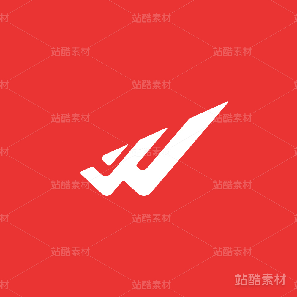
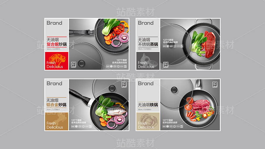
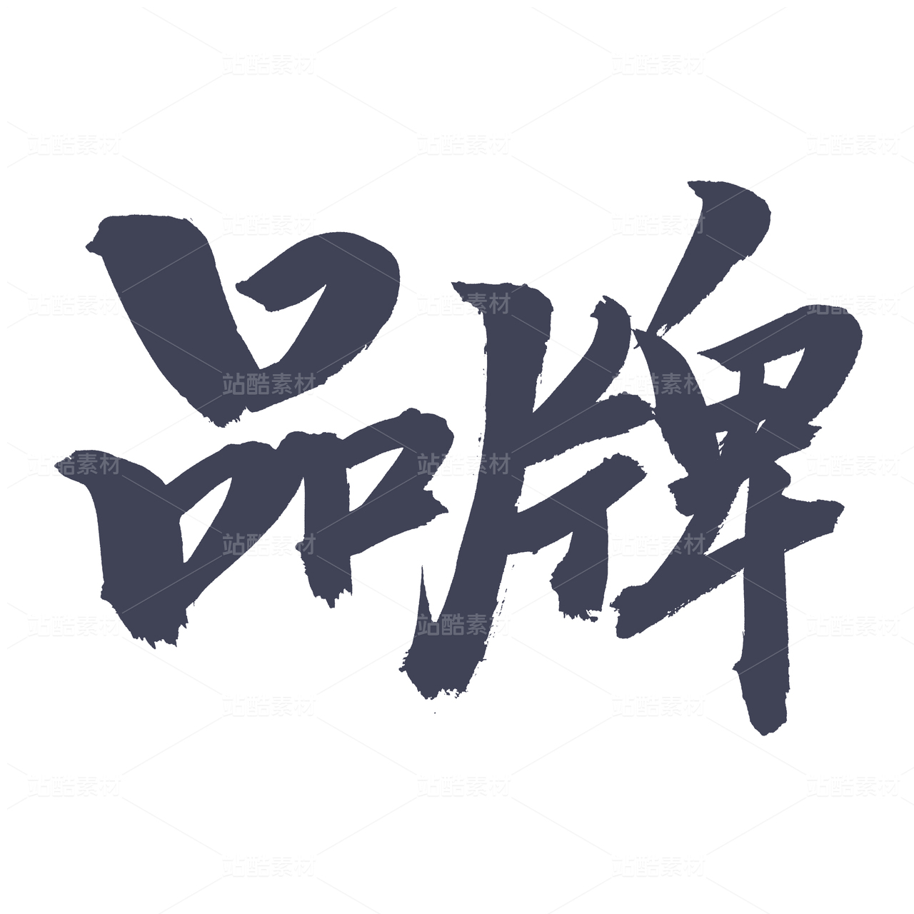
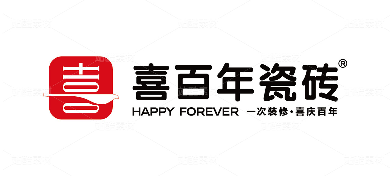
今天的案例仍旧来自老客户,客户的主营业务为电子贸易,其中包括电子元器件、电子产品、数码产品的技术开发与销售,这已经是我们为其设计的第三个品牌。
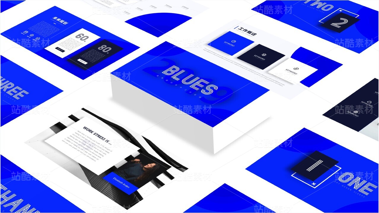
科技类品牌普遍爱用蓝色,但其实红色也会是不错的选择,在图形字体表达正确的基础上,红色可以带来更加醒目的辨识,带来更加稳重的商务感。
品牌设计都是求同存异的视觉计划,要把握好“对,但是不同”的尺度。
Today's case is still from the old customer, the customer's main business is electronic trade, including electronic components, electronic products, digital products technology development and sales, this is the third brand we have designed for them.
Science and technology brands generally love to use blue, but in fact, red will also be a good choice, on the basis of the correct expression of graphic fonts, red can bring more eye-catching identification, bring a more stable sense of business.
Brand design is a visual plan to seek common ground while reserving differences, to grasp the scale of "right, but different".


3
举报
声明
5
分享
相关推荐


评论你的想法~
表情
喜欢TA的作品吗?喜欢就快来夸夸TA吧!
推荐素材


你可能喜欢


相关收藏夹


登录注册
3登录即可同步推荐记录哦
5登录即可加入我的收藏
评论登录即可评论想法
分享分享
商品

品牌设计
站酷设计服务
¥39999起