
广州/平面设计师/1年前/982浏览
版权

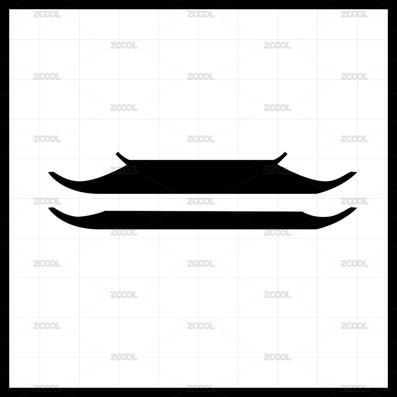
纳木措景区LOGO以湖面、山脉、牦牛角和阳光四大元素构建视觉核心,展现圣湖的自然之美与藏文化的精神象征。
在色彩上,VI体系采用多色设计,既呼应西藏传统建筑、唐卡等色彩哲学,辅助图形提炼出纳木措湖面的自然景观,增强地域特色与品牌辨识度。
整体设计融合现代美感与藏地文化基因,打造出独特且富有象征意义的高原圣湖品牌形象。
The logo of Namtso Scenic Area is constructed with four visual elements: lake surface, mountains, yak horns, and sunshine, showcasing the natural beauty of the holy lake and the spiritual symbol of Tibetan culture. In terms of color, VI system adopts multi-color design, which not only echoes Xizang's traditional architecture, Thangka and other color philosophy, but also assists graphics to extract the natural landscape of Namtso Lake, enhancing regional characteristics and brand recognition. The overall design integrates modern aesthetics and Tibetan cultural genes to create a unique and symbolic image of the plateau holy lake brand.


20
举报
声明
21
分享
相关推荐


评论你的想法~
表情
喜欢TA的作品吗?喜欢就快来夸夸TA吧!
推荐素材


你可能喜欢


相关收藏夹


登录注册
20登录即可同步推荐记录哦
21登录即可加入我的收藏
评论登录即可评论想法
分享分享