INGROUP品牌全案设计 | 金品蒸包王视觉升级


上海/室内设计师/1年前/777浏览
版权
INGROUP品牌全案设计 | 金品蒸包王视觉升级
01 PREFACE 前言
金品蒸包王面临行业同质化和创新不足的挑战,需要品牌升级以吸引年轻消费者,打破人们对传统包子铺的固有印象,和其他品牌形成差异化,保持品牌的亲民度和消费群体的包容度。
Faced with the challenge of industry homogenization and lack of innovation, The King needs to upgrade its brand to attract young consumers, break people's inherent impression of traditional steamed stuffed bun shops, form differentiation with other brands, and maintain the popularity of the brand and the tolerance of consumer groups.

02 BRAND THINKING 关于品牌思考
PART A | 品牌定位
传承粤式点心美味,古法新造为消费者提供健康、美味、便捷的餐品选择。
Inheriting the delicious Cantonese snacks, the ancient method provides consumers with healthy, delicious and convenient food choices.

PART B | 目标受众
快速美味且营养实惠的包子涵盖各个年龄段,儿童、学生、上班族、老年人都是品牌的目标受众。
Fast, delicious and nutritious steamed stuffed bun covers all ages. Children, students, office workers and the elderly are the target audience of the brand.

PART C | 品牌口号
手工现包,金品蒸包。品牌坚信"用感恩之心,做良心食品",致力于为消费者提供健康、美味、便捷的食品选择。
Hand package, gold steamed bag. The brand firmly believes that "with gratitude, do conscience food", and is committed to providing consumers with healthy, delicious and convenient food choices.

03 BRAND VISUAL IDENTITY 品牌视觉
延续“金”典 品味国风。一个品牌的全新塑造,有50%来自自身品牌名DNA。INGROUP设计的策略是延续品牌名”金品”国风DNA,强调传统风味和品质感,在契合现代美学呈现方式的同时打出差异化。
Continue the "gold" classic taste of the national wind. A new shaping of a brand, 50% from its own brand name DNA. INGROUP The design strategy is to continue the brand name "gold product" Guofeng DNA, emphasizing the traditional flavor and quality sense, and matching the modern aesthetic way of presentation, while playing differentiation.

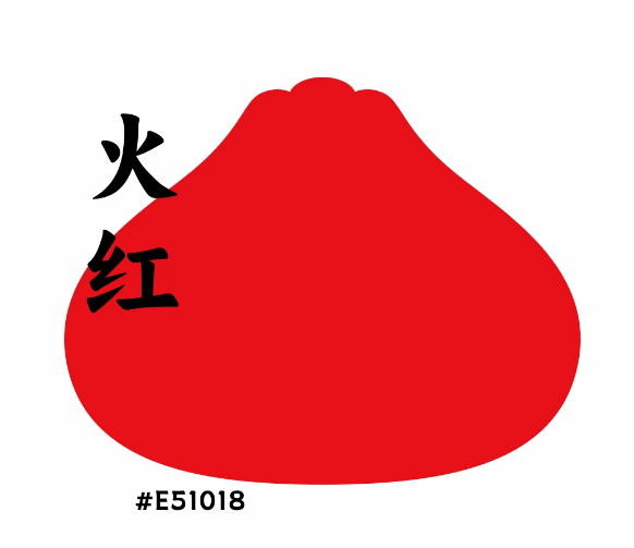
PART A | 品牌色色彩美学
品牌发源地是广东,考虑到广东人的“吉利”“兴旺”的文化,结合中国传统“苍劲墨宝“的印象,我们把 火红,金品烫金,墨黑作为品牌识别的颜色,质感拉满。
The birthplace of the brand is Guangdong. Considering the "Geely" and "prosperous" culture of Guangdong people, combined with the traditional Chinese "vigorous ink treasure" impression, we put the red, gold perm, ink black as the color of brand identification, texture is full.
PART B | 传统毛笔字的创新
在传统毛笔字基础上进行笔画的拆解和微调,起角的毛笔笔锋呈现一种气势,既保有品牌亲民感又提高了品牌辨识度。
On the basis of the traditional Chinese characters, the disassembly and fine-tuning of the strokes of the brush presents a kind of momentum, which not only retains the sense of the brand but also improves the brand recognition.


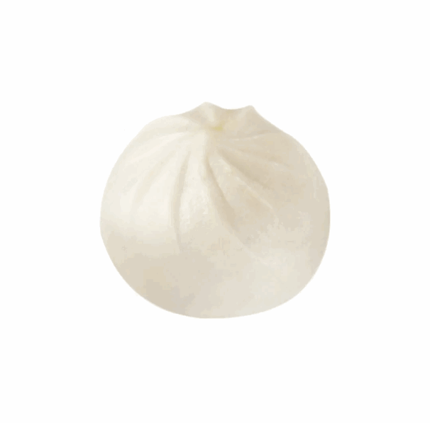
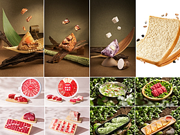
PART C | 品牌IP设计
包子在中国有着悠久的历史,提取包子外形,结合人人皆知的熊猫王形象进行组合重建,打造兼具品类特征、品牌属性、辨识度高的熊猫蒸包王形象IP。
Steamed stuffed bun has a long history in China. It extracts the shape of steamed stuffed bun, combines the well-known image of Panda King, to create an image IP with category characteristics, brand attributes and high recognition.
PART D | 品牌物料延展
将熊猫蒸包王IP符号广泛应用于包装袋、餐具、工服、店内装饰、宣传海报等各类品牌物料上,形成统一而富有特色的品牌形象体系,提高品牌的传播度。
The IP symbol of Panda Steamed Bag King is widely used in various brand materials, such as packaging bags, tableware, work clothing, store decoration, publicity posters and so on, to form a unified and distinctive brand image system and improve the spread of the brand.


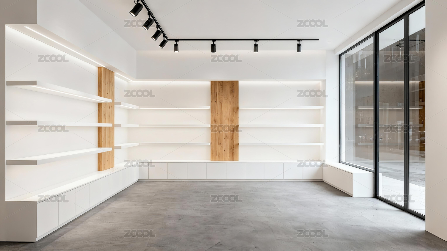
04 SPACE DESIGN 空间设计
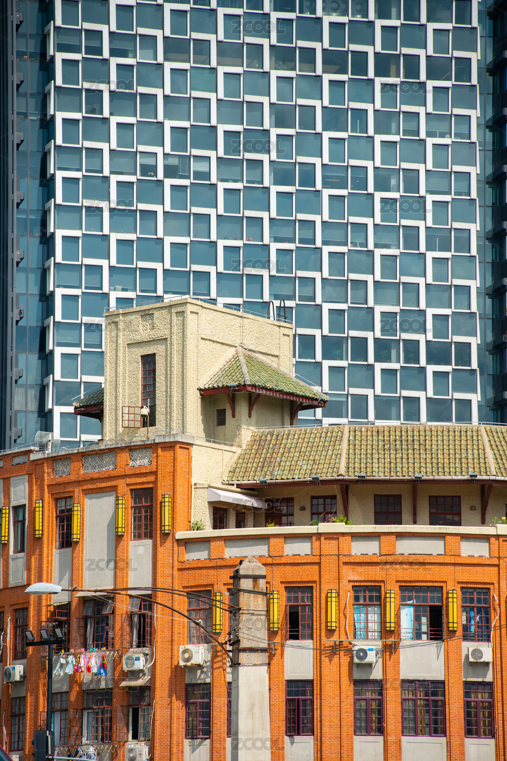
空间设计采用的是简化的中式建筑结构,同时延续红黑金品牌色应用,在门头加入IP造型突出品类,在空间设计也融入了“蒸笼”这一图形元素和材质材料,让“包子”的品类属性和品牌特色更多突出,兼具好玩、好看、好记忆的特点,让“金品蒸包王“在顾客心中留下明确的符号印记。
Space design is simplified Chinese architectural structure, at the same time continue red and black gold brand color application, not only in the door to join IP modelling category, and in the space design into the "steamer" the graphic elements and material material, let "bun" category attributes and brand characteristics more prominent, both the characteristics of fun good memory, let "gold steamed bag king" leave clear symbols in the hearts of customers.


在空间的布局动线上,门店设计了明确的通道,引导顾客从点餐区到就餐区,再到出口,形成了一个流畅的循环。这样的设计减少了顾客在店内的等待时间,也提高了门店的运营效率。
In the layout of the space, the store is designed with clear passages, guiding customers from the ordering area to the dining area and then to the exit, forming a smooth cycle. This design reduces the waiting time of customers in the store and also improves the operational efficiency of the store.

金品蒸包王的门店设计巧妙地融合了现代美学与品牌特色,通过精心挑选的材料和装饰元素,让顾客拥有视觉和感官的双重享受,为顾客提供了一个高品质的就餐环境。
The design of the store is a clever blend of modern aesthetics and brand characteristics, and through carefully selected materials and decorative elements, customers can enjoy both the eyes and the senses, providing customers with a high-quality dining environment.

05 DESIGN THIHKING 设计思考
INGROUP团队为金品蒸包王的品牌升级涵盖视觉形象和空间布局的全面革新。通过深入挖掘金品蒸包王的品牌文化,提炼其传统与现代相结合的品牌精神,同时对金品蒸包王的店铺空间重新进行视觉设计,为顾客创造了一个既舒适又具有品牌特色的就餐环境。
INGROUP The team's brand upgrade for the King covers the comprehensive innovation of visual image and spatial layout. By deeply excavating the brand culture of King, the brand spirit of combining tradition and modernity is refined, and the store space of King is visually designed, so as to create a comfortable dining environment with brand characteristics for customers.
7
举报
声明
12
分享
相关推荐


评论你的想法~
表情
喜欢TA的作品吗?喜欢就快来夸夸TA吧!
推荐素材


你可能喜欢


相关收藏夹


登录注册
7登录即可同步推荐记录哦
12登录即可加入我的收藏
评论登录即可评论想法
分享分享