1013|北京如邸酒店品牌设计

天津/平面设计师/1年前/685浏览
版权
1013|北京如邸酒店品牌设计

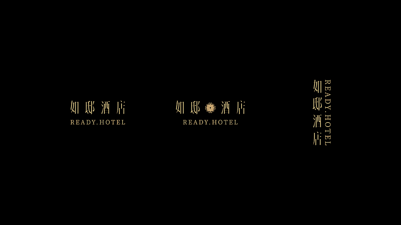
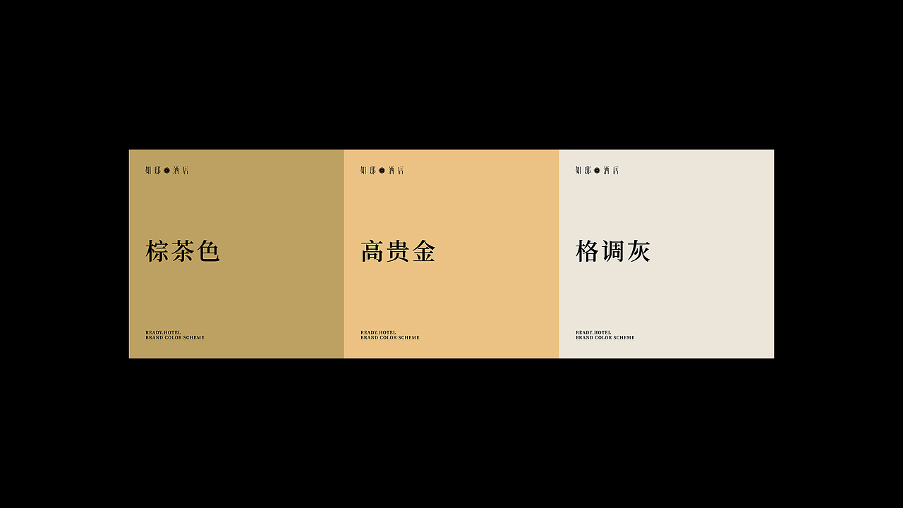

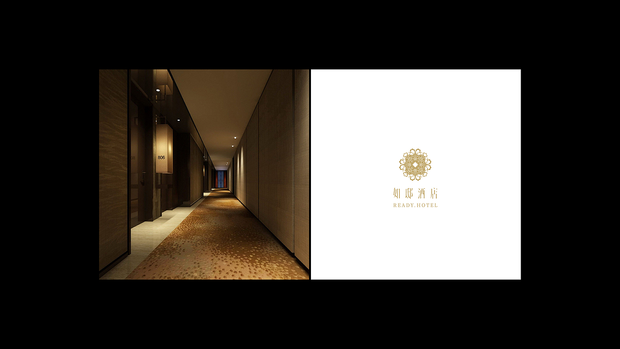


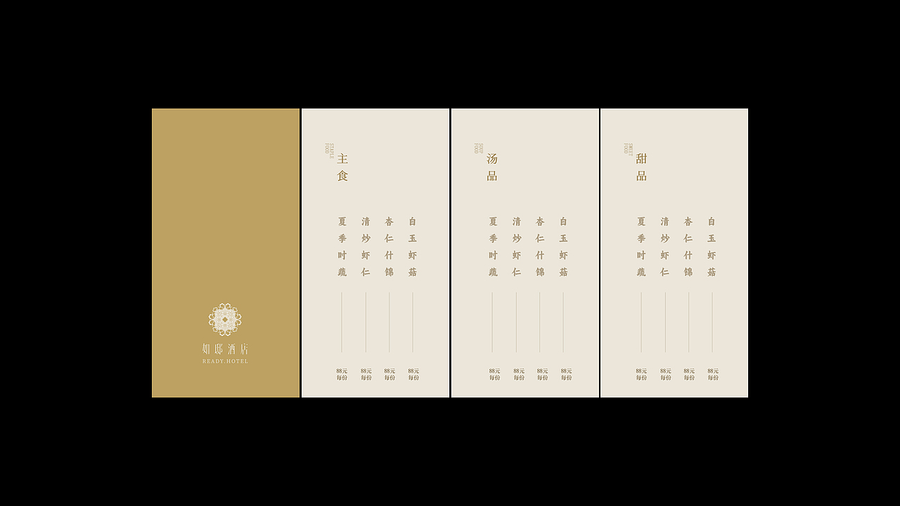


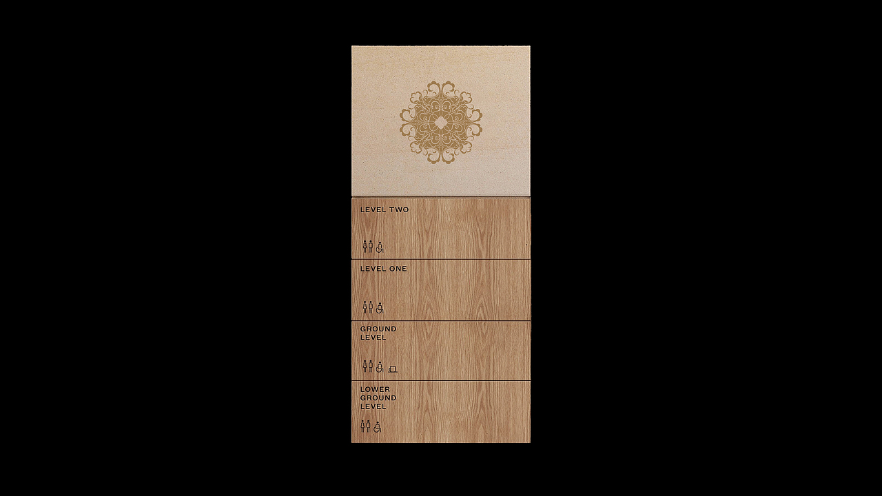

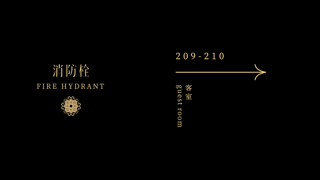
这是我们在今年7月份,为北京前门地区一家正在规划中的酒店做的品牌形象设计。整体视觉元素以景泰蓝图纹为基础,配合具有设计感的宋体,英文字体我们选用衬线字体让整体logo组合更有看头,品牌色调沿用黑金搭配凸显酒店的高级感,简约、大气的版式设计也呼应品牌热情接纳四方宾客。
This is the brand image design we did for a hotel under planning in the Qianmen area of Beijing in July this year. The overall visual elements are based on the cloisonn é pattern, combined with the design oriented Song typeface. We use serif fonts to make the overall logo combination more eye-catching, and the brand color scheme uses black and gold to highlight the hotel's high-end feel. The simple and atmospheric layout design also echoes the brand's warm acceptance of guests from all directions.
品牌 如邸酒店
监制 1013BRANDESIGN
创意 周洲
设计 郭海峰 王一东
3
Report
声明
11
Share
相关推荐


in to comment
Add emoji
喜欢TA的作品吗?喜欢就快来夸夸TA吧!
推荐素材


You may like


相关收藏夹


Log in
3Log in and synchronize recommended records
11Log in and add to My Favorites
评论Log in and comment your thoughts
分享Share