NOW-ODEN Kanto-boiled Shop

西安/平面设计师/2年前/1927浏览
版权
NOW-ODEN Kanto-boiled Shop


Intro
It is a great honor for PoKa! Design Office to carry out brand planning and visual design for the Melbourne oden brand "NOW-ODEN".
Our focus returns to the characteristics of the food itself,
exploring the possibilities between it and the fonts and graphics:
The corners of the fonts are likened to the traces of food being cooked, and the hyphens are made into bamboo sticks... Even if it is a fast-moving consumer brand, you can feel the precipitation of the food over time.
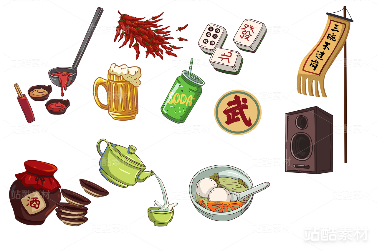
As a street fast food brand, "NOW-ODEN" accompanies people on their way to and from get off work. So we drew food and tips on the road signs to guide consumers to more companionship and spiritual content, hoping that "NOW-ODEN" will become their only choice to fill their stomachs and spirits.
The extension of the brand focuses more on peripheral design, and in the take-and-go sales method, the brand will remain in the hands (hearts) of young consumers more. It also brings more vitality to "NOW-ODEN".


非常荣幸 PoKa! Design Office 为墨尔本的关东煮品牌“NOW-ODEN”进行了品牌策划与视觉设计。
我们的关注点回归到煮物本身的特质,
探索煮物与字型、图形之间的可能性:
将字型的边角比喻成食物煮过的痕迹,将连字符制作成竹签…即使是快消费品牌,也能感受到煮物在时间中的沉淀。作为街头快餐品牌,“NOW-ODEN” 更多伴随着上下班路上的人群。于是我们将食物和小贴士绘制在路牌上,将消费者指引到更有陪伴感、更精神层面的内容当中,希望 “NOW-ODEN” 成为他们填饱肚子也填饱精神的不二之选。品牌的延展则更侧重周边设计,在即取即走的售卖方式中,让品牌更多的在年轻消费群里手中(心中)存留。也为 “NOW-ODEN” 迸发出更多的活力。
“NOW-ODEN”
想要的现在就要 用图形与世界沟通
出品方 / Produced by: Poka! Design Office
设计指导 / Art Director :刘小描
品牌策划 / Brand Planning :Funny呀, 刘小描
平面设计 / Graphic Design :刘小描,雪娇
三维设计 / 3D Design :刘小描

74
举报
声明
136
分享
相关推荐


评论你的想法~
表情
喜欢TA的作品吗?喜欢就快来夸夸TA吧!
推荐素材


你可能喜欢


相关收藏夹


登录注册
74登录即可同步推荐记录哦
99+登录即可加入我的收藏
评论登录即可评论想法
分享分享