

汕头/设计爱好者/2年前/502浏览
版权
项目丨PROJECT
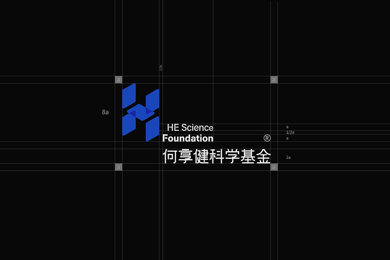
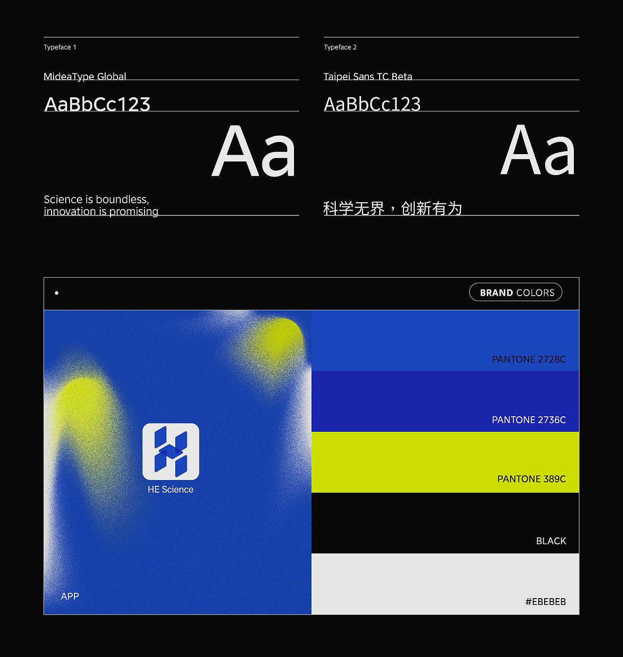
何享健科技基金LOGO设计
服务丨SERVICE
品牌LOGO/solgan/物料设计
设计丨DESIGNER
禾火Hhuo
—
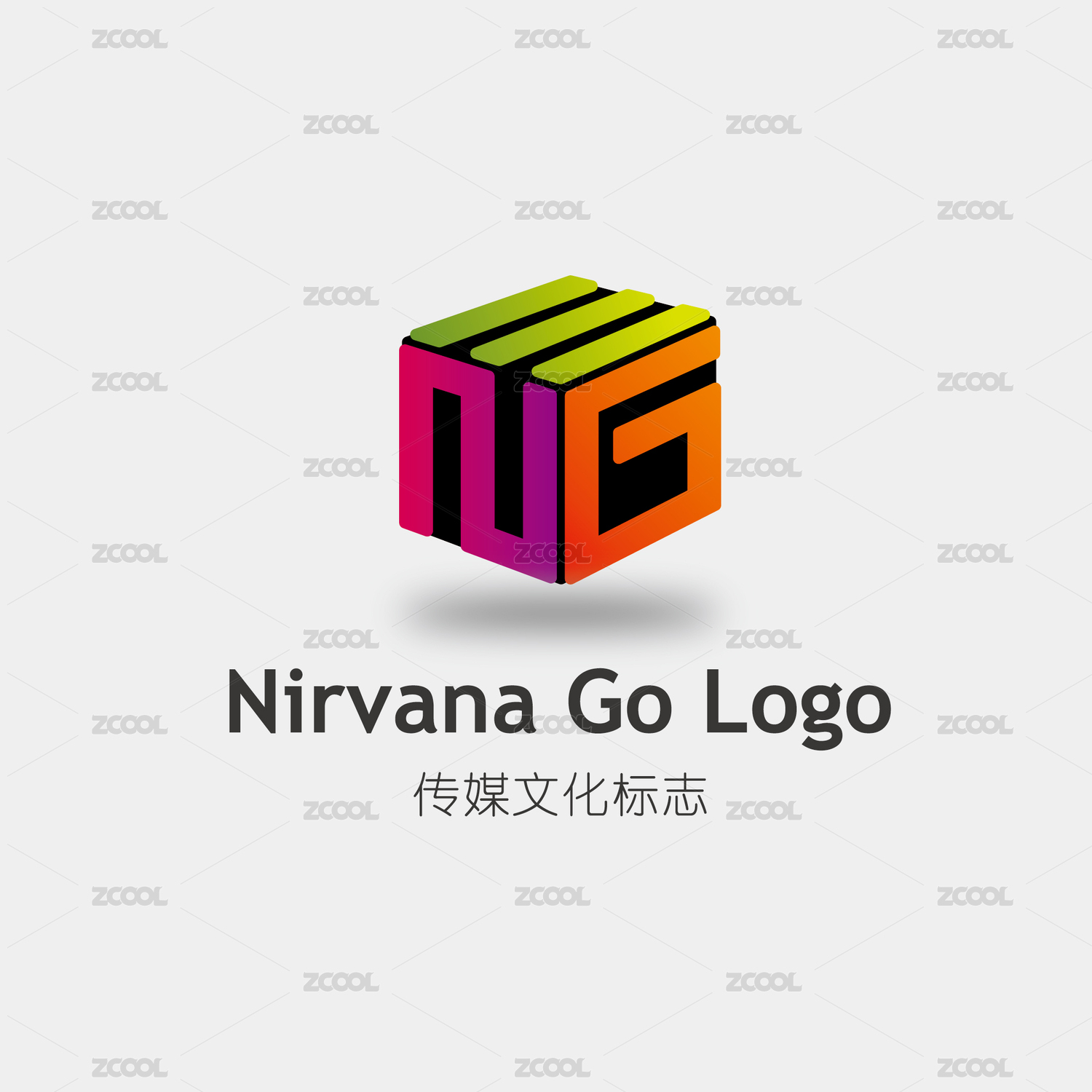
灵感源自太阳能这一科学环保能源。设计以品牌首字母"H"为蓝本,采用太阳能板的片状结构,巧妙地将其叠加成"H"形,创造出一种立体而富有层次感的视觉效果。这种设计不仅体现了对环保能源的尊重,也赋予了品牌标识以独特的三维立体感。
The inspiration comes from solar energy, a scientific and environmentally friendly energy source. The design is based on the brand's initial letter "H" and adopts a sheet-like structure of solar panels, cleverly overlapping them into an "H" shape to create a three-dimensional and layered visual effect. This design not only reflects respect for environmentally friendly energy, but also gives the brand logo a unique three-dimensional sense.





21
举报
声明
11
分享
相关推荐










评论你的想法~
表情
喜欢TA的作品吗?喜欢就快来夸夸TA吧!
推荐素材













你可能喜欢











相关收藏夹


















登录注册
21登录即可同步推荐记录哦
11登录即可加入我的收藏
评论登录即可评论想法
分享分享