16开Ceramics Visual Identity and Packaging


上海/平面设计师/2年前/6626浏览
版权
16开Ceramics Visual Identity and Packaging
Overview
16开是以设计杯子为主的陶瓷家居品牌,2017年创立于景德镇。从传承老工艺到创新设计,再到建立属于自己的釉料色彩系统,只为创作出兼具历史温度和纯粹色彩的当代日用陶瓷。
16Mo is a ceramic brand founded in Jingdezhen in 2017, with a focus on designing cups. From inheriting traditional craftsmanship to innovating designs, and establishing our own glazing color system, we strive to create contemporary porcelain that combines historical significance and pure colors for everyday use.
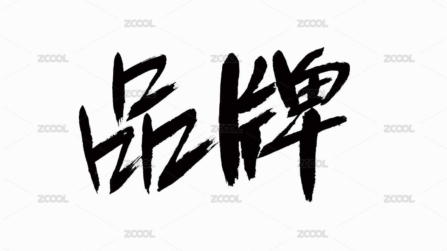
Logo
16开Logo是以定制中文字体「16开」、 「景德镇」与「16开图形logo」组合而成。品牌名「16开」与「景德镇」的Logo组合形式意在表达品牌成长于景德镇,而景德镇代表着精湛的陶瓷技艺和民族自豪。
取名为「16开」灵感来源于品牌主理人热爱绘画,从儿时起练习素描绘画的纸张尺寸便是16开大小。因此,绘制一张16开比例的纸张图形作为辅助图形,在这16开的纸张上,铺开所有对陶瓷器物的想象。
The 16Mo logo is created by combining the custom Chinese font "16开", "景德镇". The combination of the brand names "16开" and "景德镇" in the logo design aims to express the brand's growth in Jingdezhen, a place symbolizing exceptional ceramic craftsmanship and national pride.
The choice of the name "16开" is inspired by the brand founder's passion for painting, who has been using size 16Mo paper for sketching since childhood. Therefore, a 16Mo proportioned graphic is used as an auxiliary element to visualize the boundless imagination for ceramic objects.


205
举报
声明
217
分享
相关推荐


评论你的想法~
表情
喜欢TA的作品吗?喜欢就快来夸夸TA吧!
推荐素材


你可能喜欢


相关收藏夹


登录注册
99+登录即可同步推荐记录哦
99+登录即可加入我的收藏
评论登录即可评论想法
分享分享