叨叨社区APP_UI界面设计

广州/UI设计师/2年前/3334浏览
版权
叨叨社区APP_UI界面设计
-
视觉监制:张南风
项目设计:钟永鹏 /Dean
主设计:钟永鹏
内容策划:钟永鹏 / 凌然
项目指导:张南风/凌然/张艺耀
-
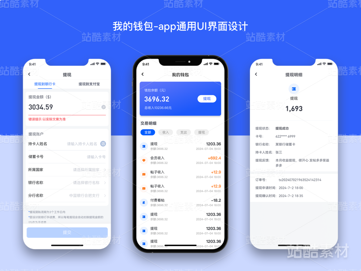
社区APP是国内趋势较为广大的市场,用户日益增长。
市面上不同社区平台不能互通所导致用户的分散;叨叨社区APP以多领域社区、简洁的社交形式所产生的价值吸引用户。因此诞生了“叨叨社区”这个APP。
将该产品优势通过头脑风暴确定主色使用黄色为产品品牌色,象征着活力、年轻为产品注入活力。
产品设计偏时尚化、年轻化、活力。
-
Community apps are a relatively broad market in China, with increasing users.
The dispersion of users caused by the inability of different community platforms to communicate on the market; The Taodao Community APP attracts users with the value generated by a multi-disciplinary community and concise social form. Therefore, the app "Daodao Community" was born.
Brainstorm the advantages of the product to determine the main color using yellow as the brand color, symbolizing vitality and youth to inject vitality into the product.
The product design tends to be fashionable, youthful, and energetic.
-
一切文案、内容、图示均以线上版本为准,此处作品仅作交流展示,不负任何法律责任
All copy, contents and illustrations shall be based on the online version. The works here are for exchange and display only, without any legal liability.


34
Report
声明
96
Share
相关推荐


in to comment
Add emoji
喜欢TA的作品吗?喜欢就快来夸夸TA吧!
推荐素材


You may like


相关收藏夹


Log in
34Log in and synchronize recommended records
96Log in and add to My Favorites
评论Log in and comment your thoughts
分享Share