香薰蜡烛品牌包装设计 | 浮岛

杭州/平面设计师/2年前/765浏览
版权
香薰蜡烛品牌包装设计 | 浮岛
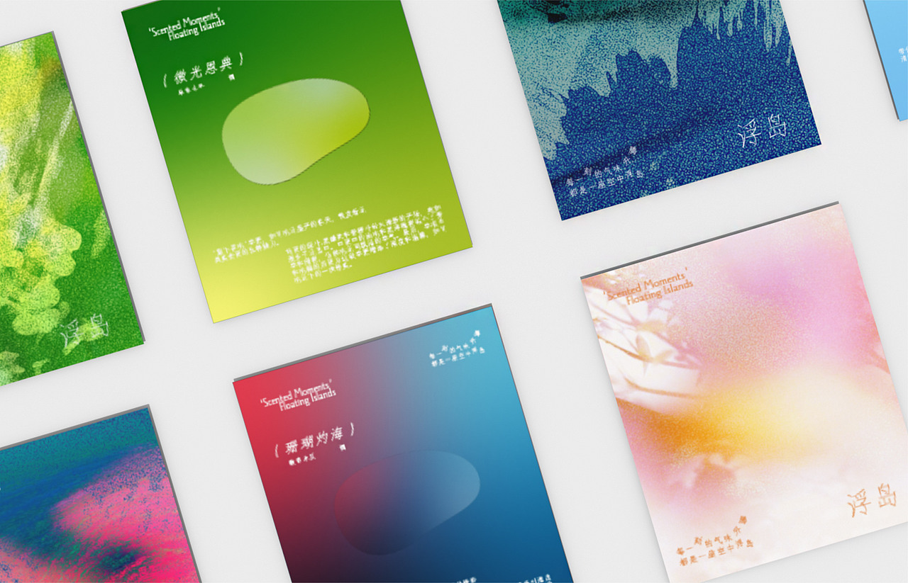
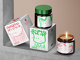
浮岛是一个香薰品牌。品牌方希望这不是一个纯色拒人于千里的品牌,而是一个有色彩,并且能传递气味感受的香薰。
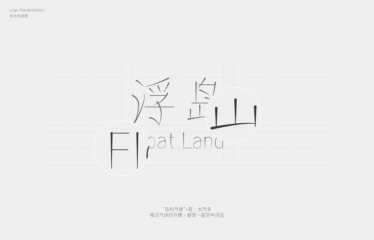
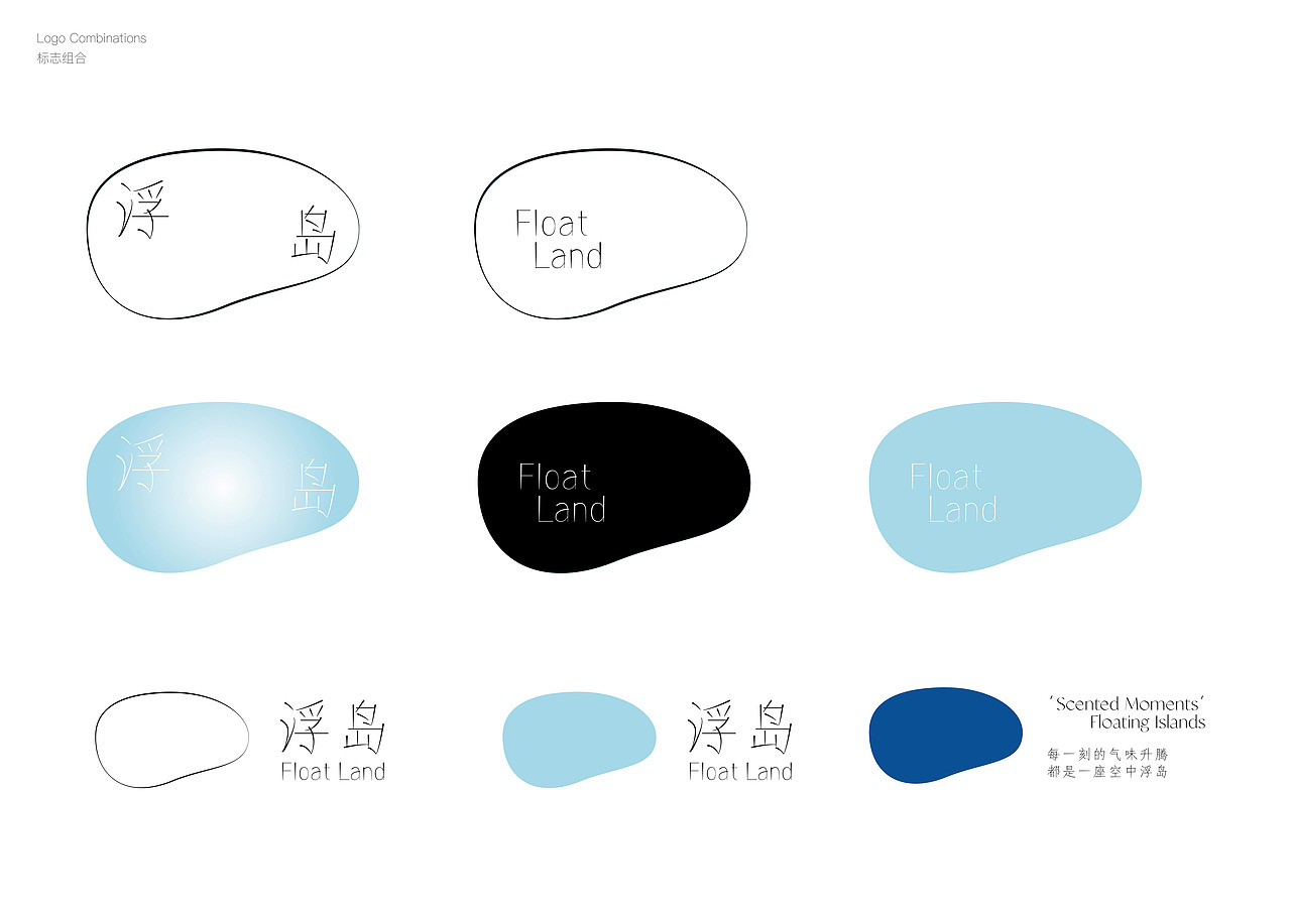
此次最核心的切入点围绕岛屿和气味发散:产品和标志从岛屿基础形态出发,logo字体提取了岛上气候特点。包装部分挑选了不同气味对应的实物配色做搭配,呈现出浮岛的样貌。
The brand aims for this to not be a monochromatic brand that keeps its distance, but rather one that is colorful and conveys the sense of scent. So, the core concept here is 'Scent Takes Shape.' We have chosen color schemes reminiscent of fragrances to convey the scent's experience.
视觉项目团队:YUYUSTUDIO
*禁止非授权转载








6
举报
声明
34
分享
相关推荐








评论你的想法~
表情
喜欢TA的作品吗?喜欢就快来夸夸TA吧!
推荐素材











你可能喜欢











相关收藏夹














登录注册
6登录即可同步推荐记录哦
34登录即可加入我的收藏
评论登录即可评论想法
分享分享