
武汉/网页设计师/2年前/77浏览
版权
品牌介绍
Brand introduction
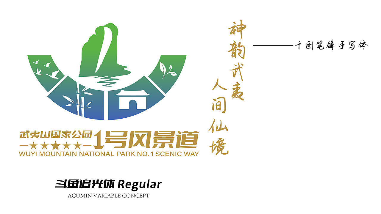
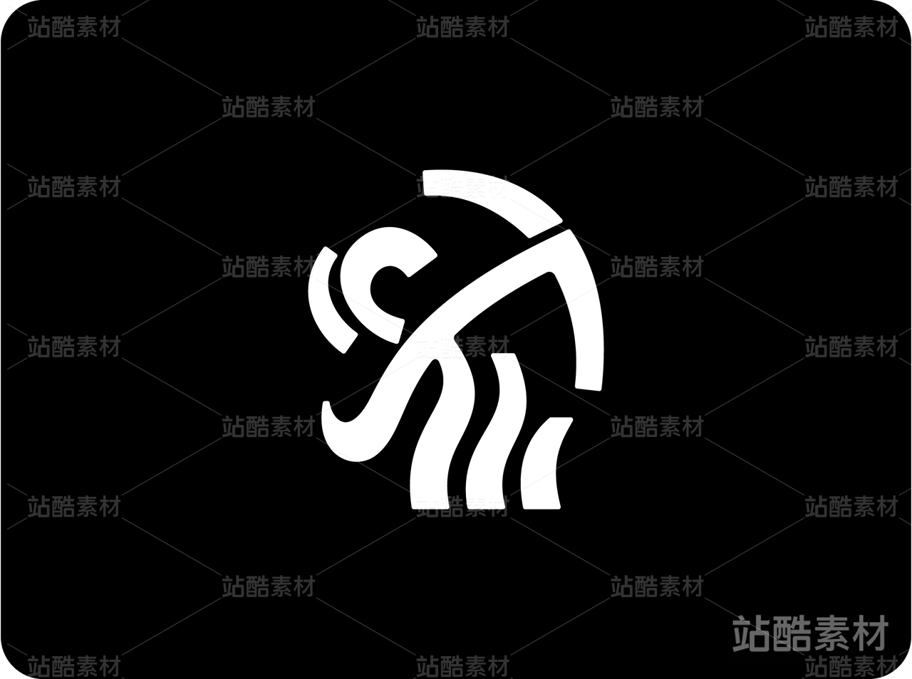
武夷山国家公园1号风景道按主题特色分四段,南源岭--黄坑镇: 为生态探索之旅,展示“碧水丹山,生物之窗”的特色主题; 黄坑镇--莒口镇:为乡村度假之旅,展示“林海竹乡,山水人家”的特色主题;莒口镇--五夫镇:为历史人文之旅,展示“理学之邦,人杰地灵”的特色主题;五夫镇--南源岭: 为山水茶之,展示“万古山水,万里茶道”的主题特色。
The No. 1 Scenic path of Wuyi Mountain National Park is divided into four sections according to the theme characteristics. Nanyuanling - Huangkeng Town: For the ecological exploration journey, showcasing the characteristic theme of "blue water and Danshan, window of biology"; Huangkeng Town - Jukou Town: for the rural holiday trip, show the characteristics of the theme of "forest and sea bamboo township, landscape family"; Jukou Town - Wufu Town: For the history and humanity of the journey, show the "Neo-Confucianism, the people of the land" characteristic theme; Wufu Town - Nanyuanling: For landscape tea tour, showing the theme of "thousands of ancient landscapes, thousands of miles of tea Ceremony.
品牌文化:中华传统文化朱熹朱子理学影响深远。
品牌理念:武夷山国家公园笑迎天下客。
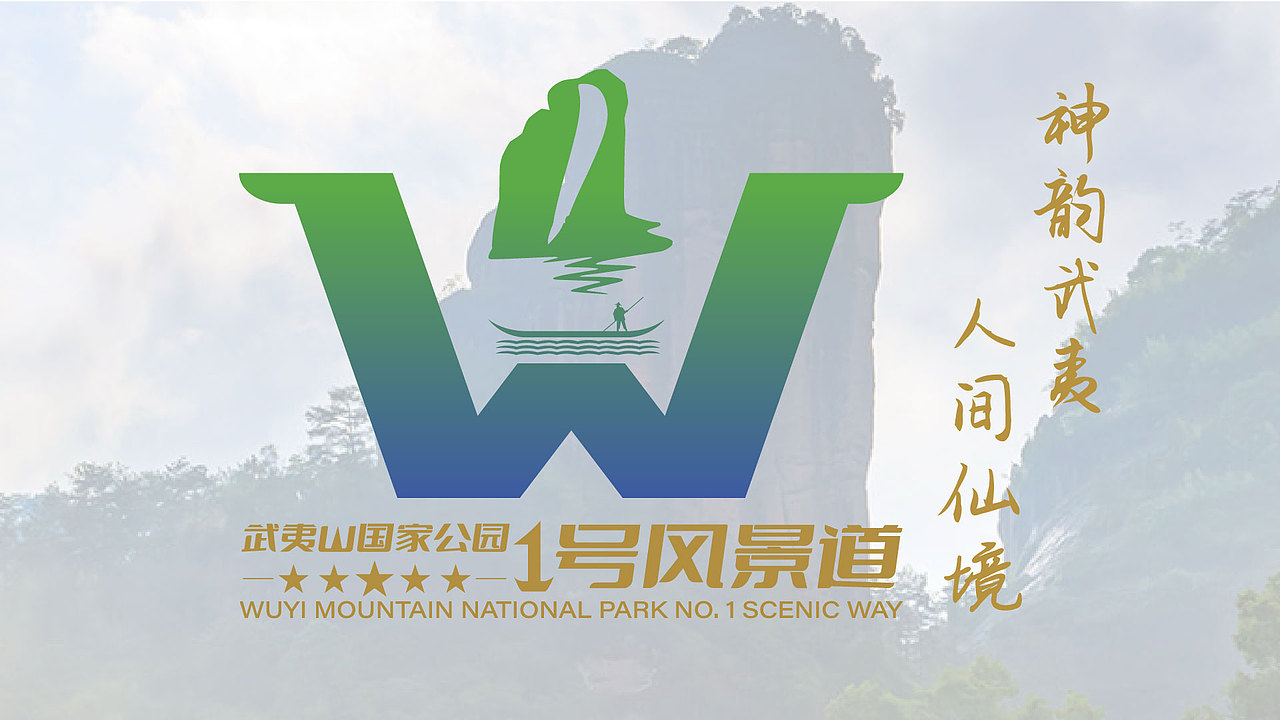
口号:神韵武夷 ,人间仙境。
设计理念:
设计者晚上下班自费利用网吧电脑牺牲自己的休息时间,花了大量的心血、时间和精力,呕心沥血认真查询资料。付出了艰苦卓绝的巨大努力。收集资料,提炼图形,美术创意加工融合提炼、精简、概括、归纳武夷山国际公园最具代表性、最能体现当地特色的视觉图形元素艺术加工,巧妙完美融合,设计软件ADOBE AI精细矢量绘图、精细调整、斟酌,认真规范化制图。设计者努力做到极致完美,希望能尽自己的力量为武夷山国家公园舔砖加瓦。带来品牌宣传推广深入全球游客人心的品牌效应的好的设计精品。设计很深。设计不易。劳逸结合。身体是革命的本钱。
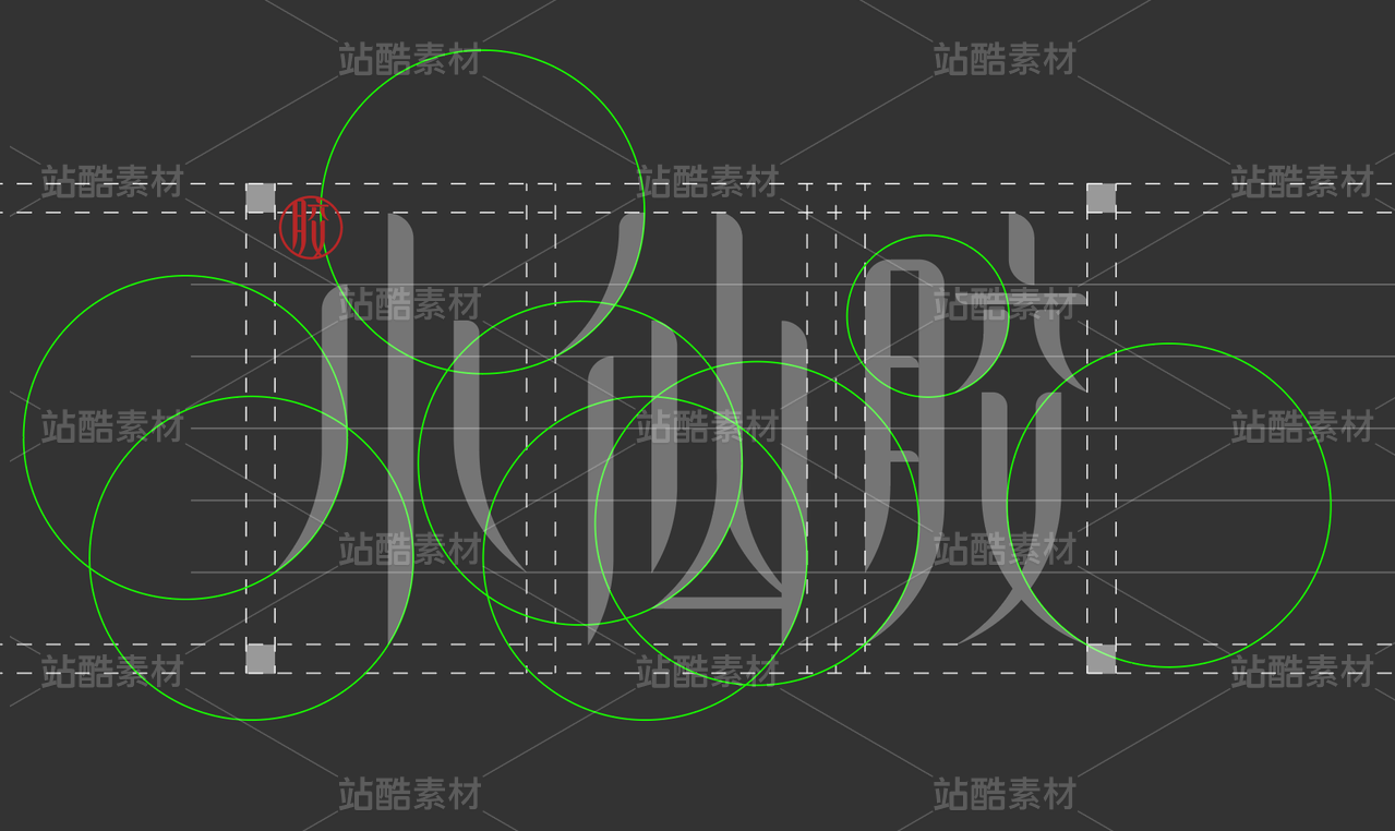
LOGO设计努力抓住主办方需求和要求。量身打造品牌视觉设计。LOGO设计紧扣品牌背景主题。武夷山国家公园1号风景道,玉女峰、九曲溪水竹筏和1号风景道交通环线地图还有笑脸,生物之窗、林海竹乡、理学之邦、万里茶道分为四段,提炼四个图形融入整体一个山字,笑迎天下客。
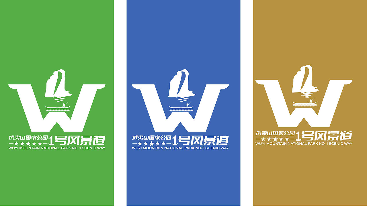
配色生态和谐翠绿、碧水蓝及金色,寓意生态健康和谐。绿水青山就是金山银山 。


0
Report
声明
收藏
Share
相关推荐


in to comment
Add emoji
喜欢TA的作品吗?喜欢就快来夸夸TA吧!
推荐素材


You may like


相关收藏夹


Log in
推荐Log in and synchronize recommended records
收藏Log in and add to My Favorites
评论Log in and comment your thoughts
分享Share