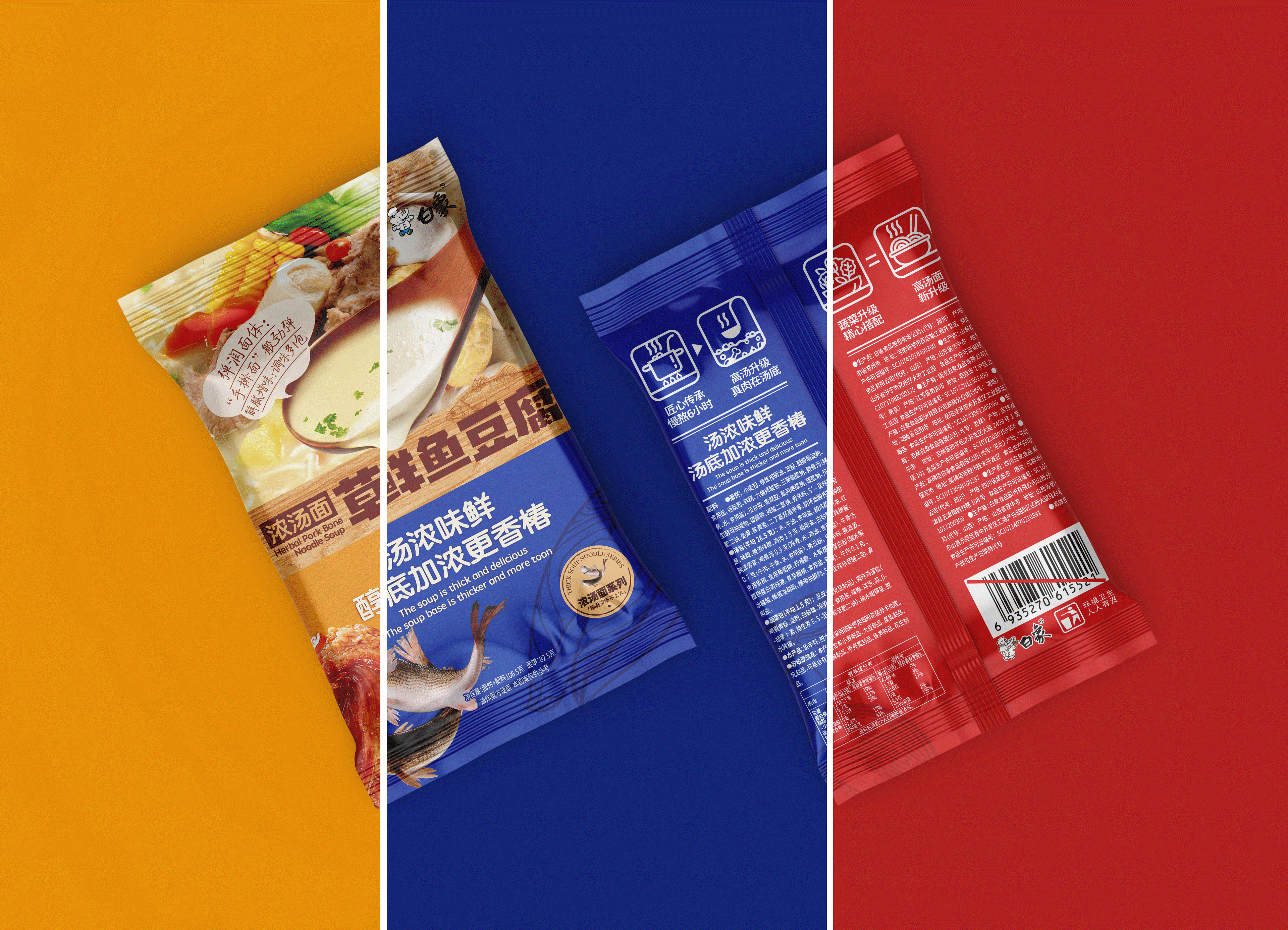
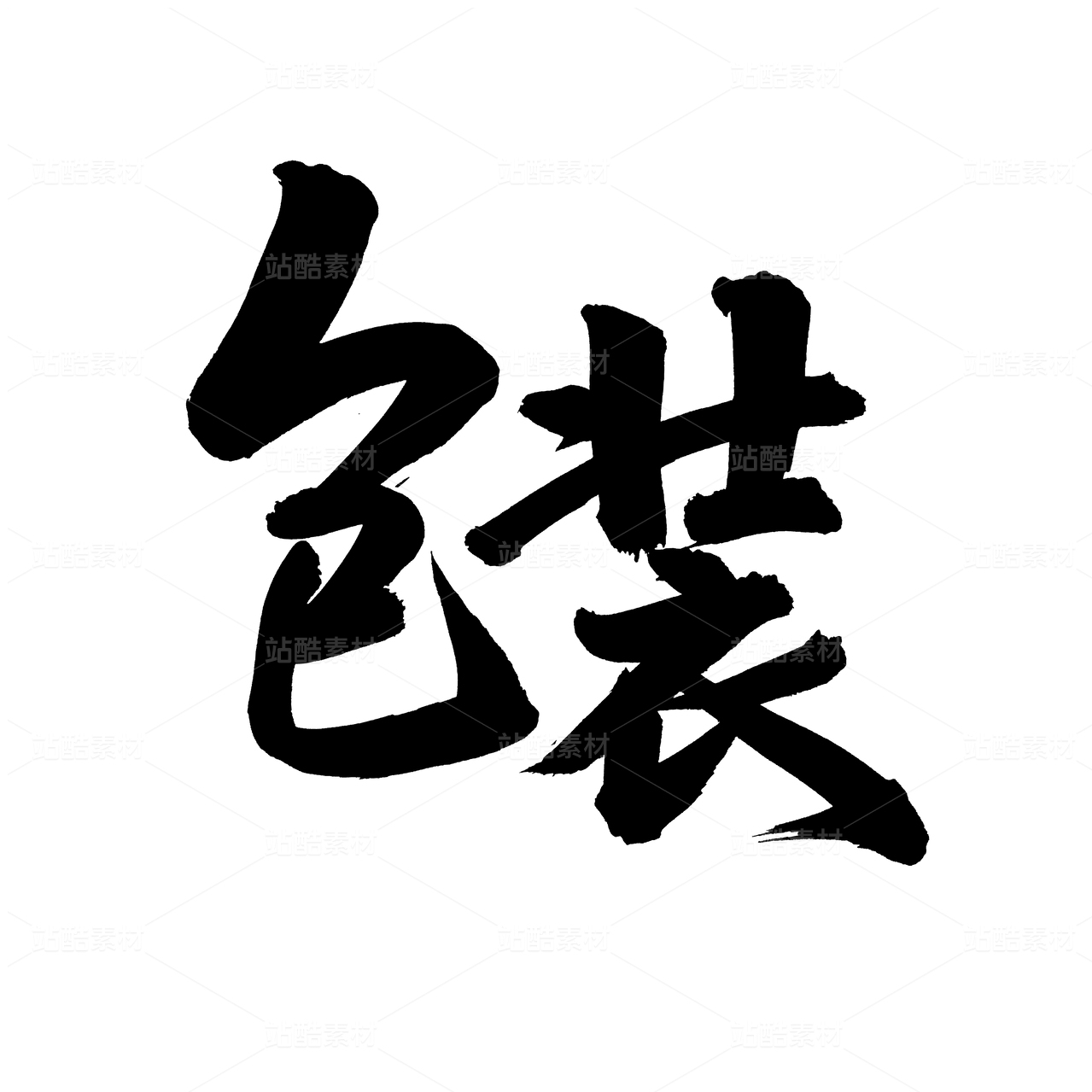
NOODLE SOUP | 阳光慢晒 ※ 浓 ※

上海/设计爱好者/3年前/4014浏览
版权
NOODLE SOUP | 阳光慢晒 ※ 浓 ※
We have been exploring what kind of packaging consumers like and what kind of packaging can attract them,
At the same time, we should not be too low-end in terms of vision, and the tonality is still going up. As a fast-food consumer product, it is a popular product for young people to grasp the relationship between traditional brands and emerging markets to guide packaging design.
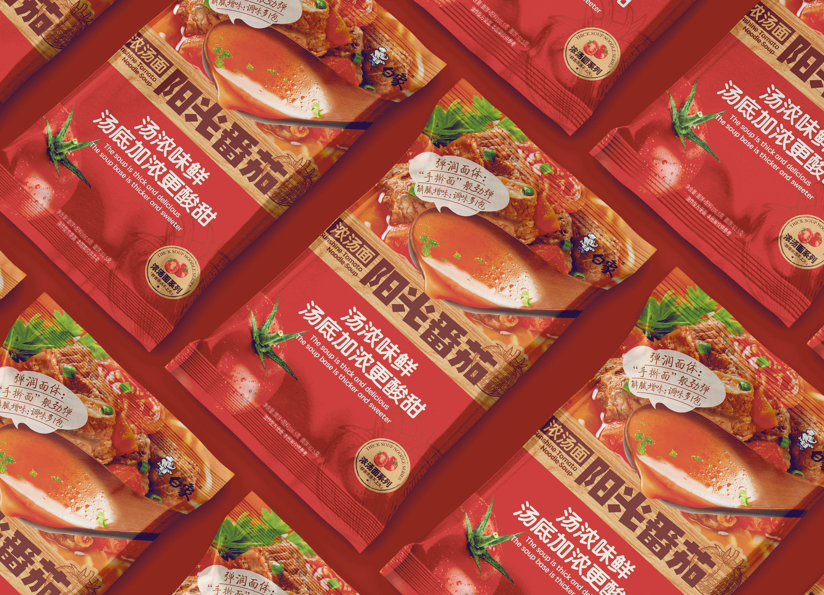
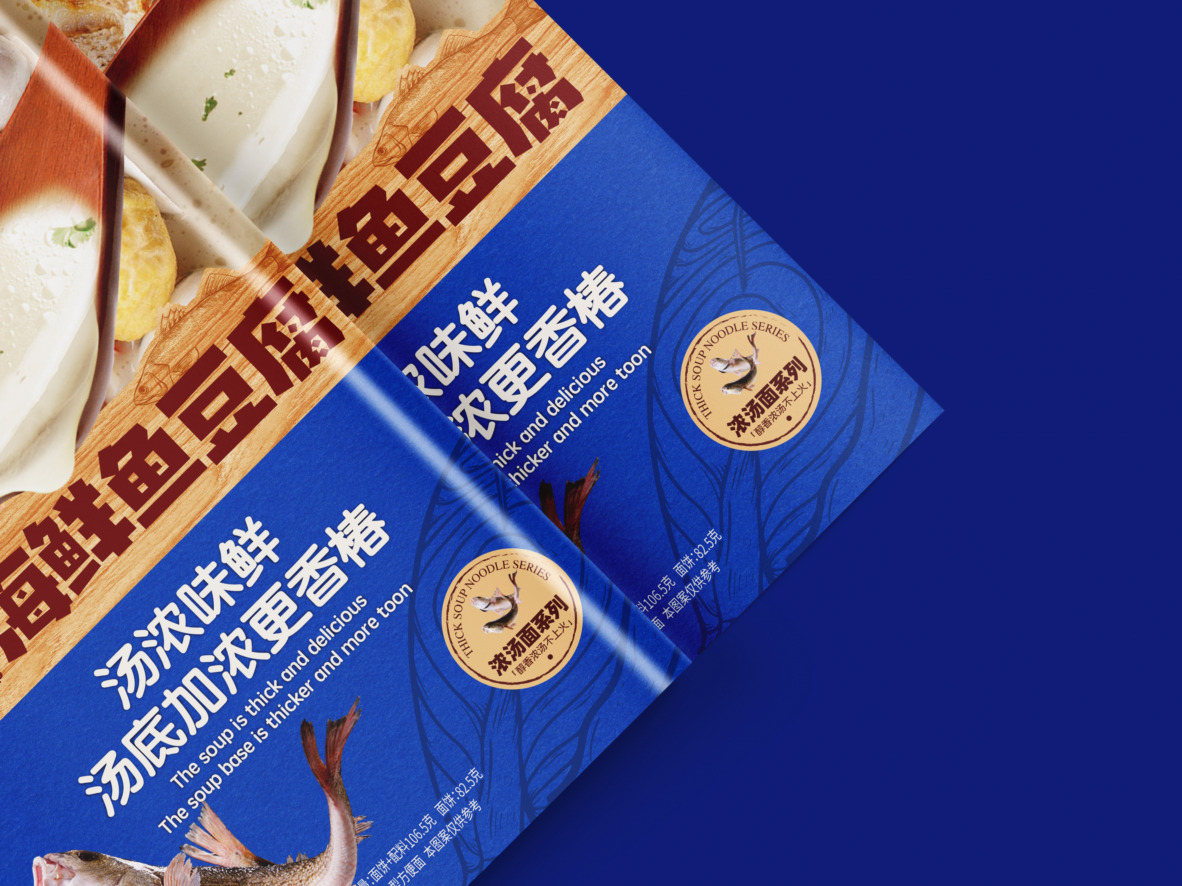
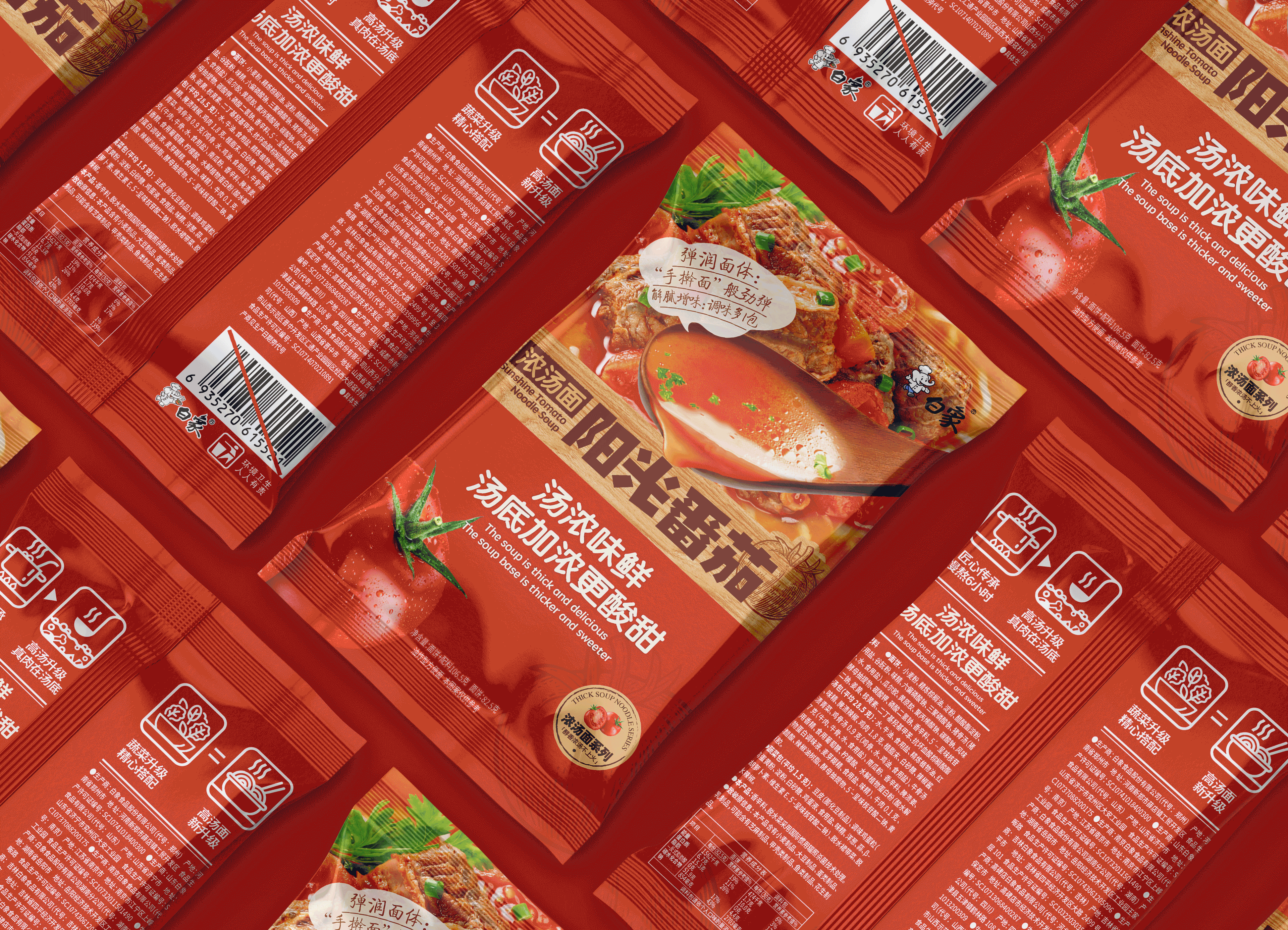
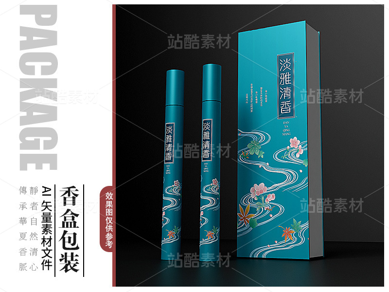
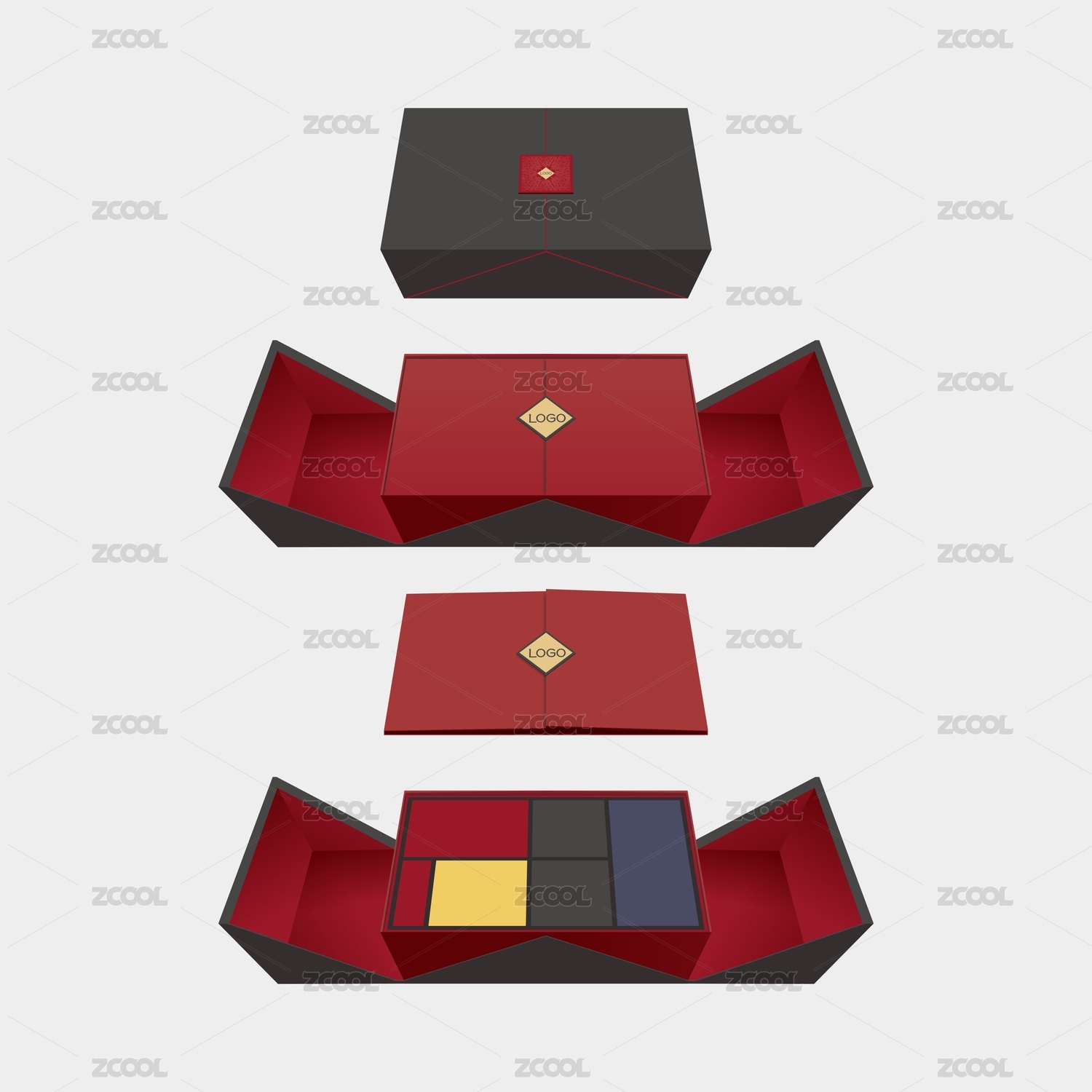
We have reduced the traditional red, yellow and blue color by C and Y to a color that allows consumers to associate with the characteristics of the product itself. In order to strengthen the prominence of the product name, we use wood grain as the bottom to increase the warmth of the product. In addition, simple design layout is used as the main information
dissemination to increase the spatial sense of the picture. The recognition of products by consumers has been enhanced, and the competitiveness of products has been greatly enhanced, thus expanding the consumer market.
—————————————————————————————————————————————————————————
我们一直在探索消费者到底喜欢什么样的包装,什么样的包装才能吸引他们,同时还要满足视觉这块不能太低端,调性还是要往上走的。作为速食消费产品,是当下年轻人颇受欢迎的产品,把握传统品牌与新兴市场的关系,来指导包装设计。
我们将传统的红黄蓝做了降C降Y的处理等到一个让消费者能联想到产品本身特性的颜色,为了强化品名的凸显度我们用木纹作为底从而增加了产品的温馨感,再加上简洁的设计排版作为主要信息传播从而增加画面的空间感。提升消费者对产品的认可度、极大增强了产品竞争力,从而扩大消费者市场。
—————————————————————————————————————————————————————————


41
Report
声明
195
Share
相关推荐


in to comment
Add emoji
喜欢TA的作品吗?喜欢就快来夸夸TA吧!
推荐素材


You may like


相关收藏夹


Log in
41Log in and synchronize recommended records
99+Log in and add to My Favorites
评论Log in and comment your thoughts
分享Share