趣味沙拉品牌设计

杭州/设计爱好者/3年前/114浏览
版权
趣味沙拉品牌设计
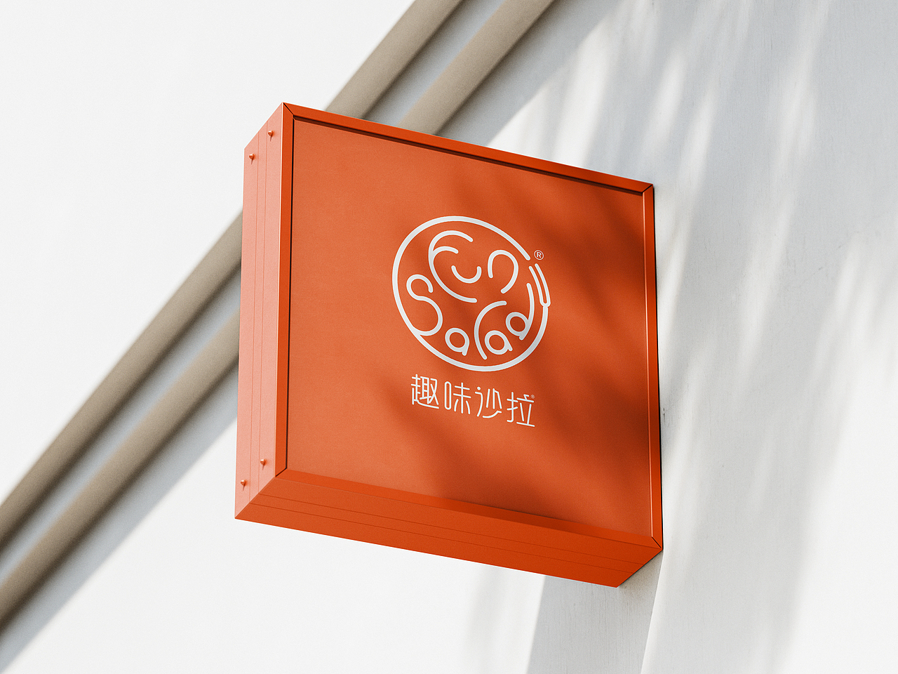
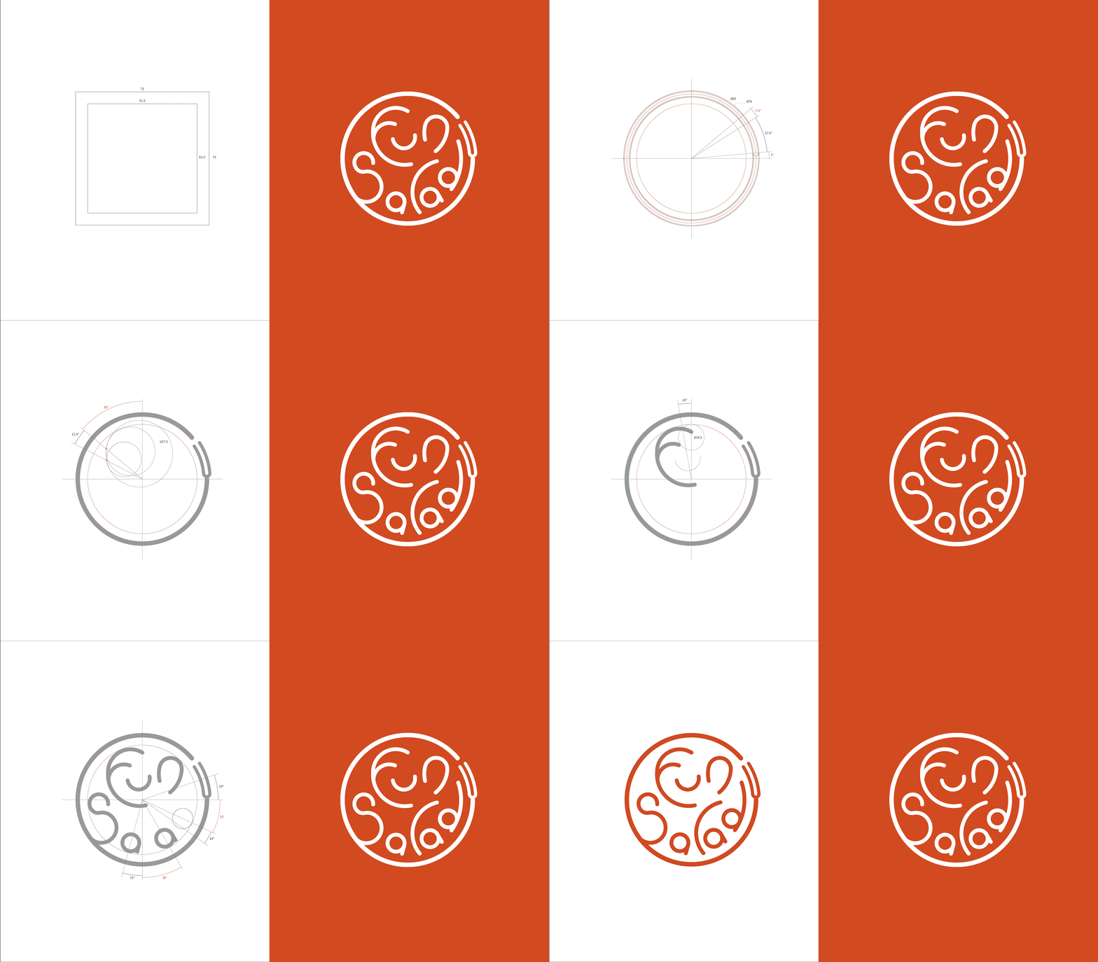
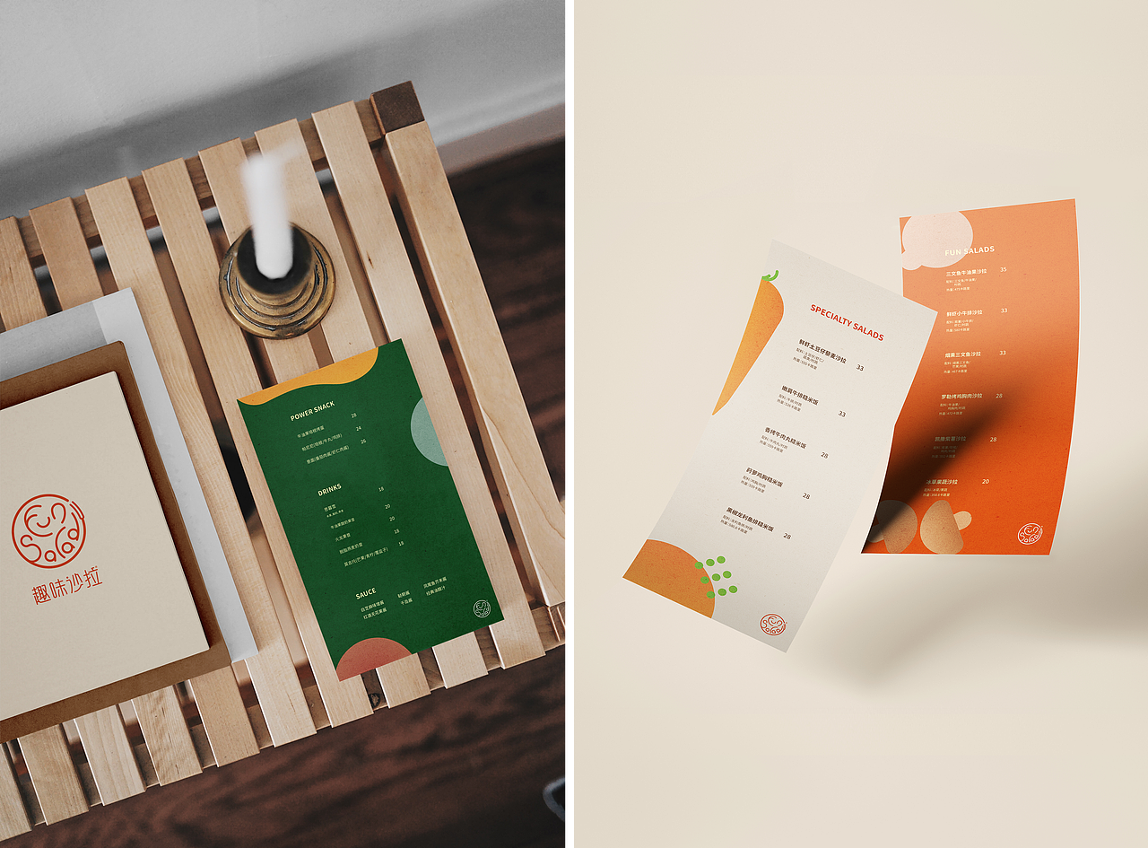
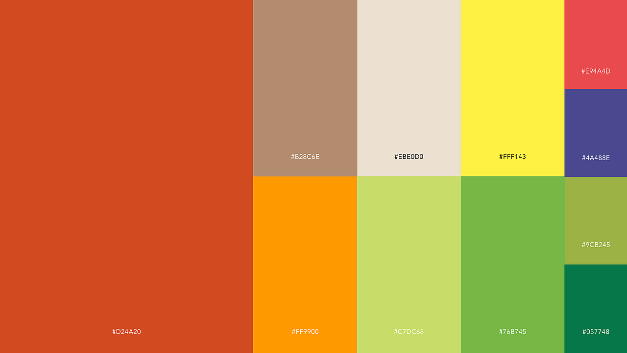
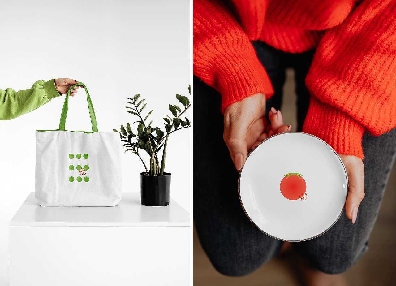
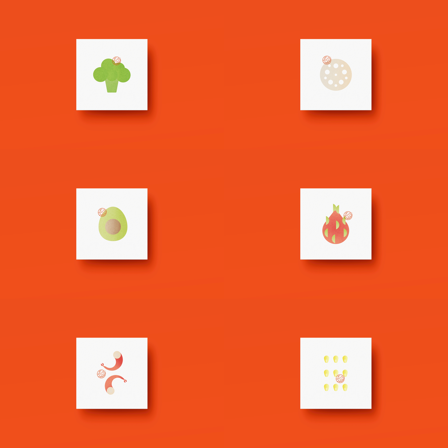
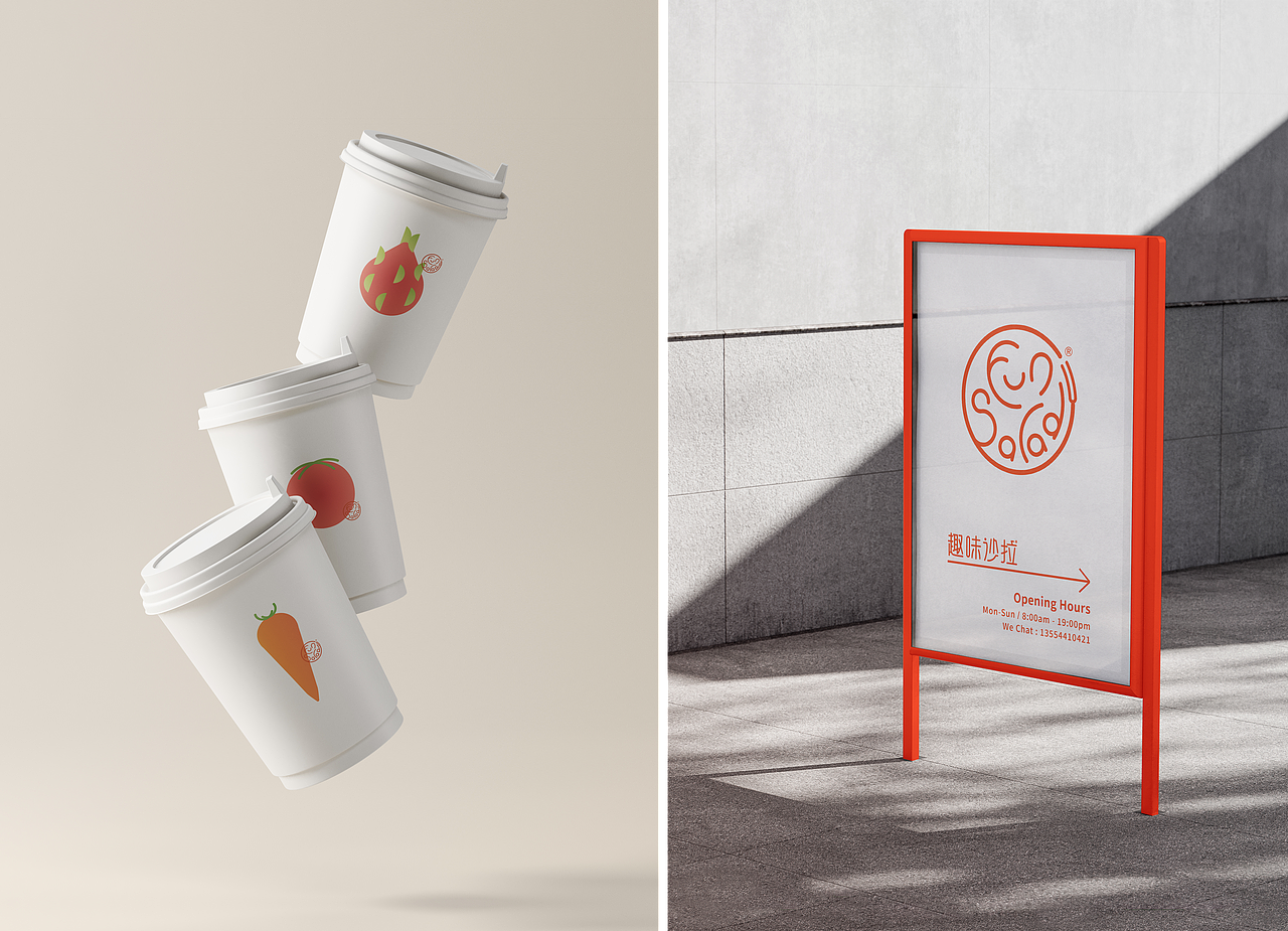
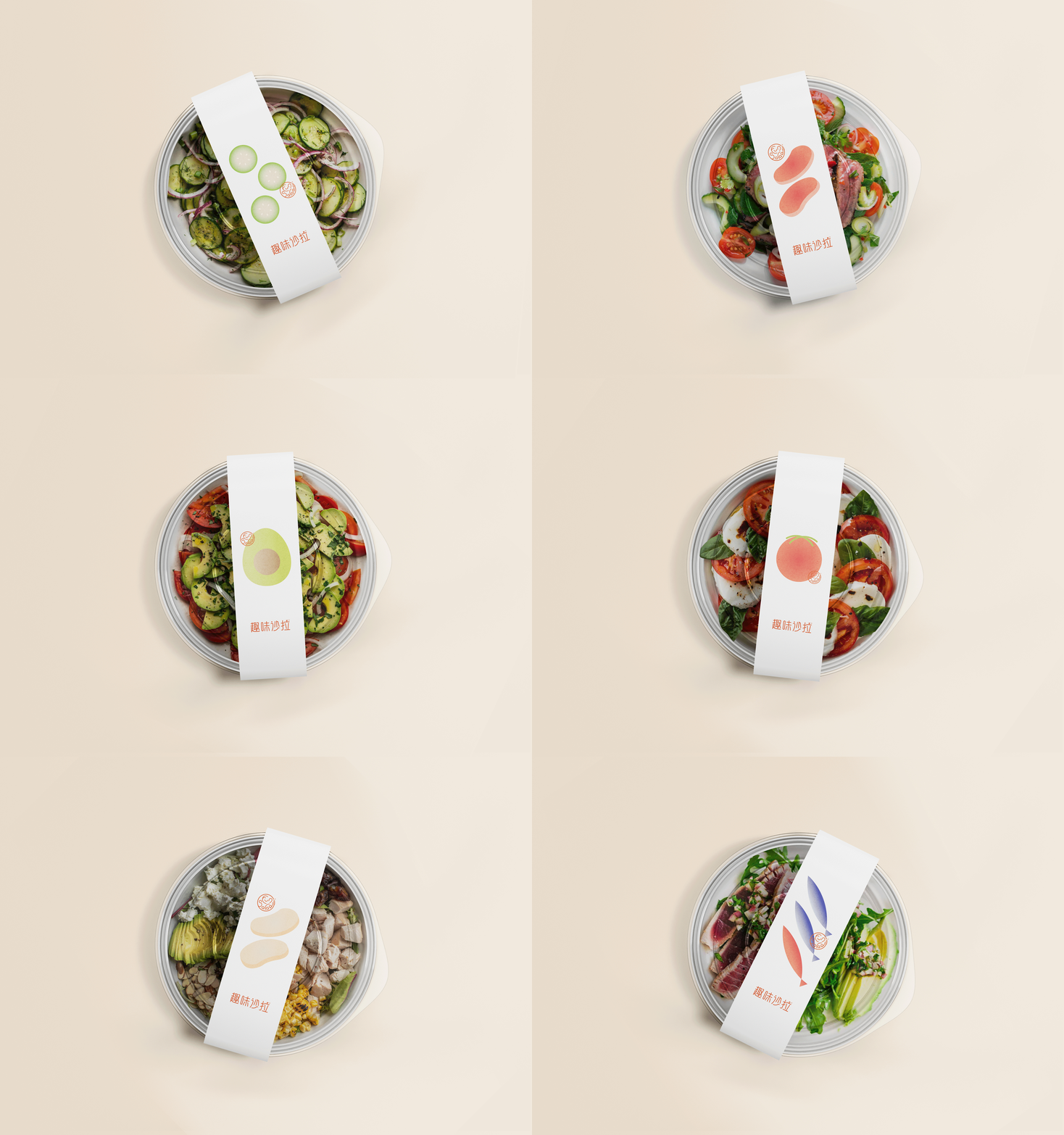
这是一家做沙拉的店铺,需要在2017年初开业的商店进行全面的形象设计。客户陈女生的初衷是为了让人感到轻松快乐的logo,健康的食物也能带给人们有趣的感受。符号设计的灵感来自名称本身。 设计方法结合了盘子叉子的简约几何设计和FunSalad拼写的形式。 结果是一个愉快且可识别的符号。 标识的字母遵循符号的设计,具有相同的美学方法。 充满活力的橙红色被选中作为在所有标识实现中占主导地位的原色,利用其生动性创造强烈的印象。现代,简单的布局与沙拉异形图案相结合,灵感源自会心一笑,延伸图案来自用于菜品的蔬菜水果,在视觉上给人简单,健康,新鲜,快乐有趣。
This is a salad shop that needs a comprehensive image design for the store that will open in early 2017. The original intention of the client, Ms. Chen, is to create a logo that makes people feel relaxed and happy. Healthy food can also bring people interesting feelings. The symbol design was inspired by the name itself. The design approach combines the simple geometric design of the plate and fork with the form of the FunSalad spelling. The result is a cheerful and recognizable symbol. The letters of the logotype follow the design of the symbol, with the same aesthetic approach. Vibrant orange-red was chosen as the dominant primary color in all logo realizations, using its vividness to create a strong impression. The modern and simple layout is combined with the special-shaped pattern of salad, inspired by a smile, and the extended pattern comes from the vegetables and fruits used in the dishes, visually giving people simple, healthy, fresh, happy and interesting.






3
创作信息
举报
声明
1
分享
相关推荐










评论你的想法~
表情
喜欢TA的作品吗?喜欢就快来夸夸TA吧!
推荐素材











你可能喜欢








相关收藏夹















登录注册
3登录即可同步推荐记录哦
1登录即可加入我的收藏
评论登录即可评论想法
分享分享