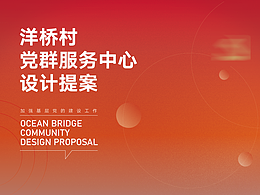
港东社区丨社区品牌升级

青岛/设计爱好者/3年前/497浏览
版权
港东社区丨社区品牌升级
港东社区丨社区品牌升级
Research planning / CubicJ
Creative design / CubicJ
品牌建设丨VI设计丨创意设计丨实验设计
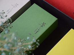
设计之初尝试着摆脱较为传统的社区视觉,将繁体的“東”字作为视觉点。以“東”字为设计基础结合社区理念“守望相助”所提取出的符号作为社区的视觉进行设计。
At the beginning of the design, we tried to get rid of the more traditional community vision, and took the traditional "East" character as the visual point. Based on the word "East" and the community concept of "keeping watch and helping each other", the symbols extracted are designed as the vision of the community.
非商业作品丨如有侵权请联系删除


7
Report
声明
20
Share
相关推荐


![[A CORNER] 高端艺术创作画室 - 品牌识别&包装设计](https://img.zcool.cn/community/69e1a1d55896afsnv65il96480.png?x-oss-process=image/resize,m_fill,w_520,h_390,limit_1/auto-orient,1/sharpen,100/quality,q_80)


in to comment
Add emoji
喜欢TA的作品吗?喜欢就快来夸夸TA吧!
推荐素材


You may like


相关收藏夹


Log in
7Log in and synchronize recommended records
20Log in and add to My Favorites
评论Log in and comment your thoughts
分享Share