苏遇小弄餐饮品牌x萬幸|苏遇酒家 味蕾齐发

常德/设计爱好者/3年前/94浏览
版权
苏遇小弄餐饮品牌x萬幸|苏遇酒家 味蕾齐发
服务丨SERVICE
品牌定位 / 品牌视觉 / VI视觉
主案设计丨萬幸萬幸
包装设计丨萬幸萬幸
时间丨2022.12
(部分图片仅为品牌展示效果,不作商业用途)
项目创作灵感:
-
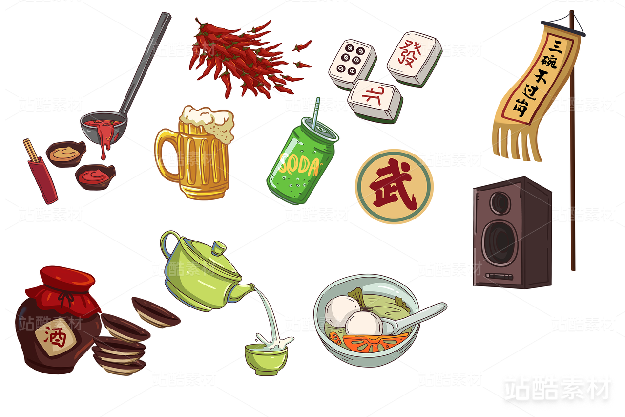
在这个餐饮品牌中主色调采用了最有传统文化底蕴的中国红,和杏黄的搭配就非常有文化底蕴太突显本帮“苏州菜”
其中辅助图形运用多用对联,牌匾的表现形式用一个“热气腾腾”表示品牌的蒸蒸日上一下子就与市面上其他品牌形成了明显的差异化
-
Project inspiration: In this catering brand, the main color adopts the most traditional cultural Chinese red, and the collocation of apricot yellow is very cultural heritage, highlighting the help of "Suzhou cuisine"
Among them, the auxiliary graphics use couplets, the form of the plaque with a "steaming" said the brand's thriving all of a sudden and other brands on the market formed obvious differentiation


3
举报
声明
1
分享
相关推荐


评论你的想法~
表情
喜欢TA的作品吗?喜欢就快来夸夸TA吧!
推荐素材


你可能喜欢


相关收藏夹


登录注册
3登录即可同步推荐记录哦
1登录即可加入我的收藏
评论登录即可评论想法
分享分享