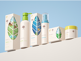
SAYHO — 品牌包装设计-磨砂膏
广州/平面设计师/3年前/6815浏览
版权
SAYHO — 品牌包装设计-磨砂膏
SAYHO
品牌包装设计-磨砂膏
.........
品牌定位:Z世代 、年轻、时尚、快消、潮玩
——
品牌名称“SAYHO”意为:哈喽!你好,嗨!为现代年轻人社交打招呼的一种亲切的方式。
从LOGO设计上以尾字母“O”做为创意点,设计成一种呆萌的脸蛋形象,亲切、可爱!
“O”字母单拎出来也成为品牌的IP视觉符号,即品牌的价值文化,IP符号具有很强的品牌传播性!能够有效的吸引消费者,
更好的让人记住品牌特征,带动消费,也是一种时尚潮流的好玩的品牌传播形式。
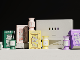
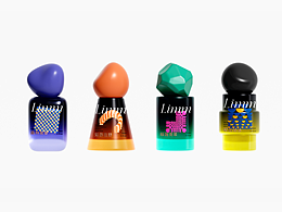
瓶型设计创意点来源于花盆,用环保再利用的理念去进行设计!
产品用完以后可以当花盆来使用,也可以当做收纳盒!
多种使用形式,环保、储物、摆件!美观漂亮!
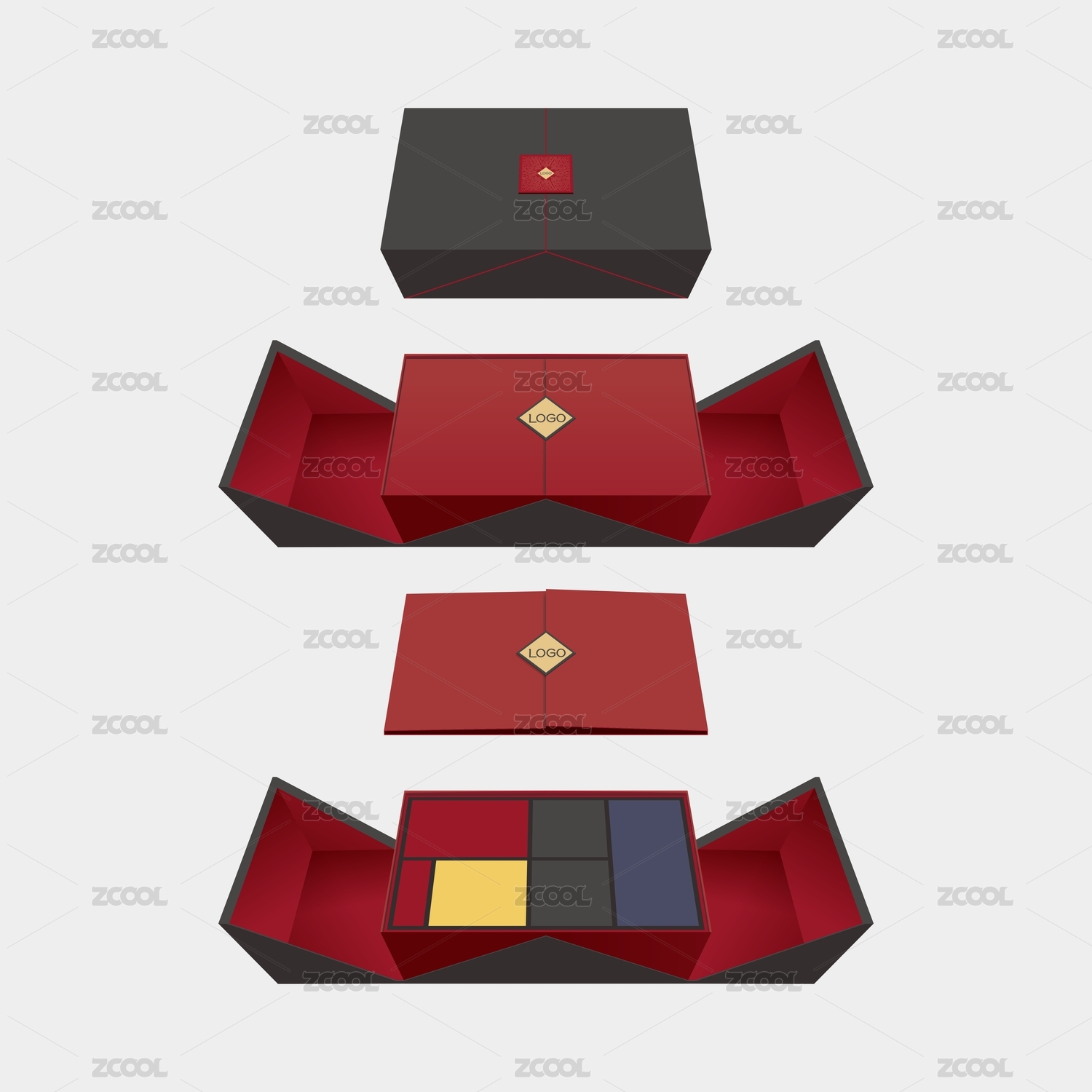
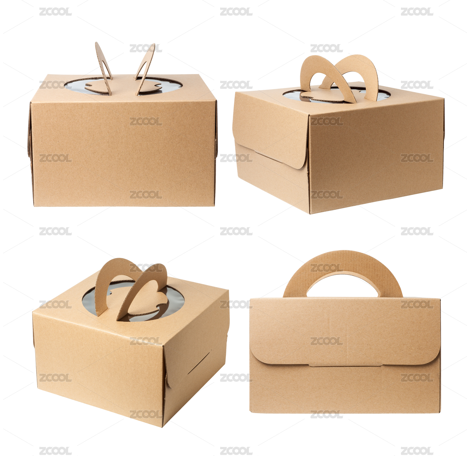
花盒区别常规的形式,采用信封造型的打开方式,仪式感满满!
嗨!你好,很高兴认识你!
The brand name "sayho" means: Hello! Hello, hi! It is a kind way to say hello to modern young people socially and draw in the distance from each other.From the logo design, the tail letter "O" is taken as the creative point, which is a lovely and cute face image, friendly and cute!The graphic list has also become the brand's IP visual symbol, that is, the brand's value culture. IP symbol has strong brand communication! Attract consumers,It is also a fashion and fun form of brand communication to better let people remember brand characteristics and stimulate consumption.
The creative point of bottle design comes from the flowerpot, which is designed with the concept of environmental protection and reuse!After the product is used up, it can be used as a flower pot or as a storage box!Multiple use forms, environmental protection, storage, decoration! Beautiful!
Hello. Nice to meet you.!
.....................
71
Report
声明
277
Share
相关推荐
in to comment
Add emoji
喜欢TA的作品吗?喜欢就快来夸夸TA吧!
You may like
相关收藏夹
Log in
71Log in and synchronize recommended records
99+Log in and add to My Favorites
评论Log in and comment your thoughts
分享Share


