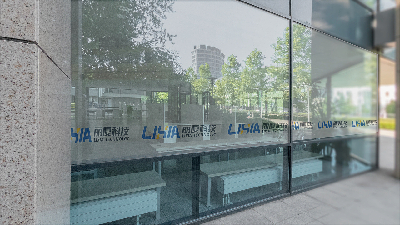
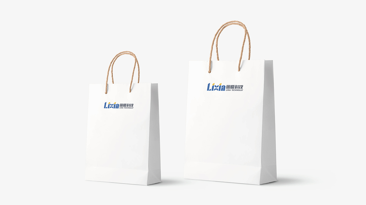
品牌设计-丽厦科技品牌标识视觉设计

厦门/平面设计师/3年前/214浏览
版权
品牌设计-丽厦科技品牌标识视觉设计
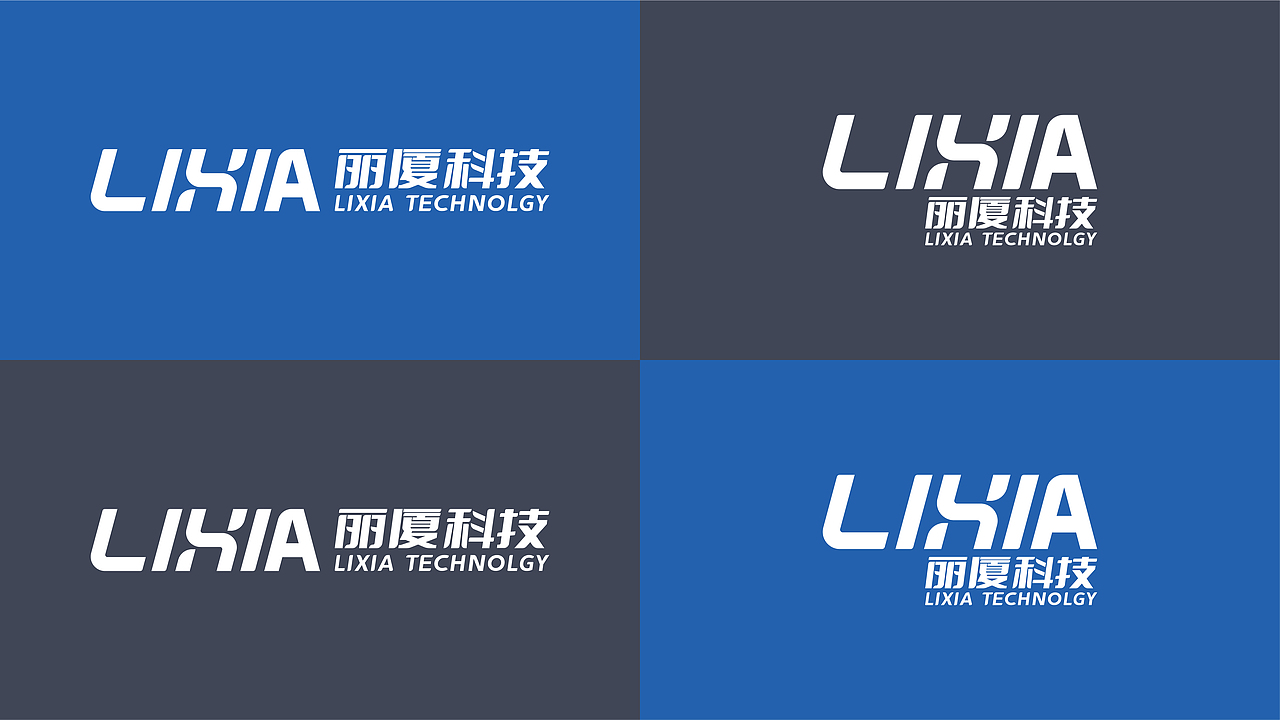
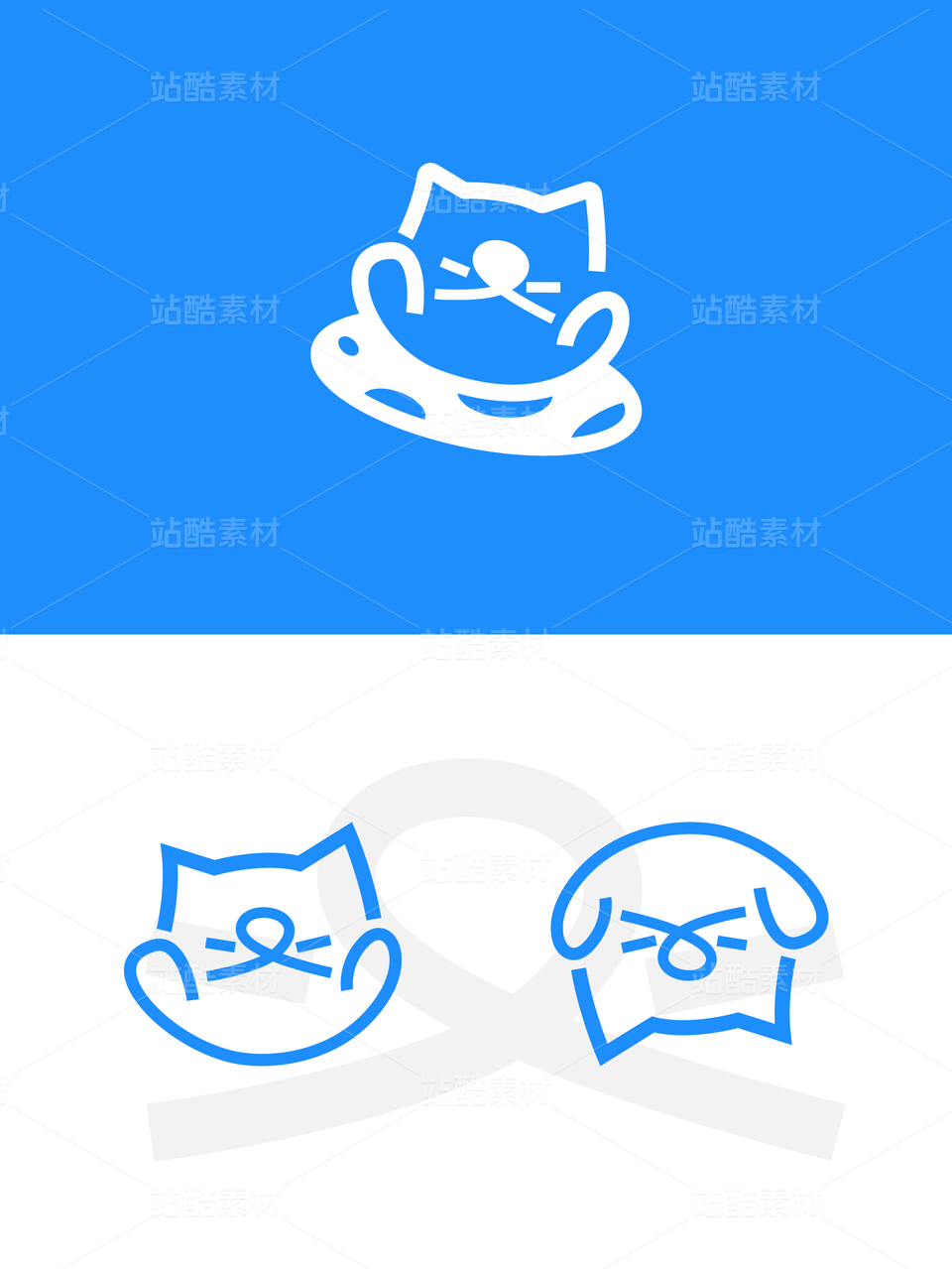
丽厦科技标识设计,在图形上把“lixia”与“链条”创意融合,造型简约凝练,图形符倾斜设计,使得标识有一种向前的意味,自带动感和速度感,是一种奔跑的姿态;体现了丽厦科技一种勇往直前、不断进取的信心和梦想。
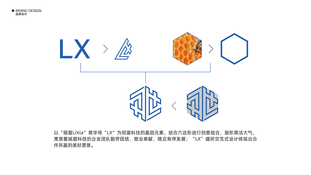
以拼音字母“LIXIA”为丽厦科技的基因元素,以“X”结合铁链元素进行创意组合,图形简洁大气,寓意着丽厦科技团队紧密协作、团结可靠,是客户可信赖稳合作伙伴;也寓意着公司致力充当链接优质商品与客户、链接现在与未来的纽带、桥梁,促进共赢、健康发展的企业愿景。
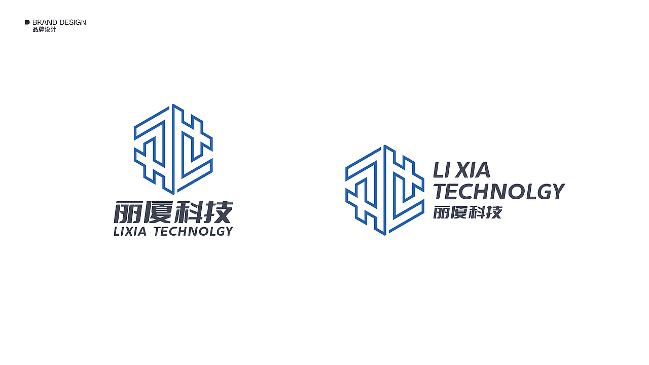
LOGO整体色调以蓝色调为主,更科技,更年轻,更有活力,充满冒险精神和前行的热情;搭配亮黄色,使得标识更为生动、充满活力、振奋人心。
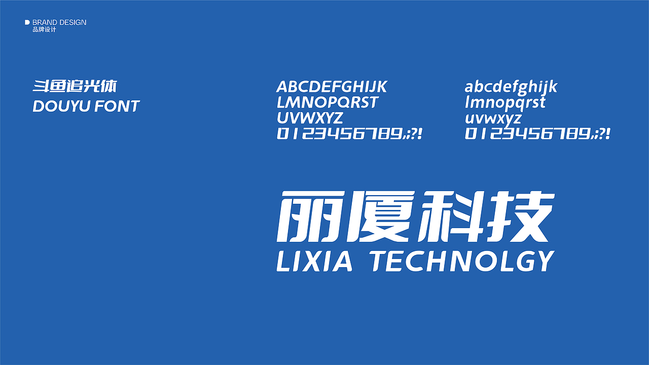
平面视觉设计|DANA Desgin Studio
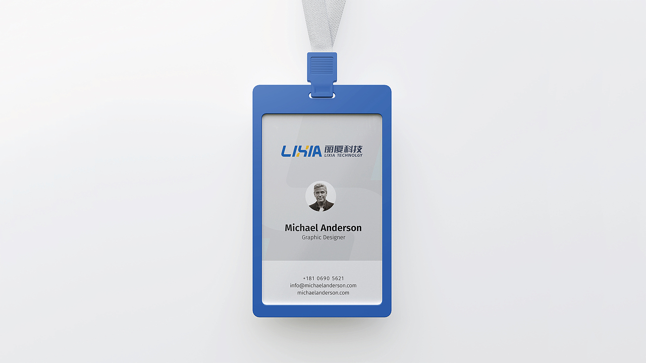
视觉效果呈现 |DANA Desgin Studio
The logo design of Lixia Technology is a creative fusion of "lixia" and "chain", with a simple and condensed shape. The inclined design of the graphic symbol makes the logo have a sense of forward movement, a sense of motion and speed, and a running posture; it embodies Tencent It embodies LIXIA Technology's confidence and dreams of moving forward and making continuous progress.
The pinyin letter "LIXIA" is the genetic element of LIXIA Technology, and the "X" combined with the iron chain element is a creative combination, the graphic is simple and atmospheric, implying that the team of LIXIA Technology works closely together, is united and reliable, and is a reliable partner of customers; it also implies that The company is committed to acting as a link and bridge between high-quality goods and customers, linking the present and the future, and promoting the win-win and healthy development of the corporate vision.
The overall color of the LOGO is mainly blue, more technological, more youthful, more energetic, full of adventure and enthusiasm for moving forward; with bright yellow, making the logo more vivid, energetic and inspiring.


2
Report
声明
7
Share
相关推荐


in to comment
Add emoji
喜欢TA的作品吗?喜欢就快来夸夸TA吧!
推荐素材


You may like


相关收藏夹


Log in
2Log in and synchronize recommended records
7Log in and add to My Favorites
评论Log in and comment your thoughts
分享Share