Doit studio |喜茶新品海报设计「案例」

上海/平面设计师/4年前/771浏览
版权
Doit studio |喜茶新品海报设计「案例」
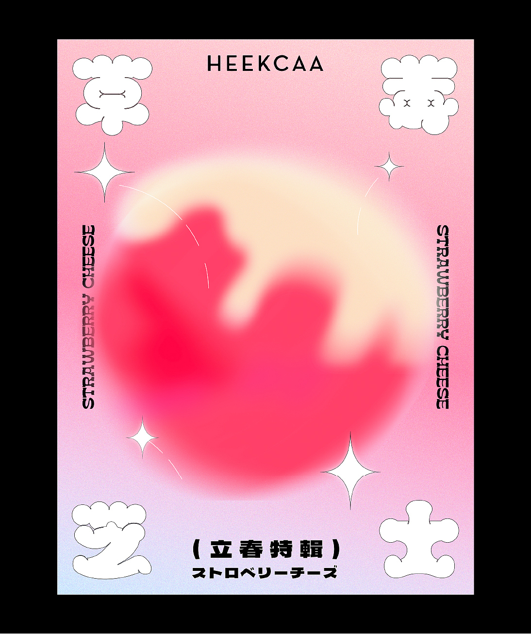
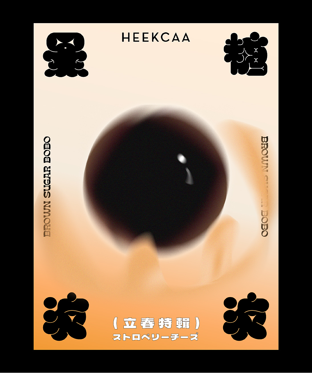
基于品牌现有的产品做了视觉设计,这是Doit尝试去做的一次训练。整体风格用了立体加可爱的字体设计,高饱和度的颜色作为主色调。在尝试立体与平面中找一些平衡点,把产品核心的特征加强并展露出来。打破当下商业化的海报视觉规则,创造新型快销品品牌设计理念;这是Doit一直以来想要做的事情。
如大家对此有更多的建议还是意见可以在私信告知我们,再次感谢大家!
Based on the brand's existing products, visual design is done, which is a training that Doit tries to do. The overall style uses a three-dimensional and cute font design, and high-saturation colors are used as the main color. In trying to find some balance between three-dimensional and flat, strengthen and reveal the core features of the product.




4
举报
声明
19
分享
相关推荐










评论你的想法~
表情
喜欢TA的作品吗?喜欢就快来夸夸TA吧!
推荐素材
你可能喜欢









相关收藏夹








登录注册
4登录即可同步推荐记录哦
19登录即可加入我的收藏
评论登录即可评论想法
分享分享