
北京/平面设计师/3年前/4616浏览
版权
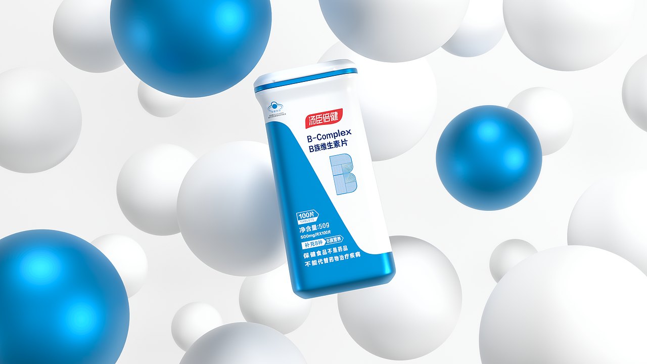
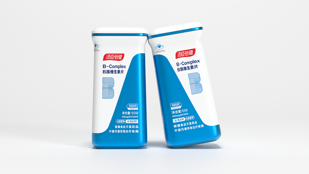
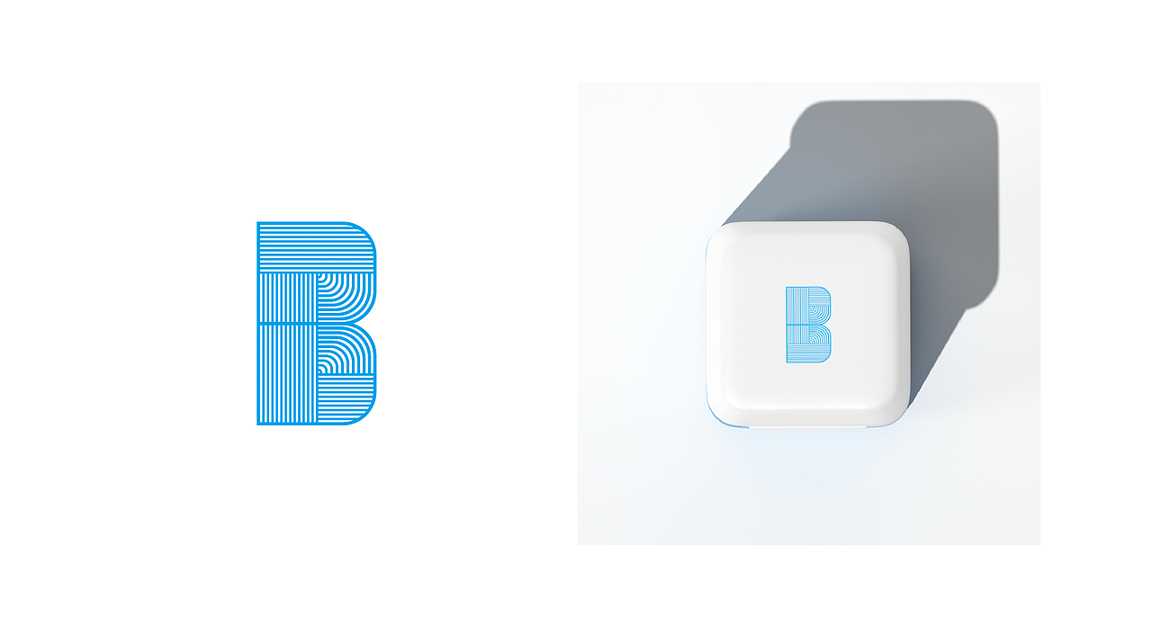
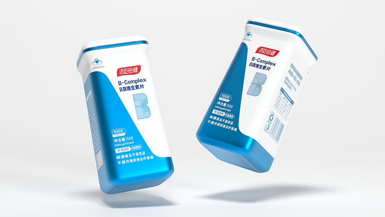
设计以提高产品辨识度和保留行业属性感为主旨,通过瓶型的宁方勿圆话和独特的瓶身形状来与竞品来开差异化和层次感,此外瓶身图案以大幅度斜切的分割线来打造产品本身的超级符号,进一步增加辨识度和差异化。产品正反双面放在一起刚好拼凑出高山的抽象形,寓意品牌勇攀高峰。货架陈列方面,正反两面拼凑成一组,组组图案相连,远看酷似一座座山峰,营造出一种极强的视觉冲击力,使人过目不忘。B族的家族符号为天蓝色,未来其他系列的产品以改变配色方案和B符号来区分sKu,45°斜切的超级符号和版式不变。
Design to improve product identification and retain the sense of industry attributes as the theme,Through the unique words of product modeling and competitive products to open differentiation and hierarchy ,In addition,The parting line of the bottle body is used as the memory symbol of the product , Further increase identification and differentiation ,The product front and back together just make up the abstract shape of the mountain,Meaning brand brave climb peak,In terms of shelf display, the positive and negative sides are in a group, and the pattern of the group is connected,From a distance, they look like mountains ,Create a strong visual impact,It makes a photographic memory ,The family symbol of group B is sky blue,In the future, other products will change the color scheme and B symbol to distinguish the sKu , The super symbol and layout of the 45° diagonal cut remain unchanged.


49
Report
声明
71
Share
相关推荐


in to comment
Add emoji
喜欢TA的作品吗?喜欢就快来夸夸TA吧!
推荐素材


You may like


相关收藏夹


Log in
49Log in and synchronize recommended records
71Log in and add to My Favorites
评论Log in and comment your thoughts
分享Share