看点高级的
拿点有用的
学点真干货
找点新财路
发布
登录
注册
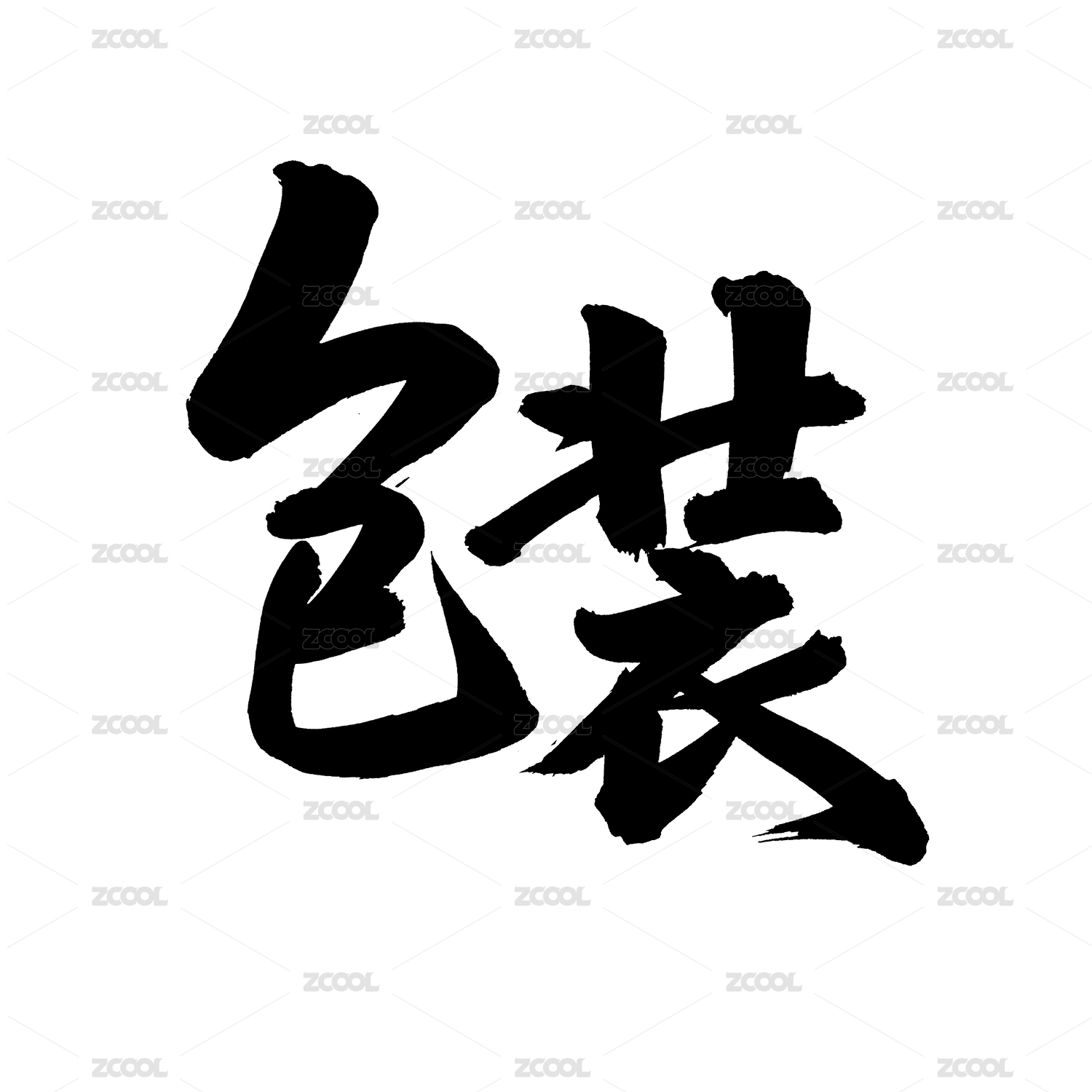
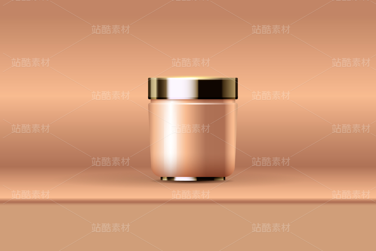
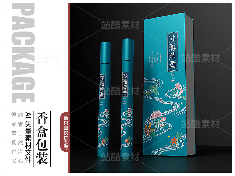
sophie's™护肤品LOGO及包装设计
菩示熊品牌设计
武汉
/
平面设计师
/
4年前
/
7832浏览
版权
私信
关注
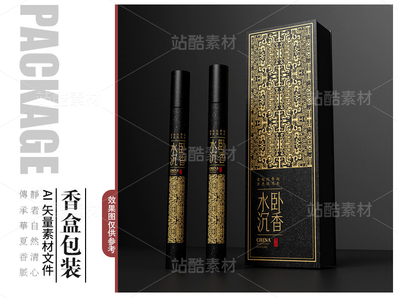
sophie's™护肤品LOGO及包装设计
菩示熊品牌设计
关注
sophie's™护肤品LOGO及包装设计
------
设计师 | FORMER
------
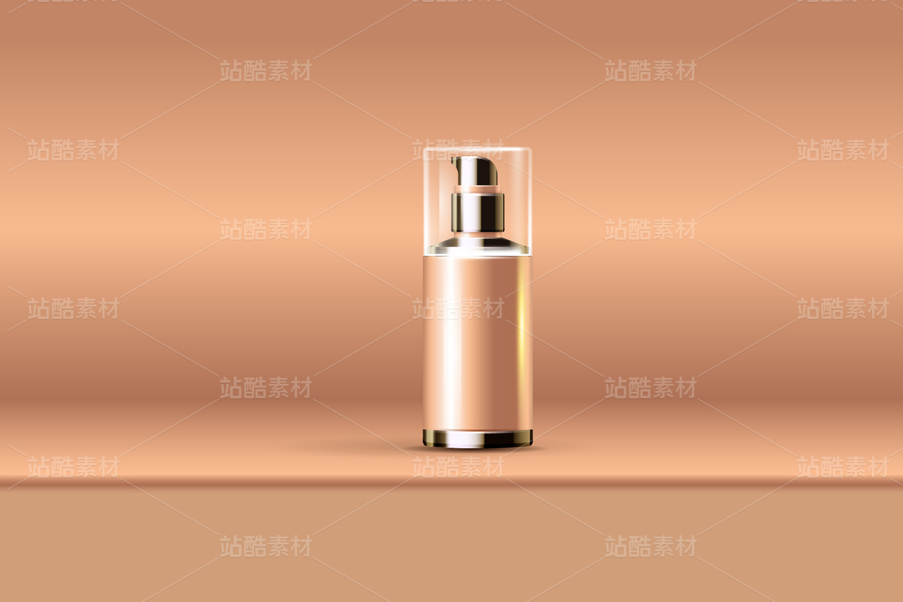
LOGO设计,将字母O以一大一小的圆形来呈现,似两个细胞,表示我们的产品深层锁住你的美。又似两滴水的交融状,表示用我们产品的女性水嫩娇美的肌肤。又似一个拥抱的姿态,表示拥抱美好的事物,也表示包容、内涵、博大。
收藏
收藏
收藏
收藏
收藏
收藏
收藏
收藏
收藏
收藏
收藏
收藏
收藏
收藏
收藏
收藏
收藏
收藏
收藏
收藏
收藏
收藏
收藏
收藏
收藏
收藏
收藏
收藏
收藏
收藏
25
举报
|
声明
138
分享
原创作品
平面
包装
护肤品
LOGO
美妆
相关推荐
换一换
烂番茄(Rotten Tomatoes)餐饮品牌视觉设计
24
菩示熊品牌设计
请回答1988字体设计
244
菩示熊品牌设计
2025年第一季度作品集整理好啦
401
菩示熊品牌设计
我要设计1000个商标 | 2024年第4季度原设计合集
1018
菩示熊品牌设计
2024年12月下旬字体logo设计作品集
477
菩示熊品牌设计
关注
日化
82
鑫鑫家的常遇春
新作 | 鮨曛日式清酒包装设计
730
菩示熊品牌设计
BINFOLD 液体肥料营养液包装设计
2608
菩示熊品牌设计
ROLANYIN-乳酸精华液包装设计
972
菩示熊品牌设计
会员精选
最近的字体 and 最近的生活
870
刘兵克
推广
2024年10月上旬字体logo设计作品集
11
菩示熊品牌设计
评论
登录
评论你的想法~
表情
发布评论
喜欢TA的作品吗?喜欢就快来夸夸TA吧!
推荐素材
你可能喜欢
换一换
爪财进宝
278
didaso
HLvitails-香港大健康品牌设计
118
北岸佬JN
AIGC一一提示词权重到底怎么用?
511
AICG的小卡拉米
电小卫/电车好装备就选电小卫,品牌设计,包装设计
191
万有引力品牌设计
涂涂的ONLINE时刻
445
JIAJIAN_STUDIO
Branding | U.GUO 零食品牌包装设计
184
OnedayDesign
相关收藏夹
换一换
关注
日化
82
鑫鑫家的常遇春
关注
包装
37
山那边的朋友
关注
包装
34
氧气与盐
关注
美妆护肤品牌包装logo设计
21
张鱼小丸仔
关注
2022
16
xunyier
关注
包装
15
老爷的泡面
大家都在看
查看更多
IP 形象
国庆
LOGO 设计
海报设计
插画设计
壁纸图片
作品集
VI 设计
UI 设计规范
AI 绘画
表情包
PPT模板
#护肤品
护肤品【
护肤品】
护肤品,
护肤品、
护肤品
护肤品‘
护肤品
护肤品【】
化妆品、护肤品
化妆品护肤品
化妆品 护肤品
a设计
AS设计
by设计
设计in
in设计
it设计
、设计
设计.
设计】
设计
设计、
设计
#设计#
🤮设计
设计‘’
is设计
设计‘
设计
设计。
#设计
if设计
设计,
设计
@设计
an设计
设计 、
登录注册
25
登录即可同步推荐记录哦
99+
登录即可加入我的收藏
评论
登录即可评论想法
分享
分享