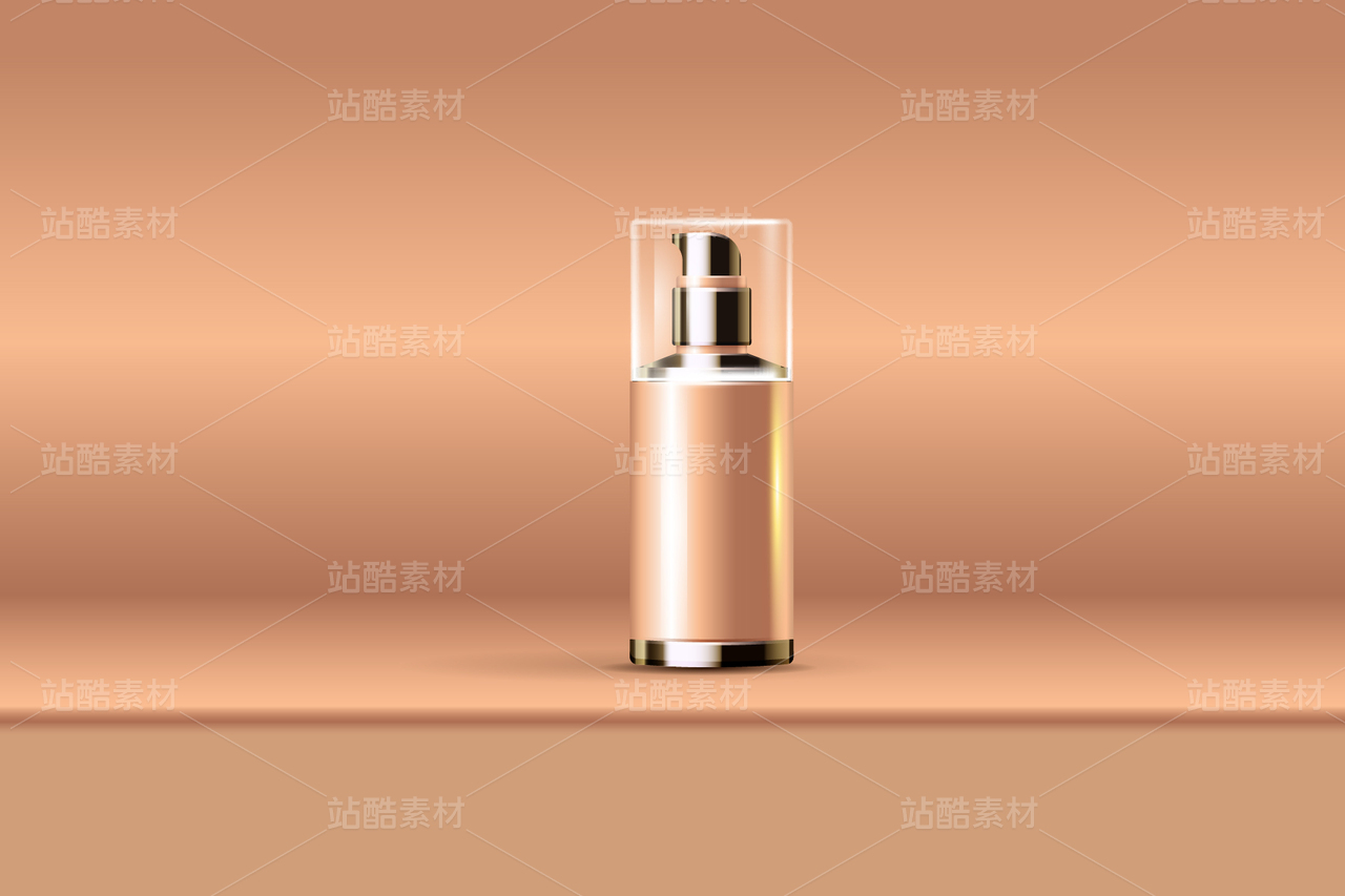
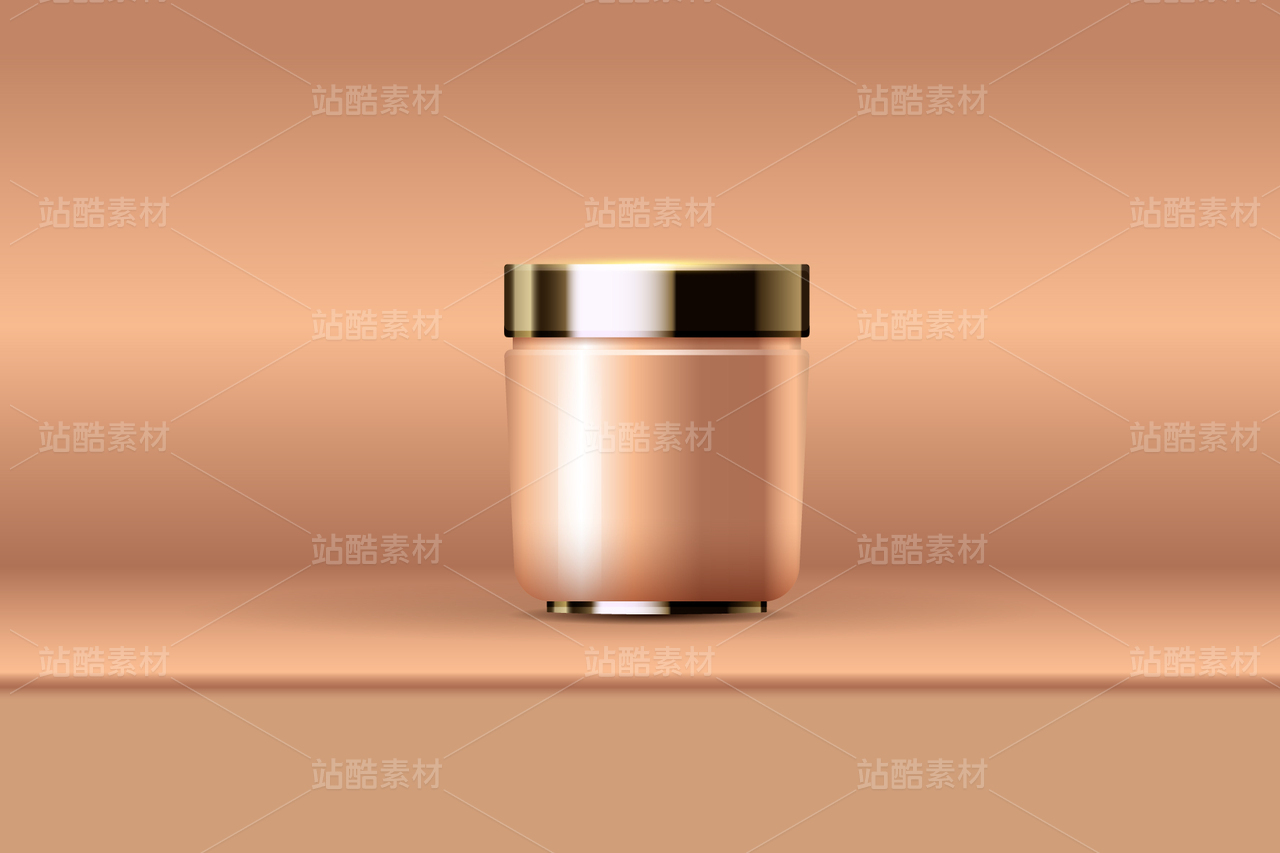
PETITJEAN丨头皮磨砂膏丨包装设计

广州/艺术工作者/4年前/3113浏览
版权
PETITJEAN丨头皮磨砂膏丨包装设计
原创/执行设计师:高志坚 Gaomc
——
品牌:PETITJEAN
设计成果:包装设计
所在地:中国 广州
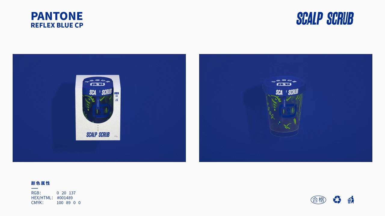
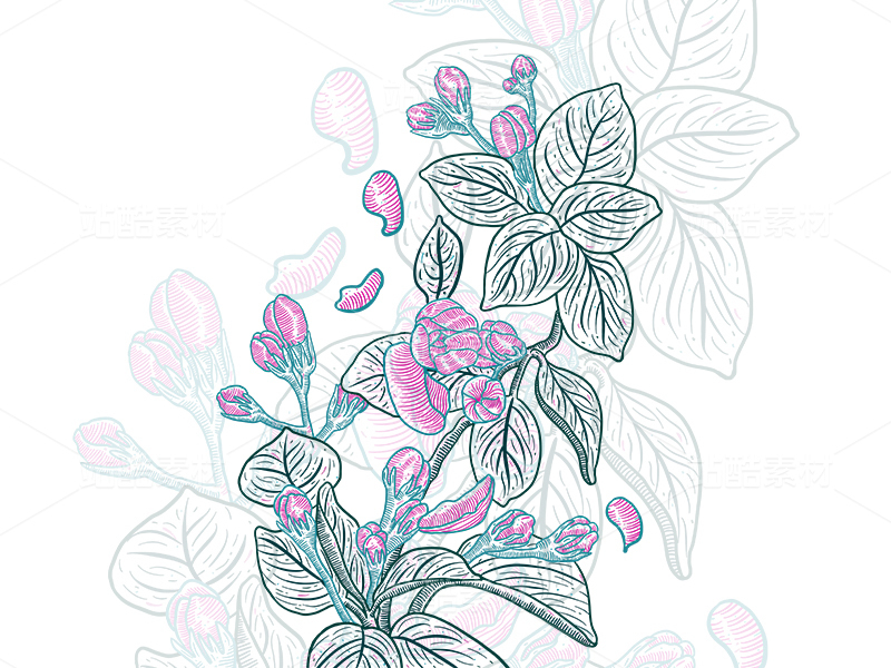
设计原理:使用了蓝白色为主色调,绿色为辅助色,对于瓶子的设计极其重视,所以整体视觉在于瓶子,外包就采用了镂空结构,让顾客直接看到瓶子的设计。由于它是一款头皮磨砂膏,所以瓶子的抽象涂鸦图案都与头发有关,例如梳子、吹风筒、SPA、植物、泡泡、修护、滋养、由卷到直等图案。
Design principle: Blue and white are used as the main color and green is the auxiliary color. The bottle design is extremely important, so the overall vision lies in the bottle. The outsourcing adopts a hollow structure to allow customers to directly see the bottle design. Since it is a scalp scrub, the abstract graffiti patterns of the bottle are all related to hair, such as combs, hair dryers, SPA, plants, bubbles, repair, nourishment, and curl to straight patterns.


36
举报
声明
104
分享
相关推荐


评论你的想法~
表情
喜欢TA的作品吗?喜欢就快来夸夸TA吧!
推荐素材


你可能喜欢


相关收藏夹


登录注册
36登录即可同步推荐记录哦
99+登录即可加入我的收藏
评论登录即可评论想法
分享分享