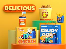
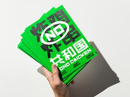
MR.JACK美式炸鸡汉堡品牌全案设计


杭州/艺术工作者/4年前/147504浏览
版权
MR.JACK美式炸鸡汉堡品牌全案设计
项目丨PROJECT
MR.JACK/2021.08
服务丨SERVICE
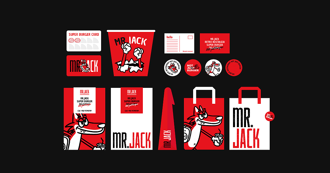
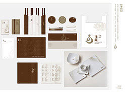
品牌定位/品牌视觉/产品包装
团队丨想象之外
主案设计/刘冬麟
插画设计/冯嘉韵、陈未绪
C4D渲染/宇航员、小奋青
文案策划/零零苏
动效设计/也无
项目背景
-
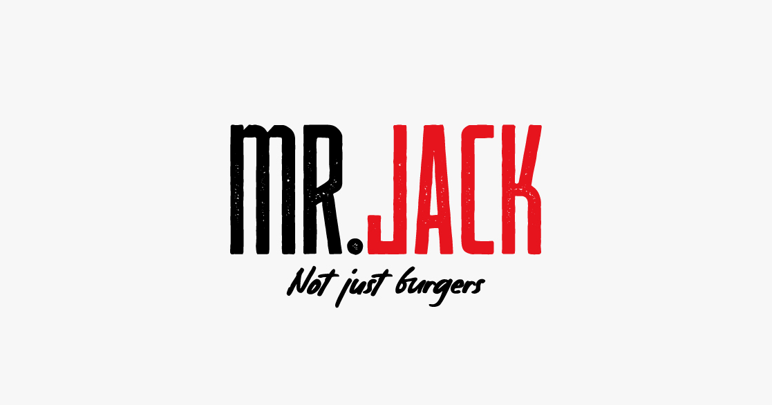
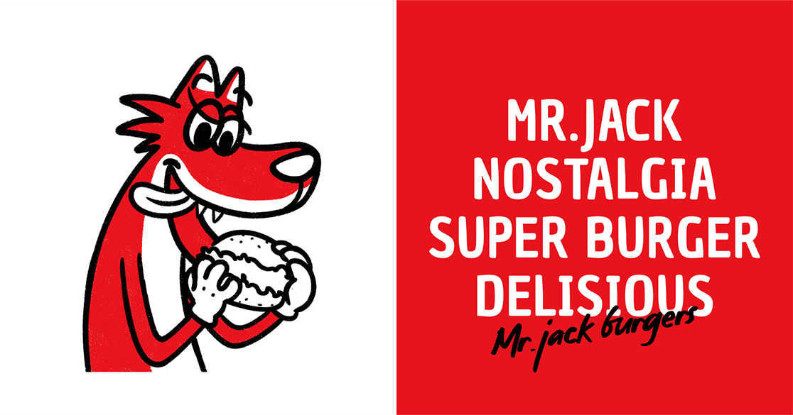
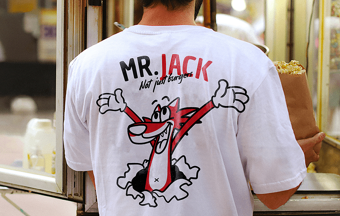
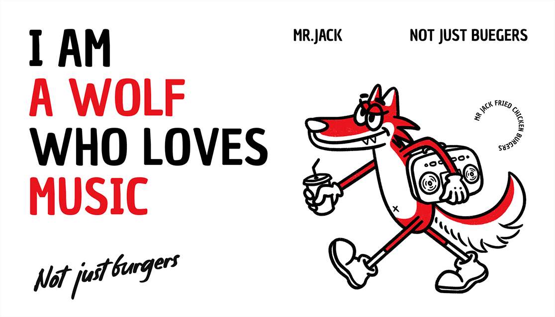
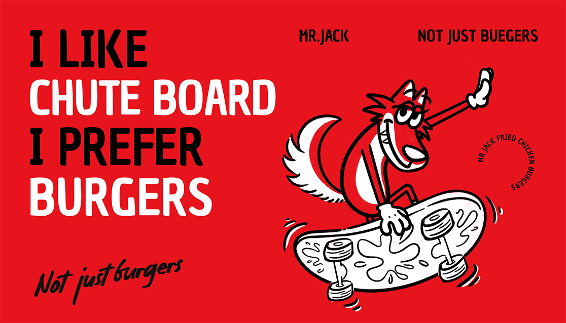
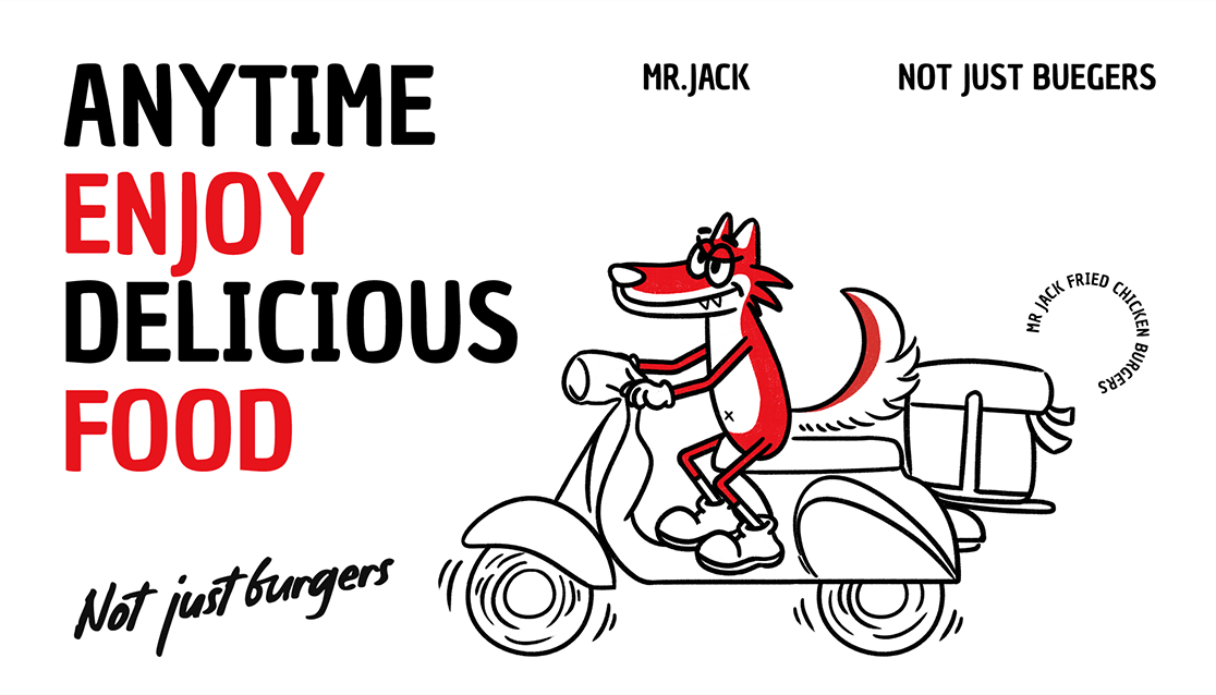
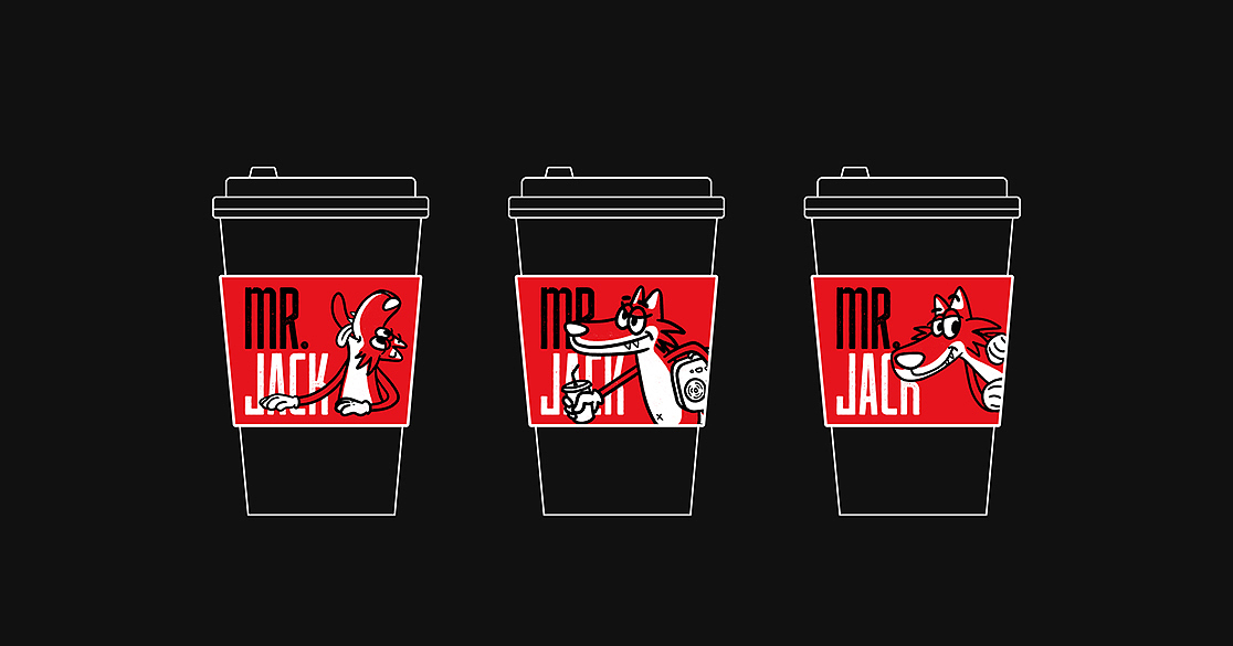
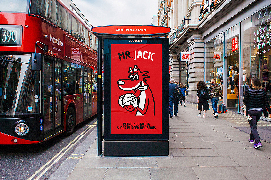
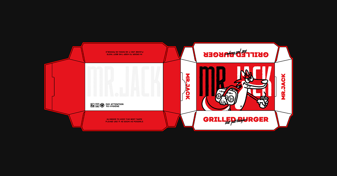
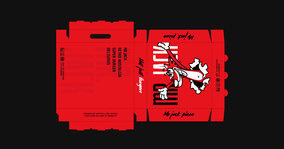
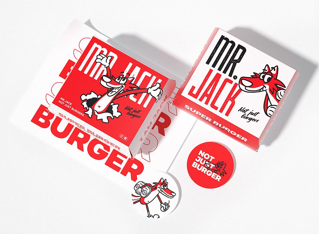
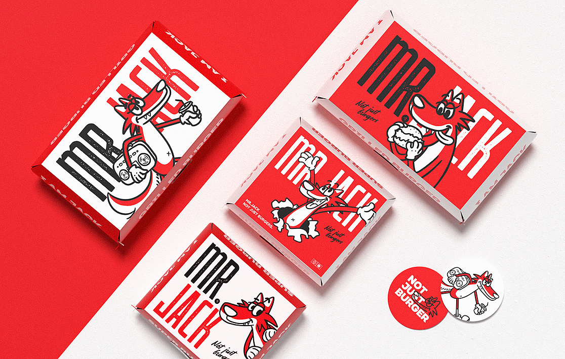
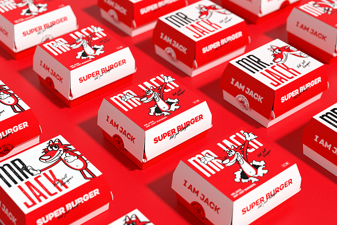
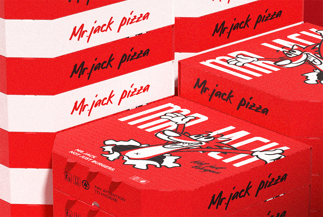
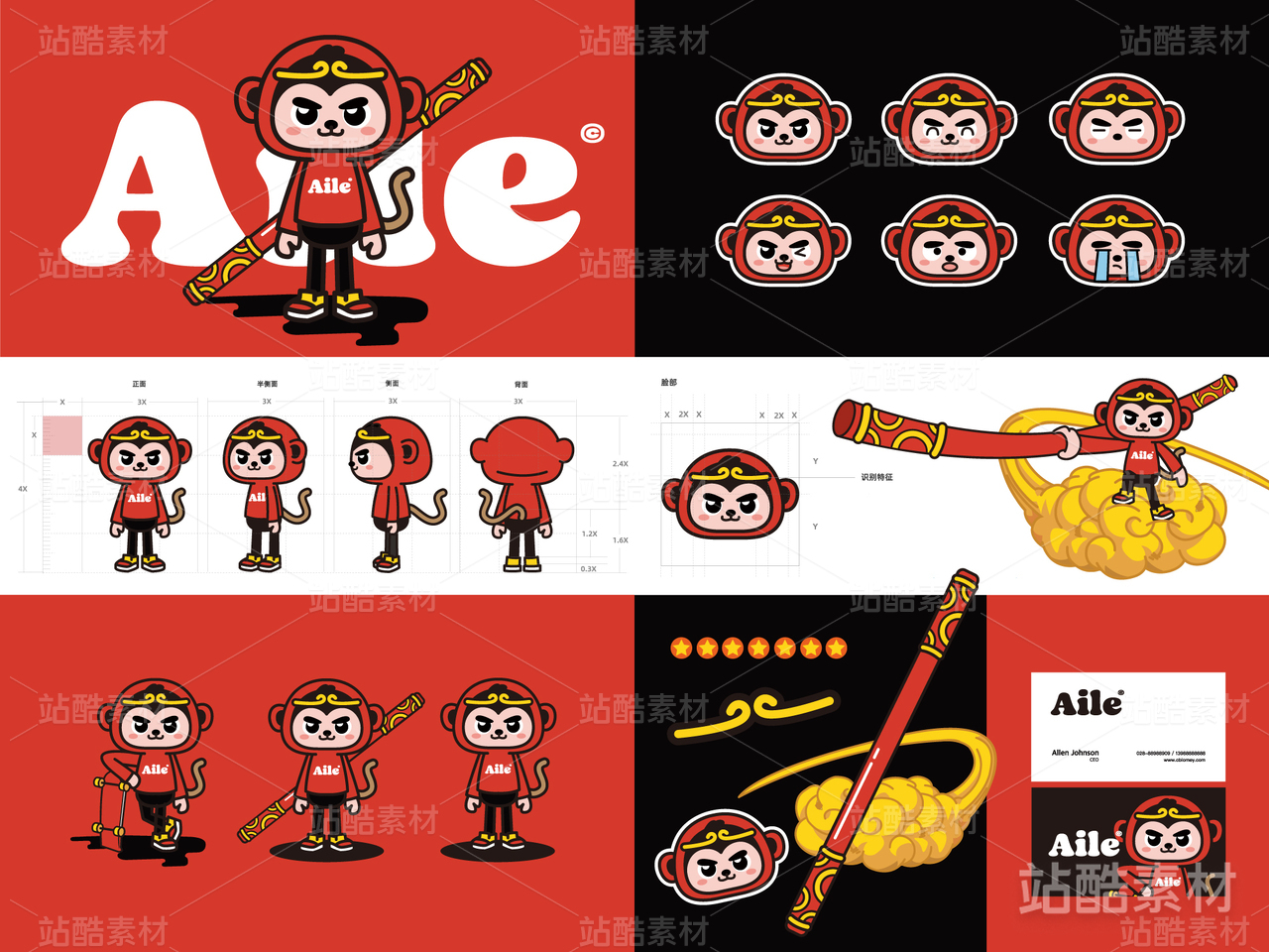
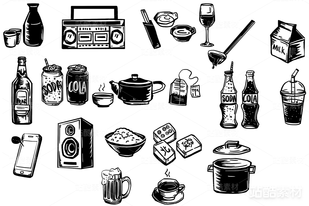
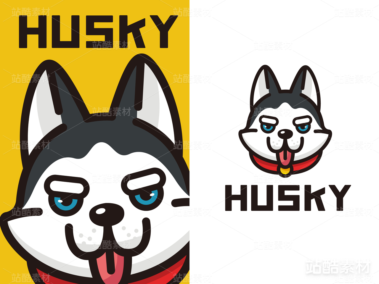
Mr. JACK 一个主打美式趣味风格的快餐品牌,坐落于洛杉矶。
JACK是一头性格幽默调皮,热爱运动与音乐,拥有无尽好奇心又勇于挑战的狼。主理人倡导自由随性、不拘泥于传统标签印象,所以餐厅以JACK为品牌形象,并以它的名字命名了这家美式快餐店。
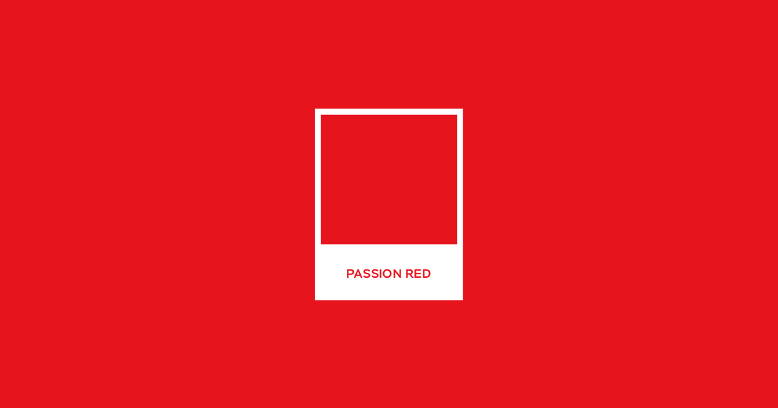
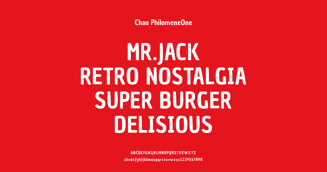
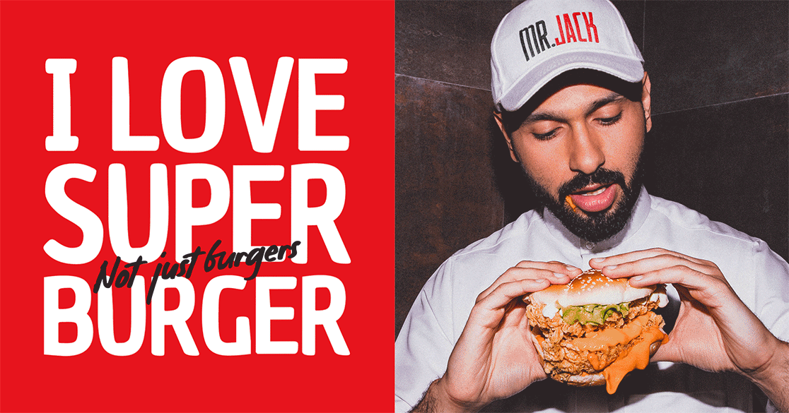
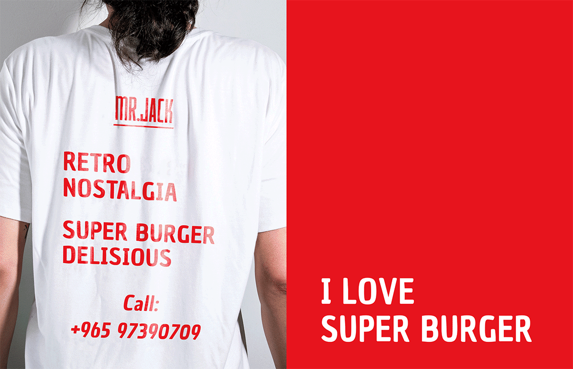
品牌视觉上采用热情红,刺激食欲的同时,也给人带来热情欢快的感觉,令饥饿的顾客可以快速的被吸引。热情红也象征着JACK的整体性格,其蠢萌的形象可以拉近品牌与消费者之间的距离,提高品牌在消费者中的好感度。品牌搭配鲜明简约的英文,具有独特的视觉冲击力。
Mr. Jack is a fast food brand focusing on American interesting style, located in Los Angeles.
Jack is a funny and naughty wolf who loves sports and music, has endless curiosity and has the courage to challenge. The manager advocates freedom and freedom, not stick to the traditional label impression, so the restaurant takes Jack as the brand image and named this American fast food restaurant after it.
The brand adopts warm red visually, which not only stimulates appetite, but also brings people a warm and cheerful feeling, so that hungry customers can be quickly attracted. Warm red also symbolizes Jack's overall character. Its stupid and cute image can shorten the distance between the brand and consumers and improve the popularity of the brand among consumers. The brand is matched with bright and simple English, which has a unique visual impact.
* 作品仅发布于站酷


1609
举报
声明
3340
分享
相关推荐


评论你的想法~
表情
喜欢TA的作品吗?喜欢就快来夸夸TA吧!
推荐素材


你可能喜欢


相关收藏夹


登录注册
99+登录即可同步推荐记录哦
99+登录即可加入我的收藏
评论登录即可评论想法
分享分享