讯飞智能家居

北京/UI设计师/4年前/850浏览
版权
讯飞智能家居
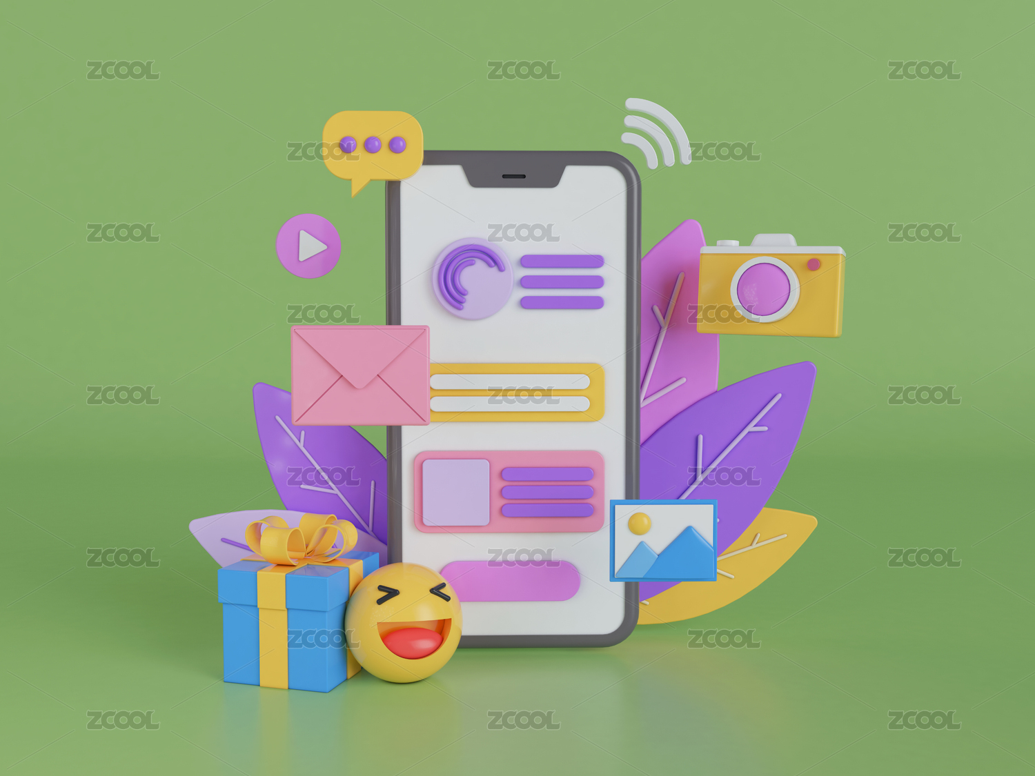
◆第一次参加设计赛事,也是第一次设计该类产品。将移动端的设计思路套用过来,也并不是无从下手。结合应用场景及设计原型,最后设计思路也比较清晰,以简洁大气为基调开展设计。
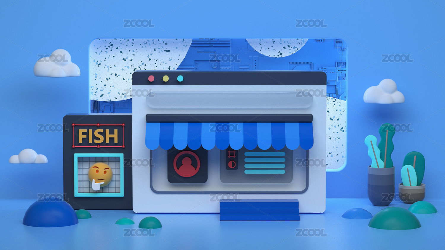
◆图标以线性图标设计,保持风格统一及信息传达清晰。界面中不过多的增加冗余元素,通过颜色对比将冷热及功能特性凸显。
◆个中细节仍有不足,也欢迎各位提出指导建议~
◆ participated in the design competition for the first time and designed such products for the first time. It is not impossible to apply the design idea of the mobile terminal. Combined with the application scenario and design prototype, the final design idea is also relatively clear, and the design is carried out based on the simple atmosphere.
◆ the icons are designed with linear icons to maintain a unified style and clear information transmission. Redundant elements are not added in the interface, and the cold, hot and functional characteristics are highlighted through color comparison.
◆ there are still some deficiencies in the details. You are also welcome to put forward guidance suggestions~


3
举报
声明
12
分享
相关推荐


评论你的想法~
表情
喜欢TA的作品吗?喜欢就快来夸夸TA吧!
推荐素材


你可能喜欢


相关收藏夹


登录注册
3登录即可同步推荐记录哦
12登录即可加入我的收藏
评论登录即可评论想法
分享分享