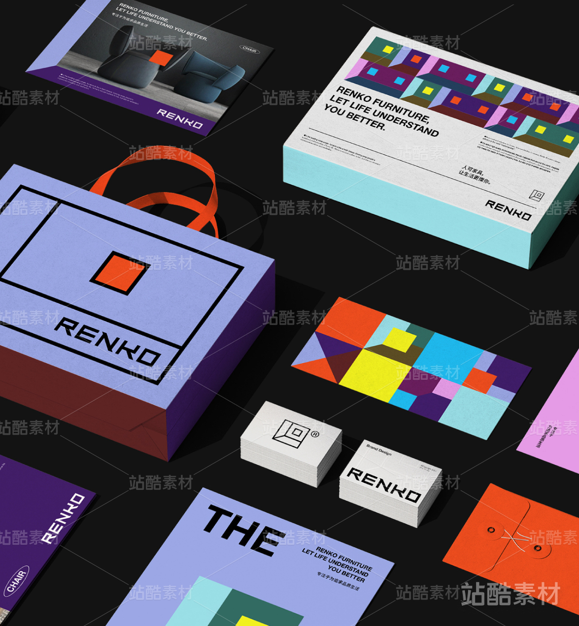
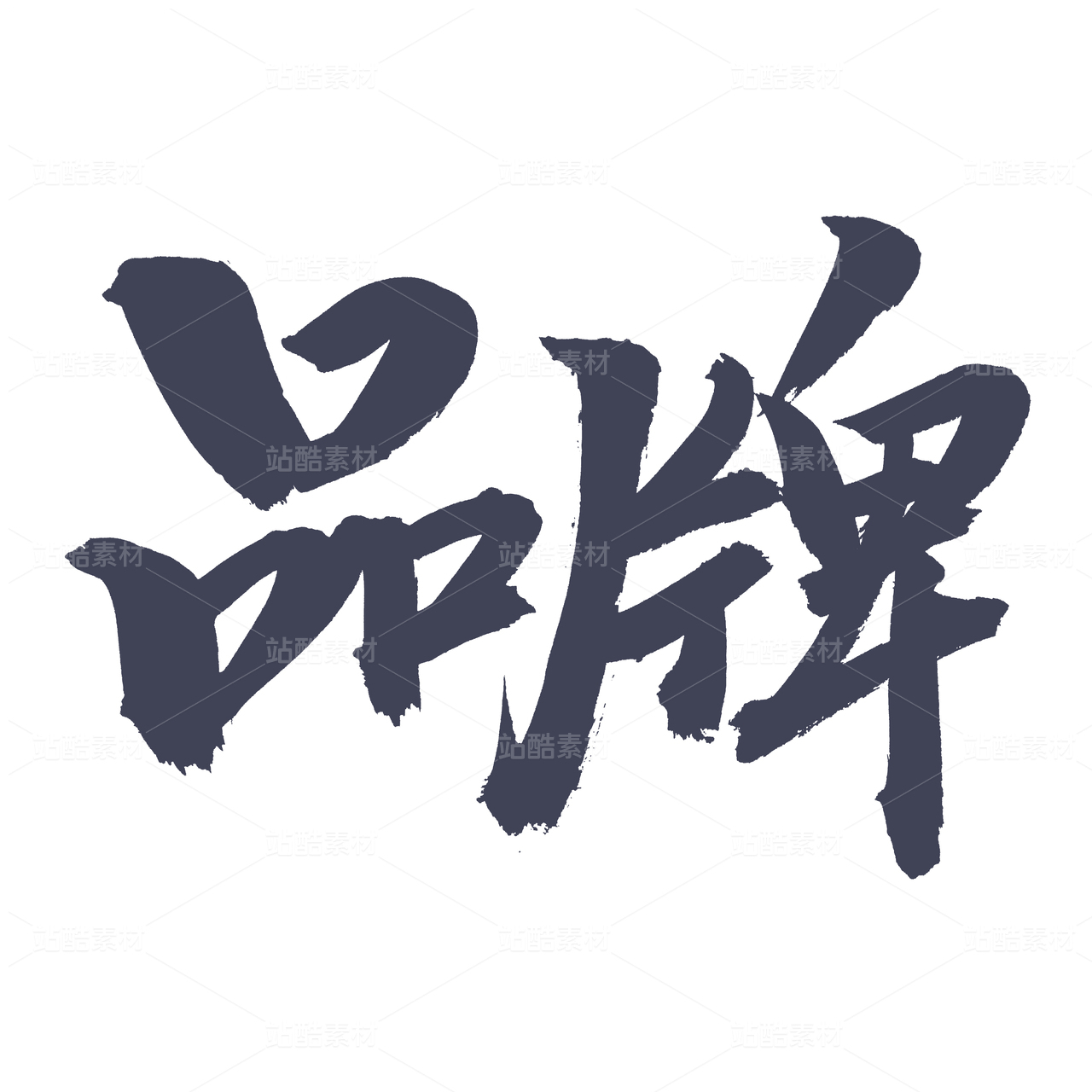
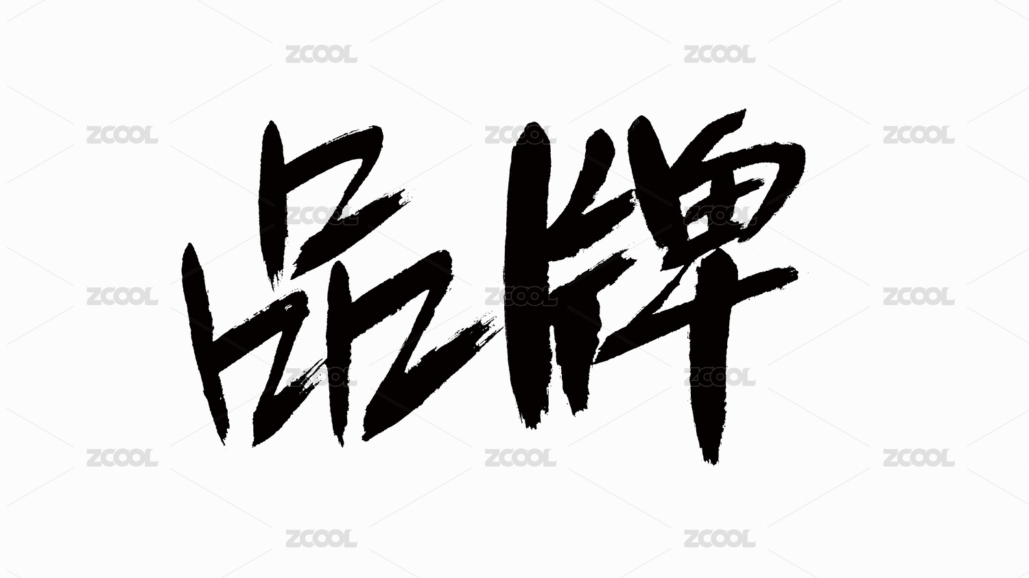
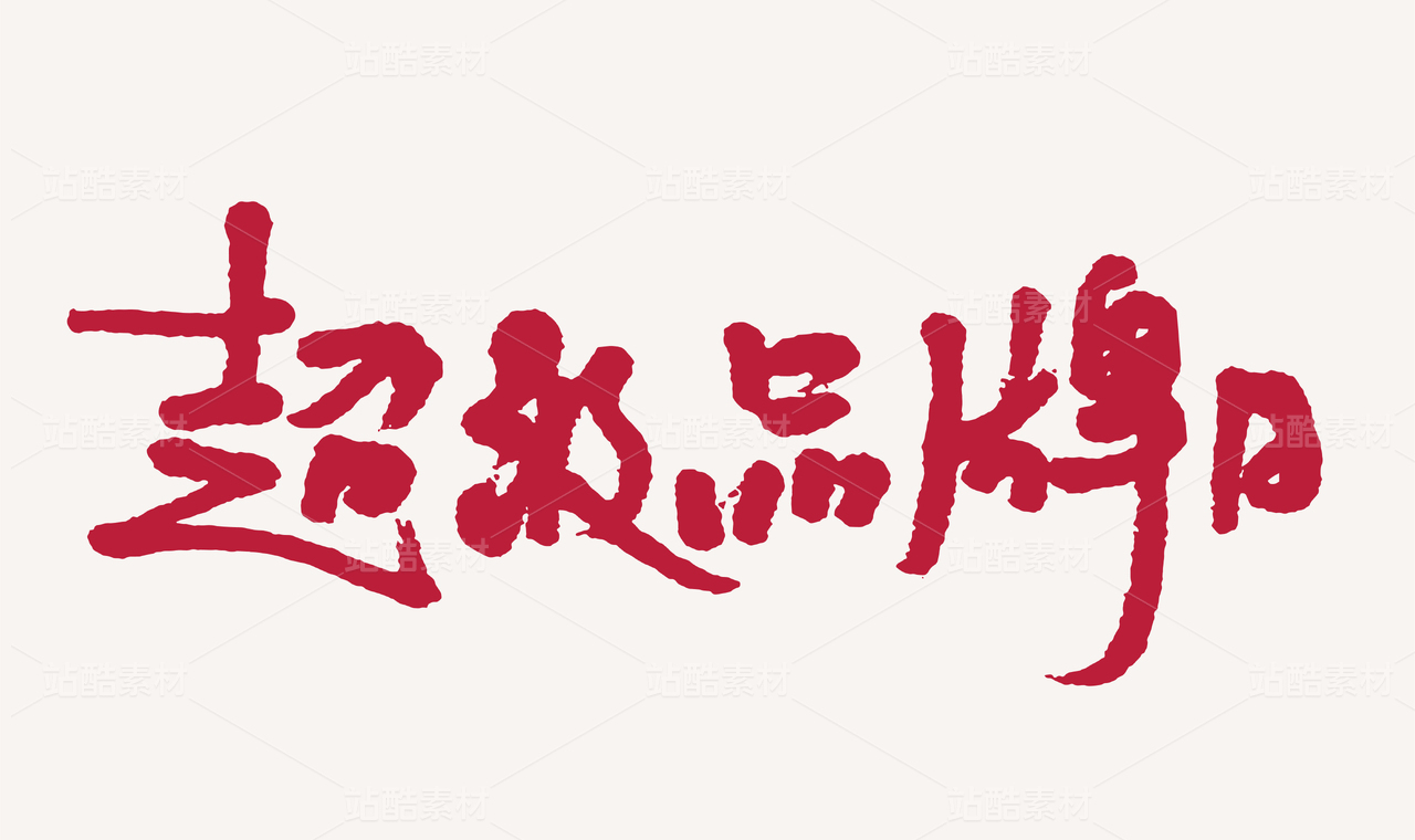
BRAND NEW MIU3.0品牌视觉形象升级

上海/设计爱好者/4年前/3342浏览
版权
BRAND NEW MIU3.0品牌视觉形象升级
本次MIU CLUB NANJING品牌视觉形象3.0升级
以热爱为出发点,尝试用设计的方式将听觉与视觉相结合
以朝圣文化为创意原点,运用图形语言
融合中寻求变化,秩序中大胆革新
简单的拱状圆弧象征着不同思想、故事和声音的交集与碰撞
演绎多元化与个性化,使丰富的品牌内涵得以表达
MIU CLUB NANJING brand visual image 3.0 upgrade.
With passion as the starting point, I try to combine hearing and vision in the way of design.
With pilgrim culture as the origin of creativity, graphic language is used.
Seek change in integration, bold innovation in order.
The simple arcs represent the intersection and collision of different ideas, stories and sounds.
Deduce diversification and individuation, make rich brand connotation can express
为真谛,为信仰,为虔诚,一路走来,不论快慢,终将抵达
既是对信仰的追逐,也是对朝圣者虔诚的回音
For truth, for faith, for piety, all the way, no matter how fast or slow, will eventually arrive.
It is both a pursuit of faith and an echo of the pilgrim's piety.


55
创作信息
举报
声明
175
分享
相关推荐


评论你的想法~
表情
喜欢TA的作品吗?喜欢就快来夸夸TA吧!
推荐素材


你可能喜欢


相关收藏夹


登录注册
55登录即可同步推荐记录哦
99+登录即可加入我的收藏
评论登录即可评论想法
分享分享