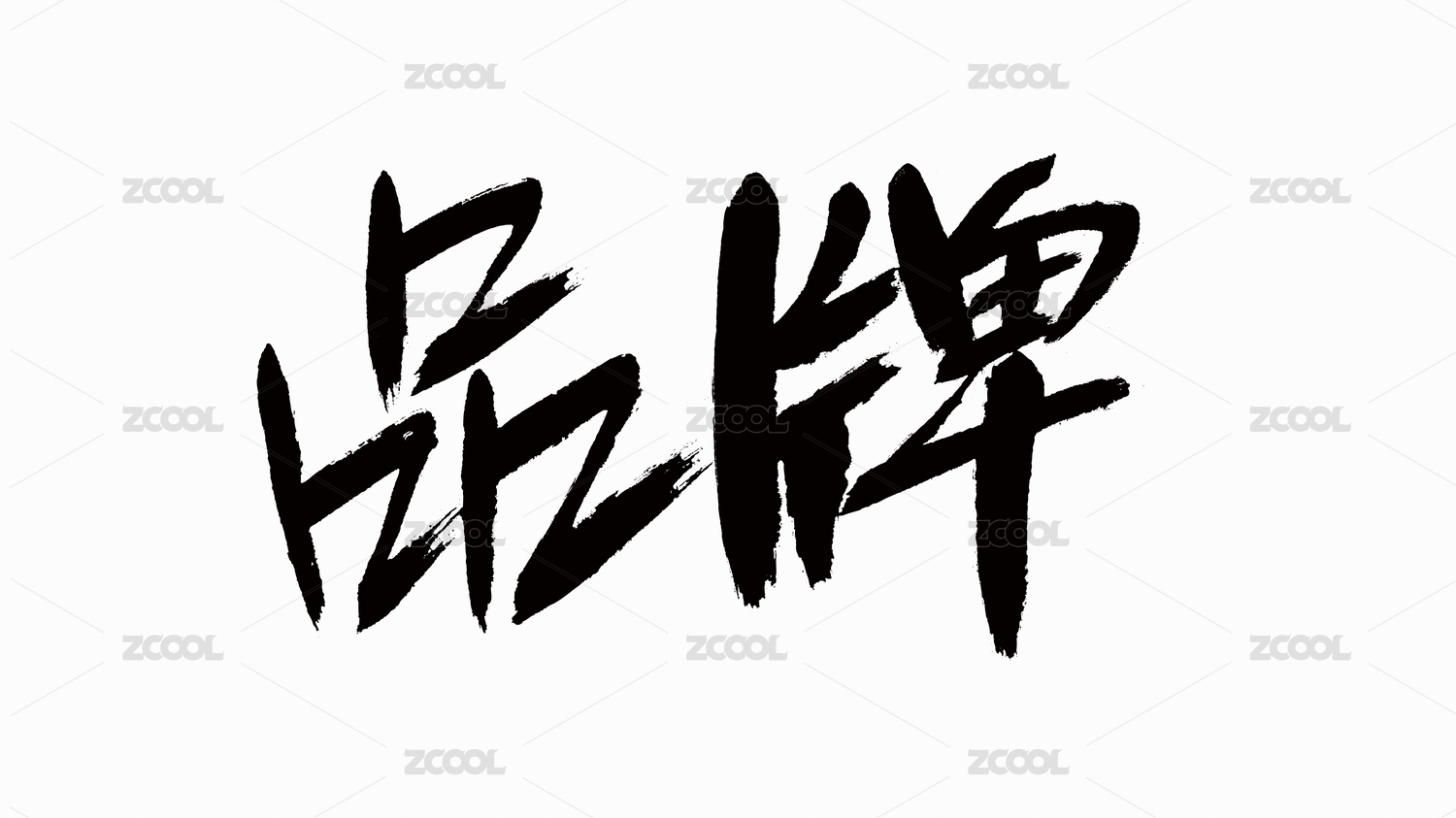
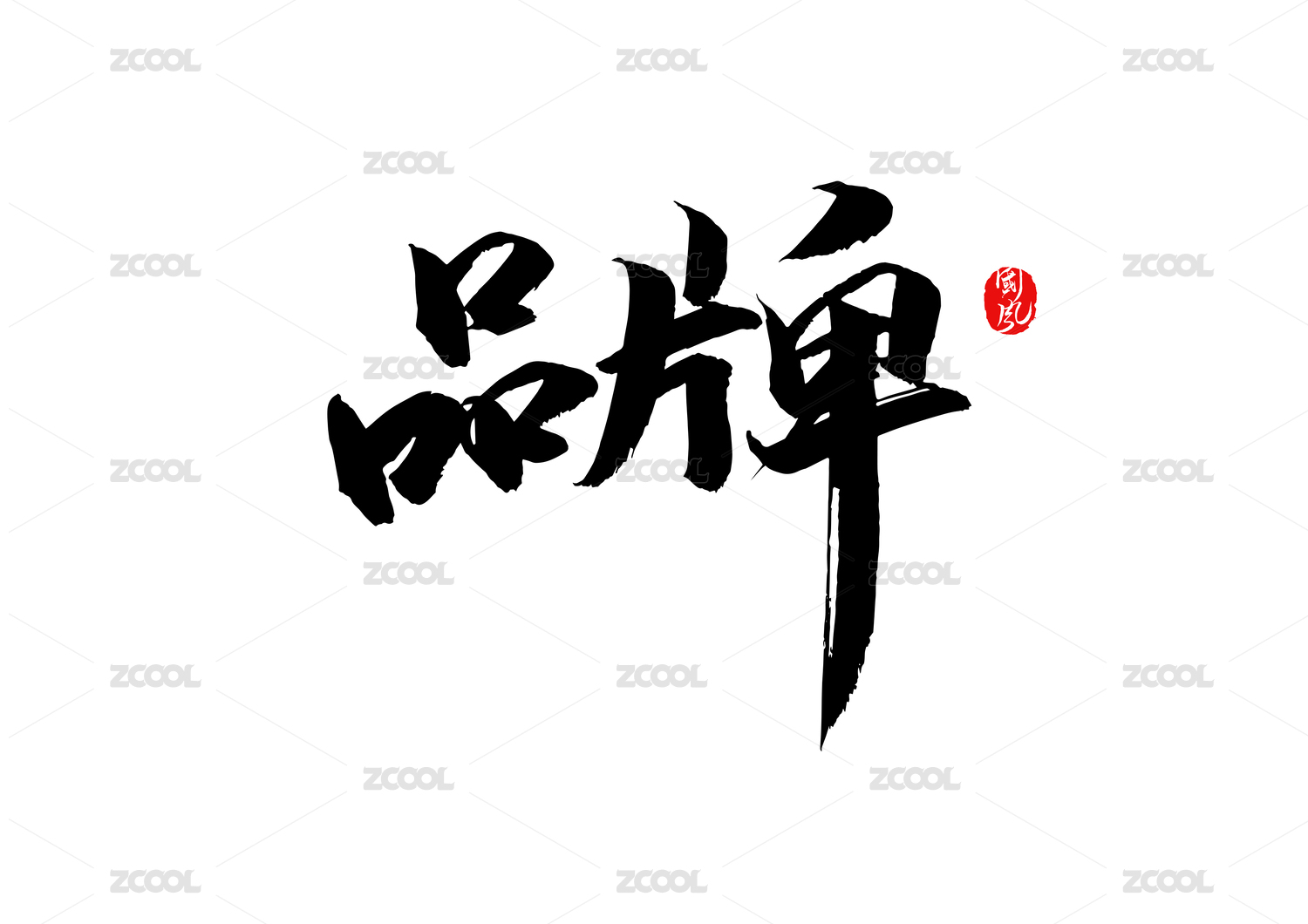
鹤下芙蓉餐饮品牌视觉设计

成都/艺术工作者/5年前/1519浏览
版权
鹤下芙蓉餐饮品牌视觉设计
鹤下芙蓉餐饮品牌视觉设计
作品名称:鹤下芙蓉餐饮品牌视觉设计
设计公司:RICHSTUDIO
原创设计师:插画师慧琼sky
工艺设计:sky
插画设计:慧琼
鹤下芙蓉,是天津的张总和李总去年委托我们设计的餐饮项目。天津烤鱼品牌,如何突出重围?烤鱼品类一片红海,我们如何引爆?只能从新的角度去诠释天津烤鱼,视觉突围。天津黄鹤楼最为知名,我们便想象了鹤与鱼的爱情。鹤是谦谦君子,鱼儿是美人。他们偶然在芙蓉花盛开的时节在黄鹤楼下相遇,便展开了一段缠绵悱恻感人至深的爱情故事。品牌核心就是烤鱼与爱情,都要整整齐齐。我们以新中式的风格,鹤与鱼爱的寓意相结合。引领90后00后消费的餐饮连锁品牌,新中式的国潮觉醒。文化复兴,国潮觉醒。与时俱进,新技术,新工艺。新工具,老情怀。用国潮的手法,这两年流行的插画艺术绘画方式,绘制了浪漫唯美的场景,给烤鱼品牌注入浪漫潮文化,使年轻消费者在品尝美味佳肴的同时,也能了解鹤下芙蓉独一无二的品牌文化。
Lotus under the crane is a catering project commissioned by Mr. Zhang and Mr. Li of Tianjin last year. Tianjin roast fish brand, how to highlight the siege? Grilled fish is a red sea, how can we detonate it? Only from a new perspective to interpret Tianjin roast fish, visual breakthrough. Tianjin Yellow Crane Tower is the most famous, so we all imagine the love between crane and fish. Crane is a modest gentleman, fish is a beauty. By chance, they met at the Yellow Crane downstairs when the hibiscus flowers were in full bloom, and they started a touching love story. The core of the brand is roast fish and love, which should be neat. We use the new Chinese style to combine the meaning of crane and fish love. Leading the post-90s and post-90s consumption of catering chain brands, the awakening of new Chinese style


7
举报
声明
35
分享
相关推荐


评论你的想法~
表情
喜欢TA的作品吗?喜欢就快来夸夸TA吧!
推荐素材


你可能喜欢


相关收藏夹


登录注册
7登录即可同步推荐记录哦
35登录即可加入我的收藏
评论登录即可评论想法
分享分享