2020字体设计总结

哈尔滨/学生/4年前/140浏览
版权
2020字体设计总结
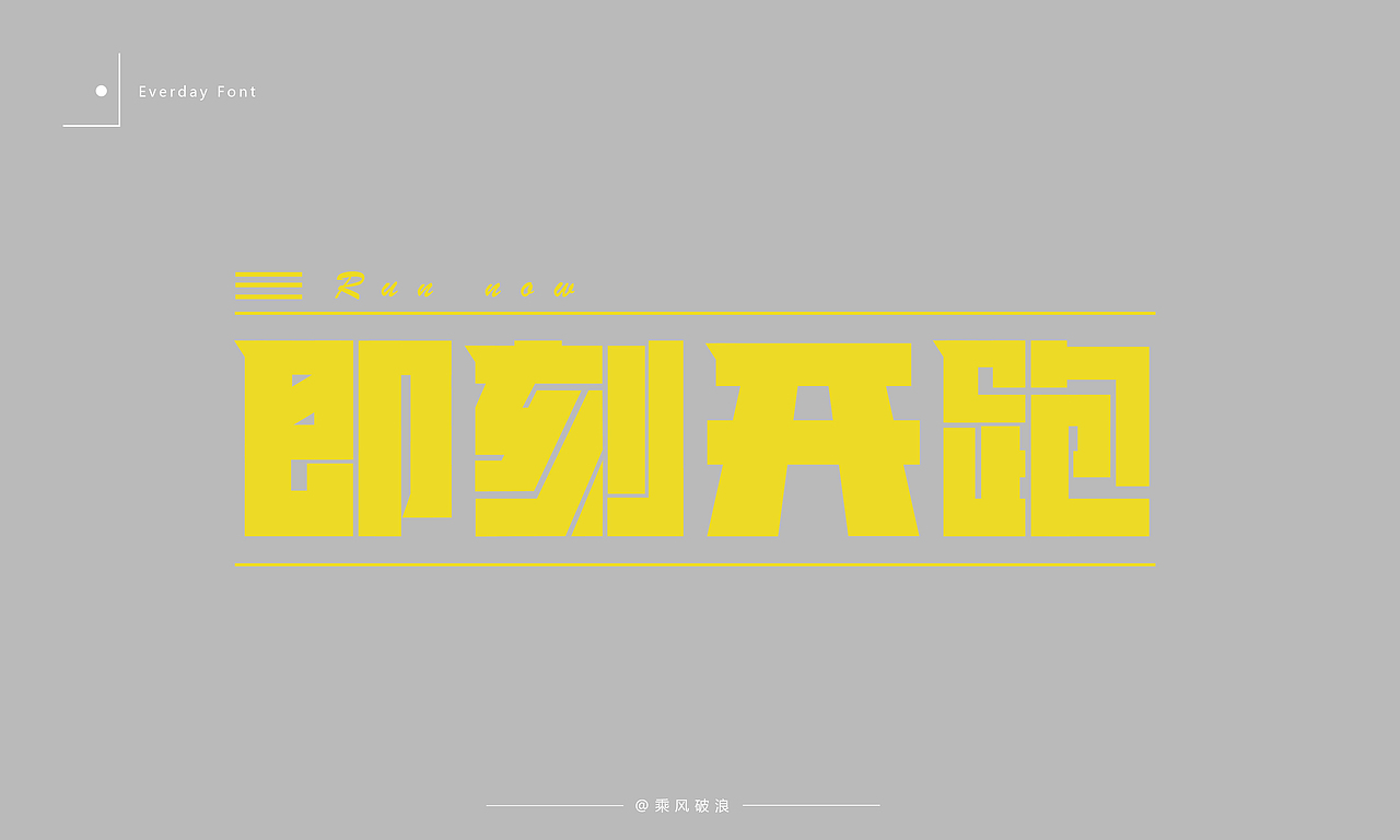
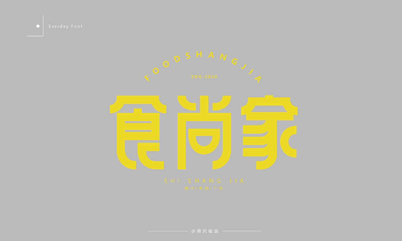
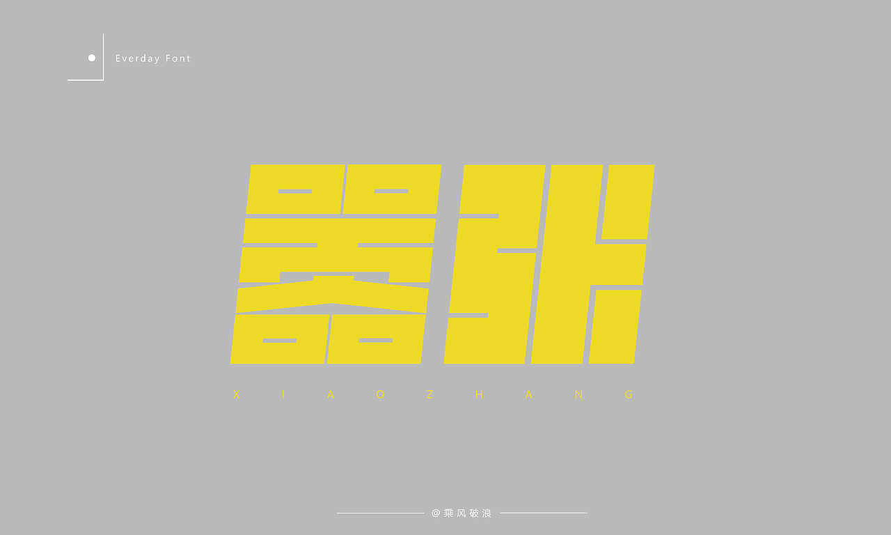
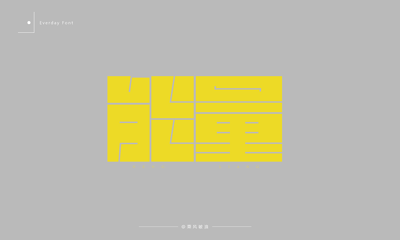
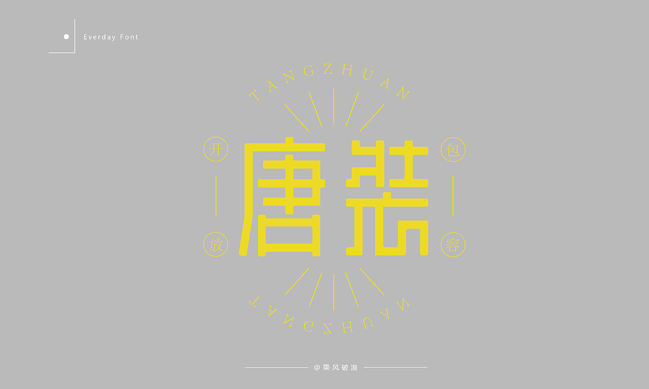
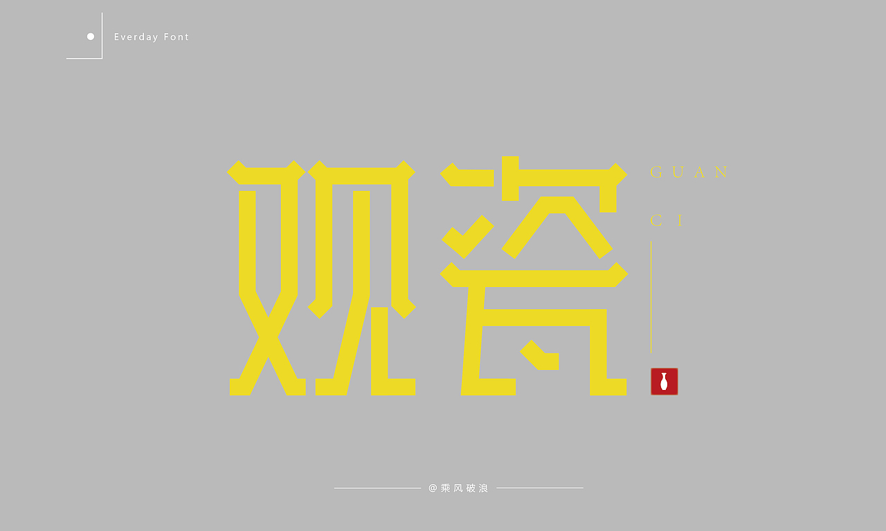
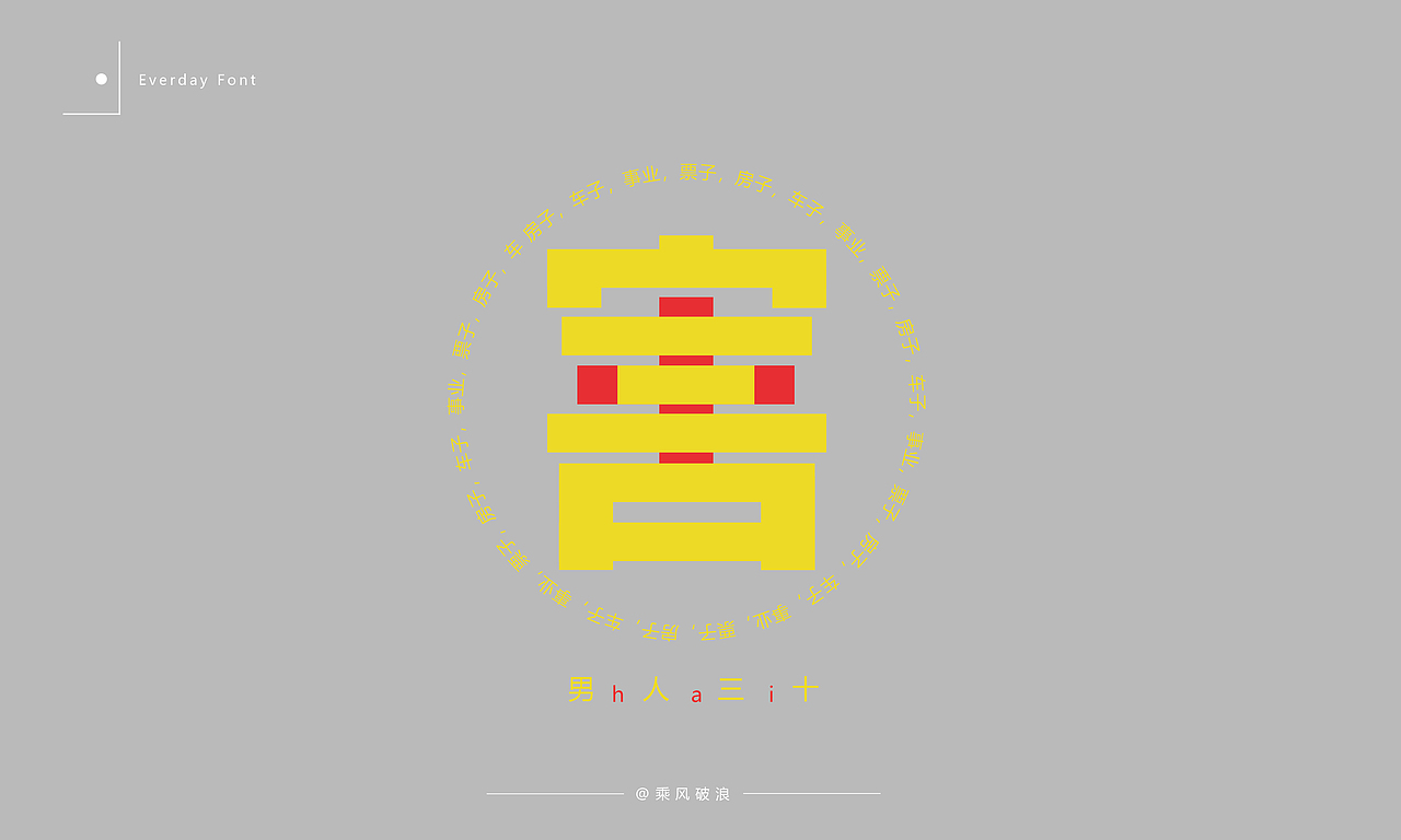
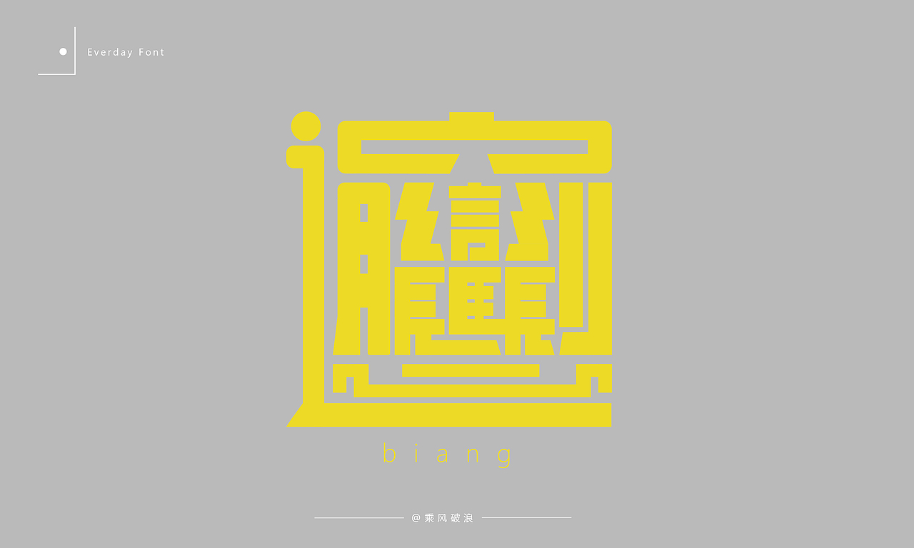
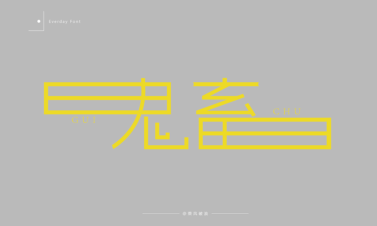
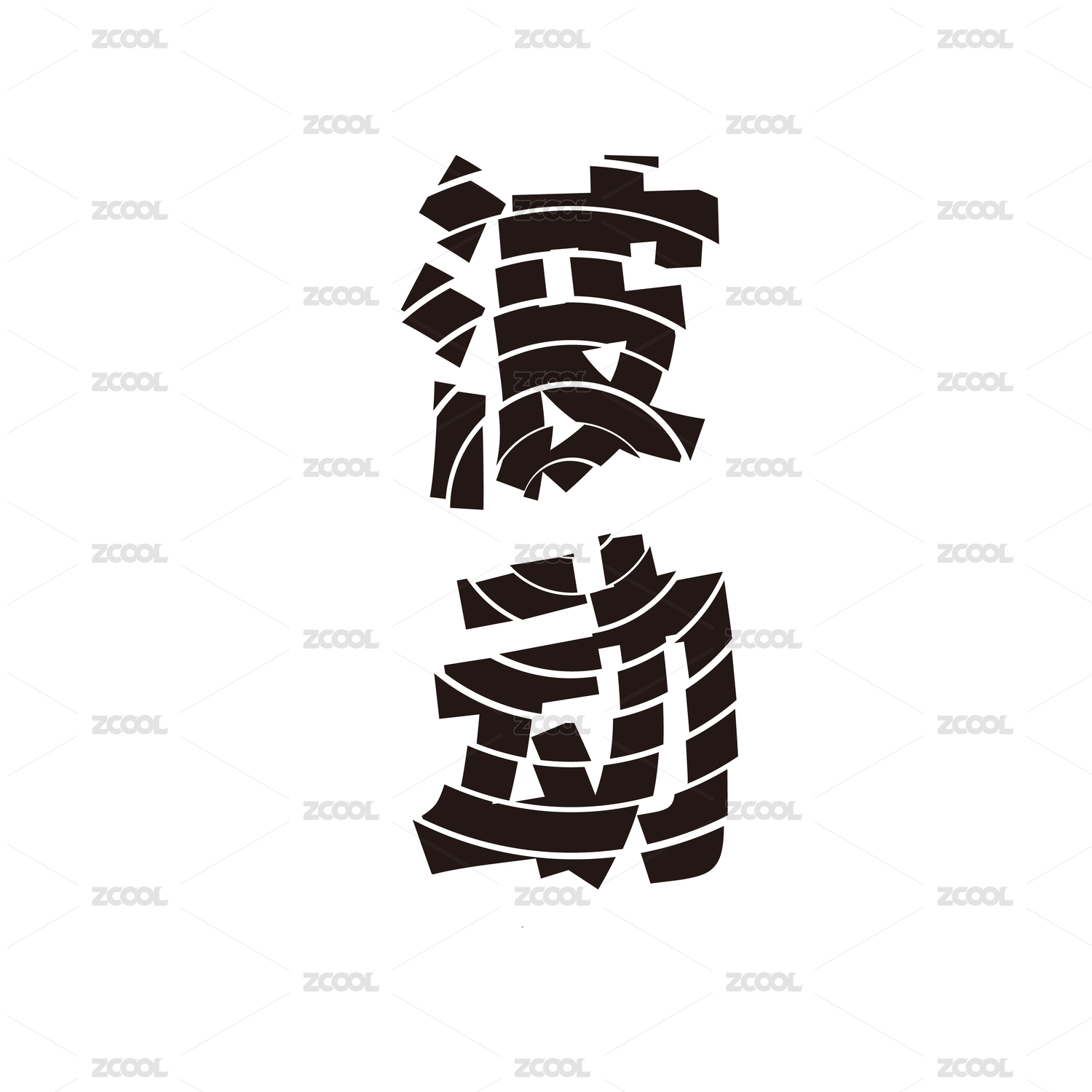
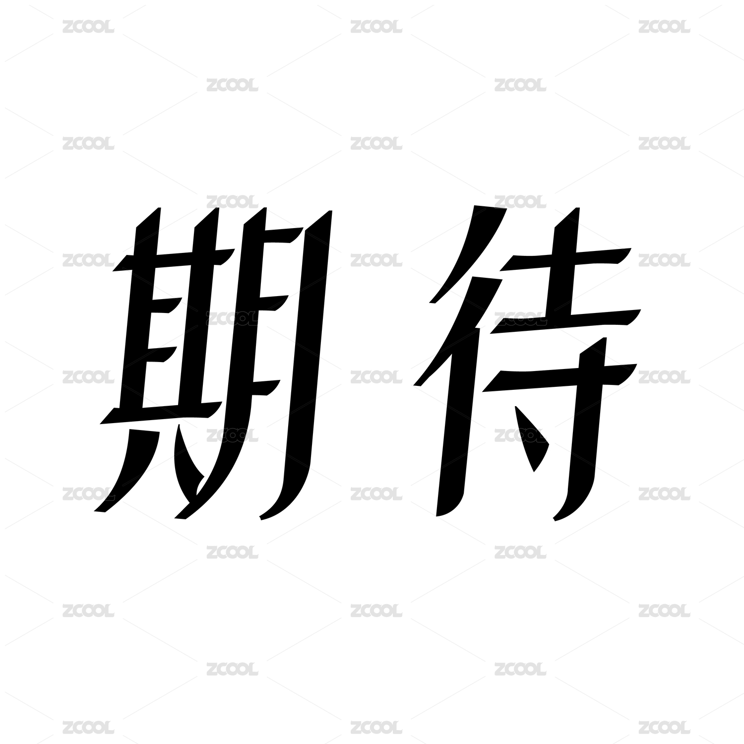
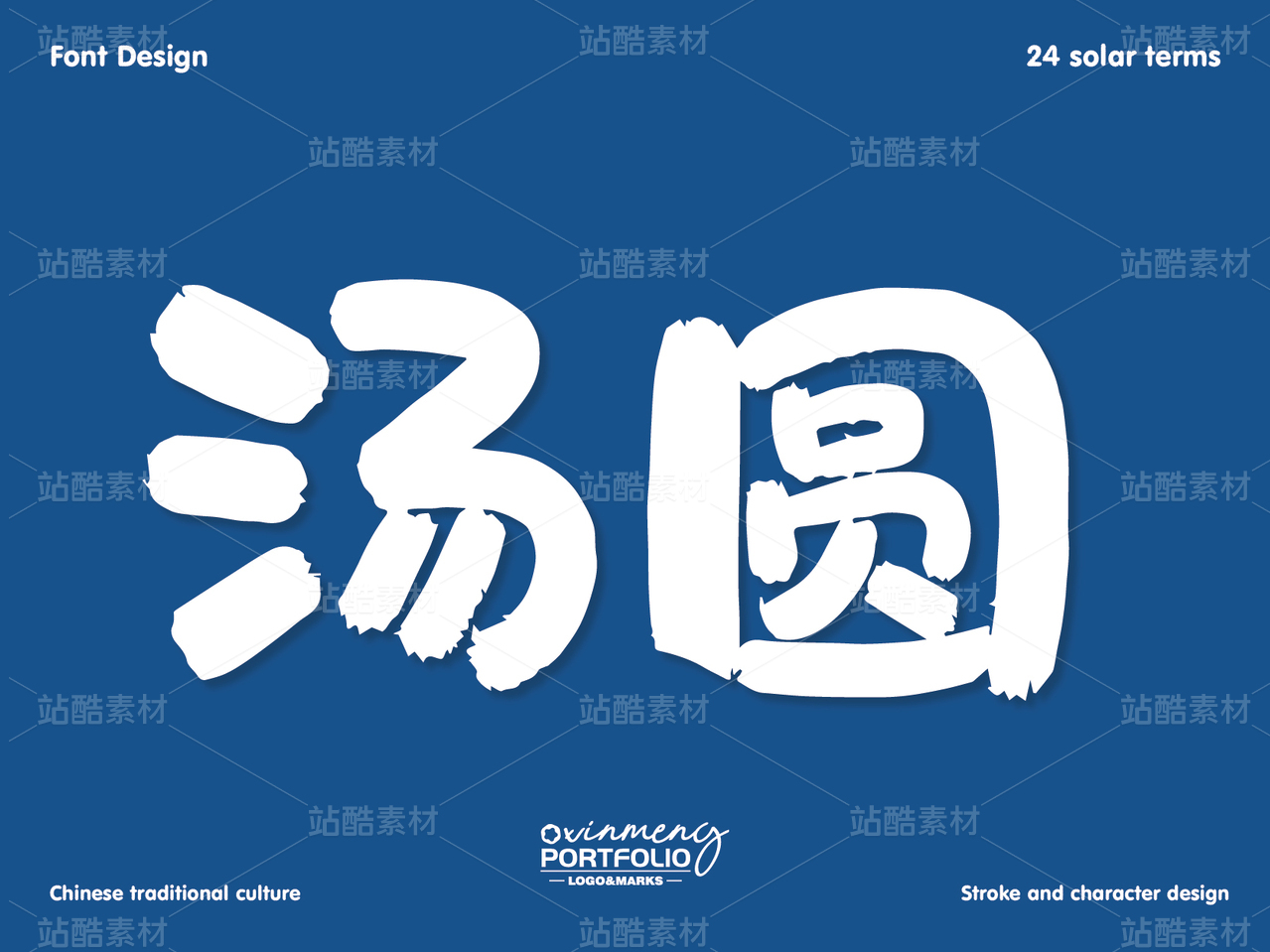
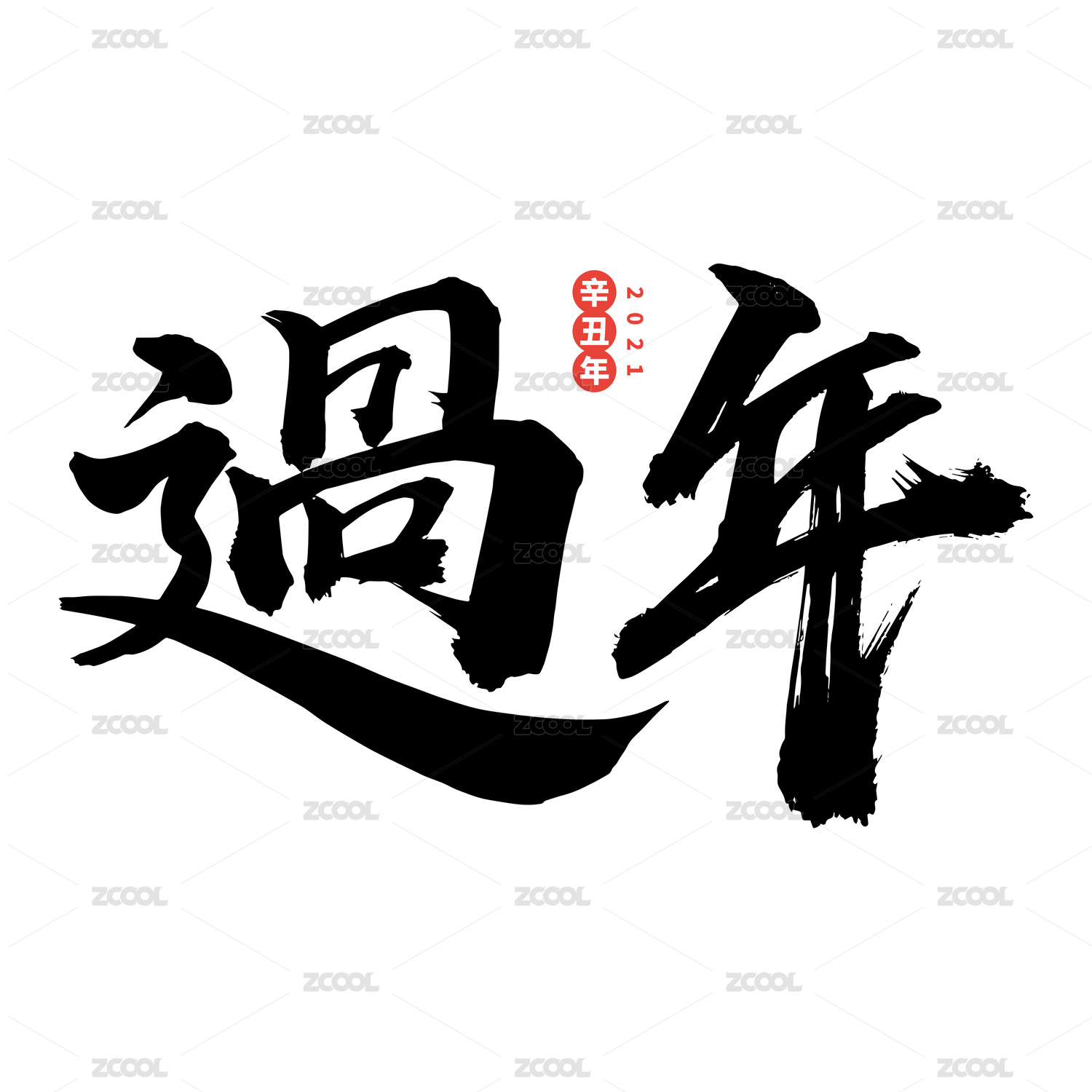
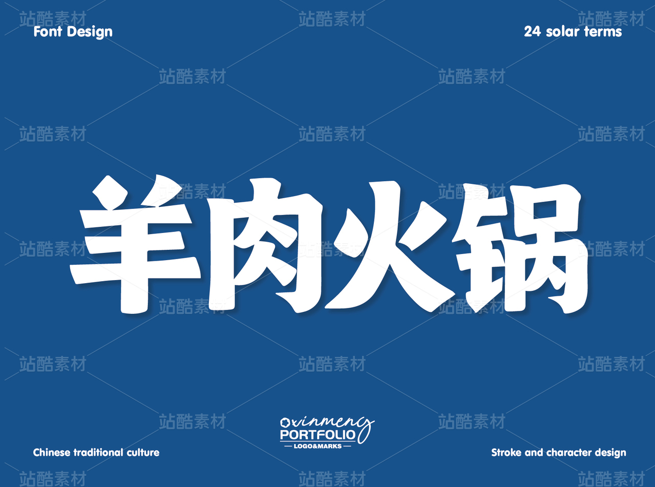
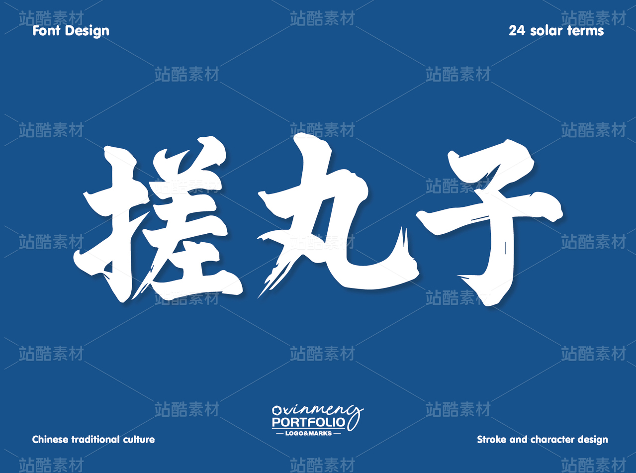
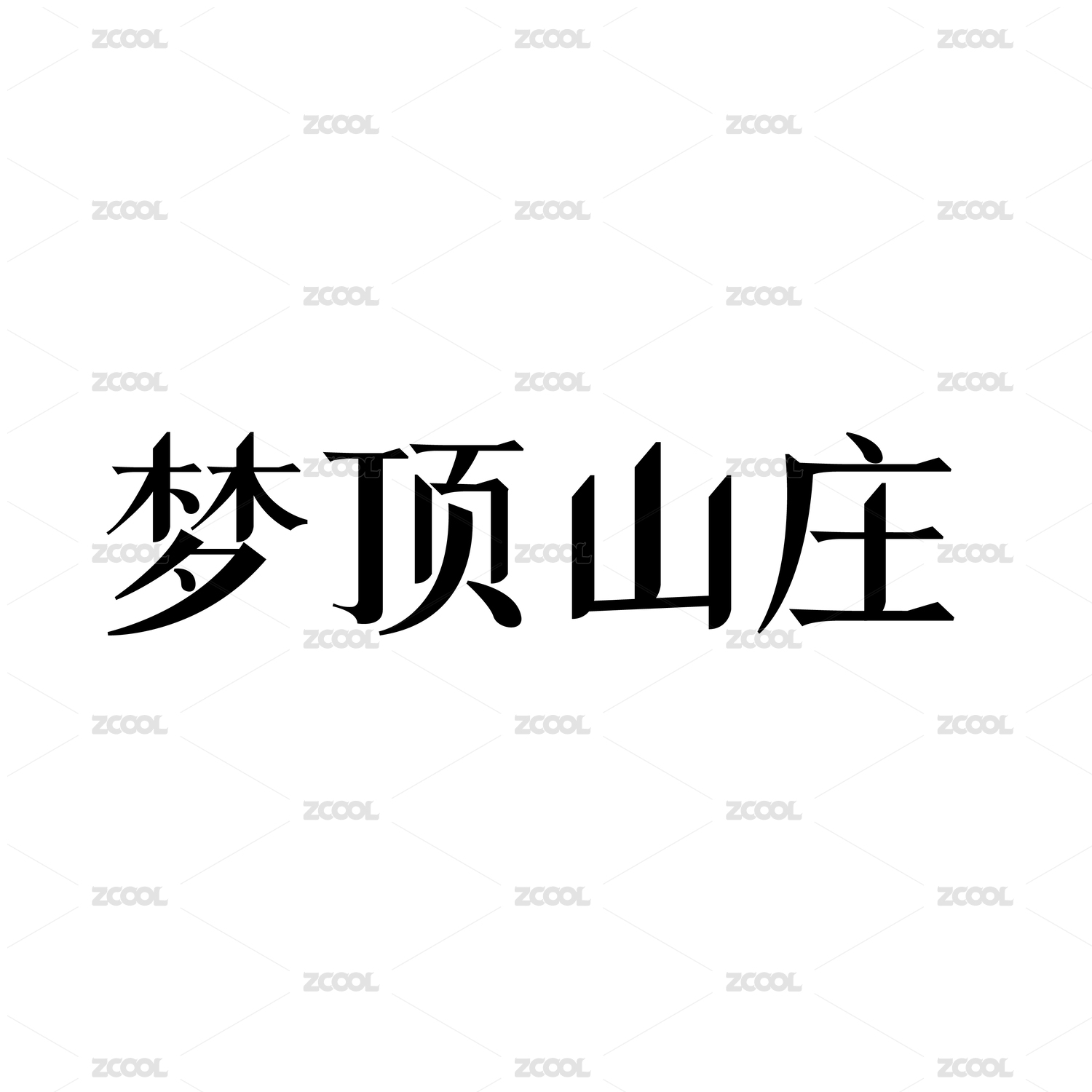
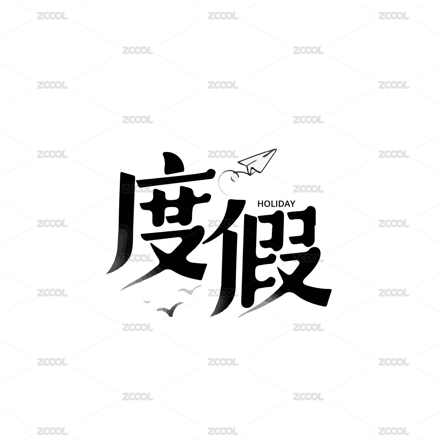
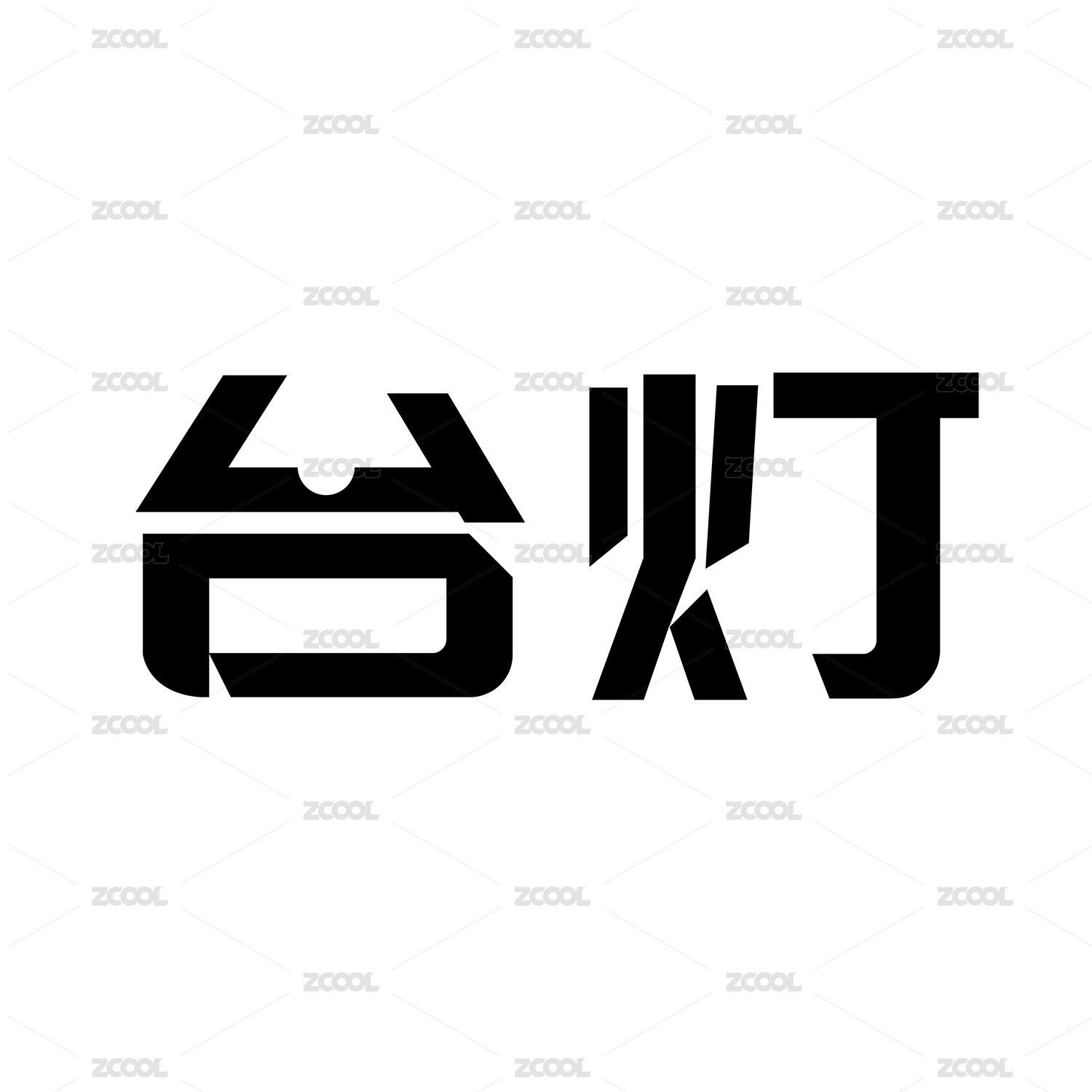
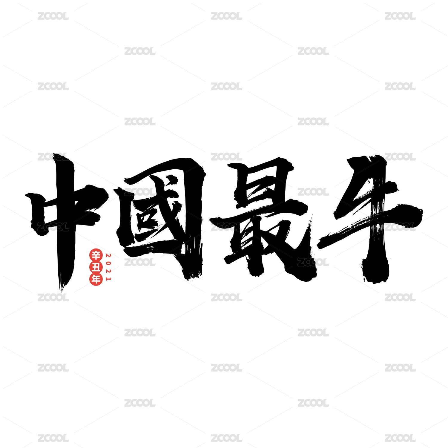
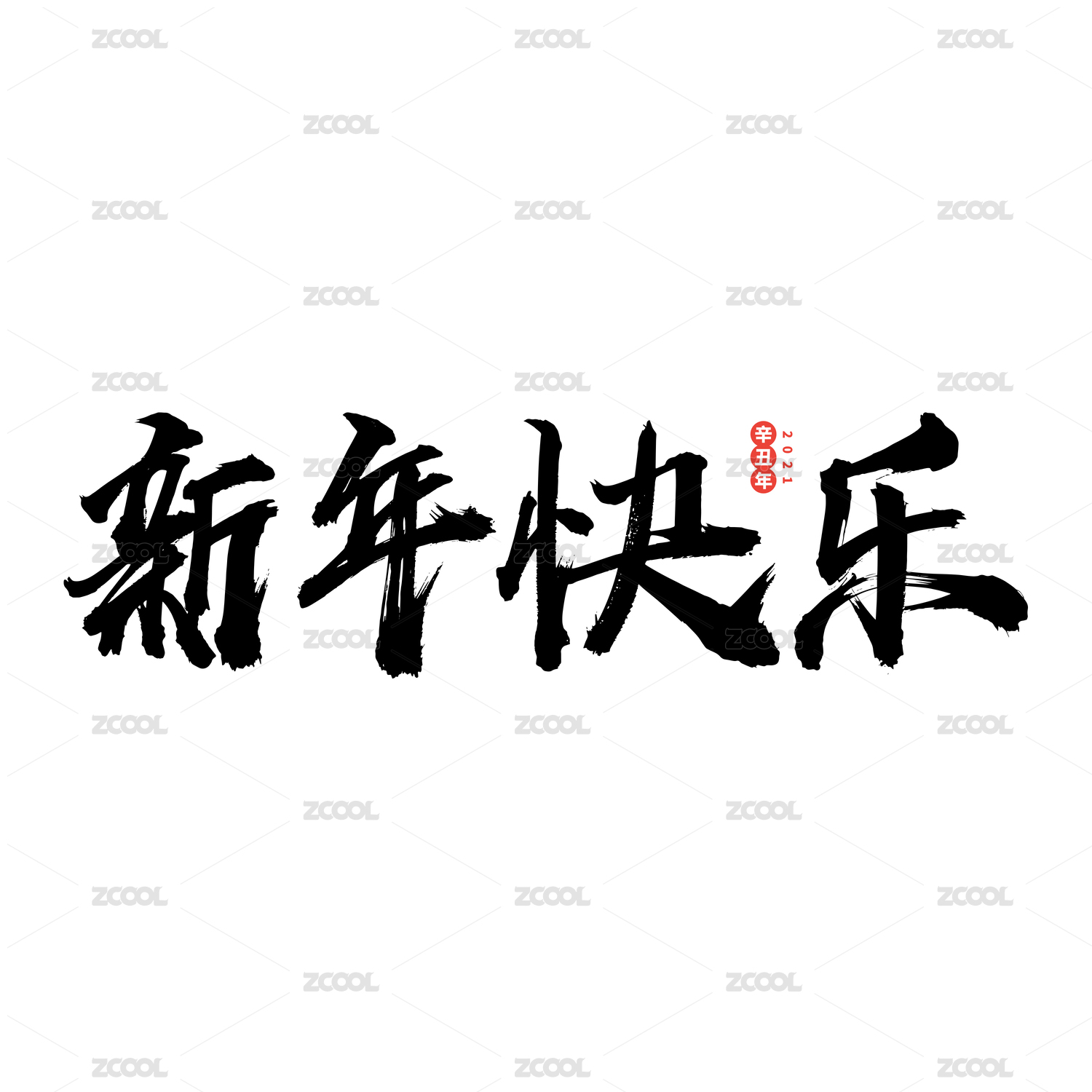
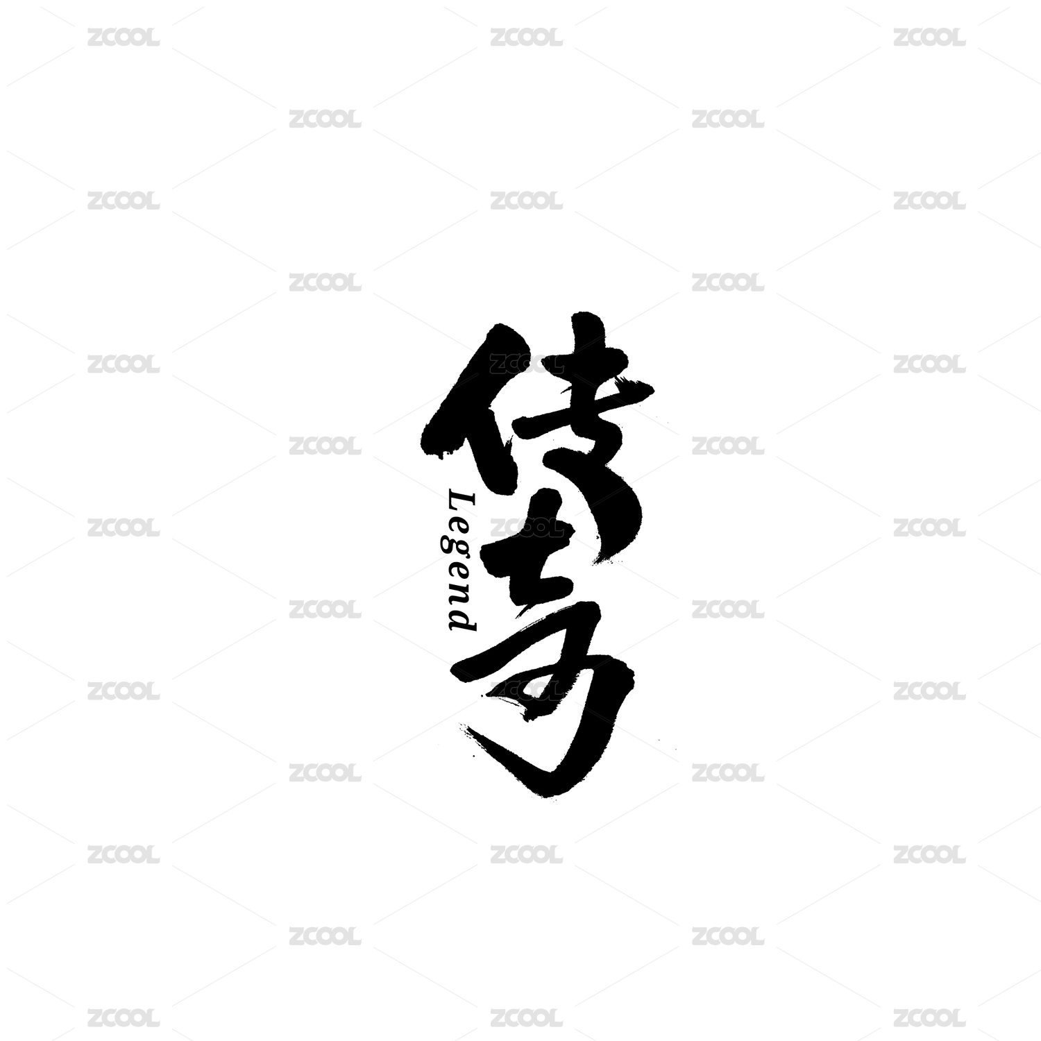
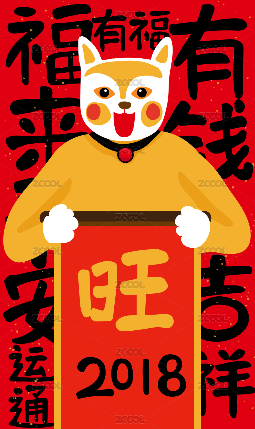
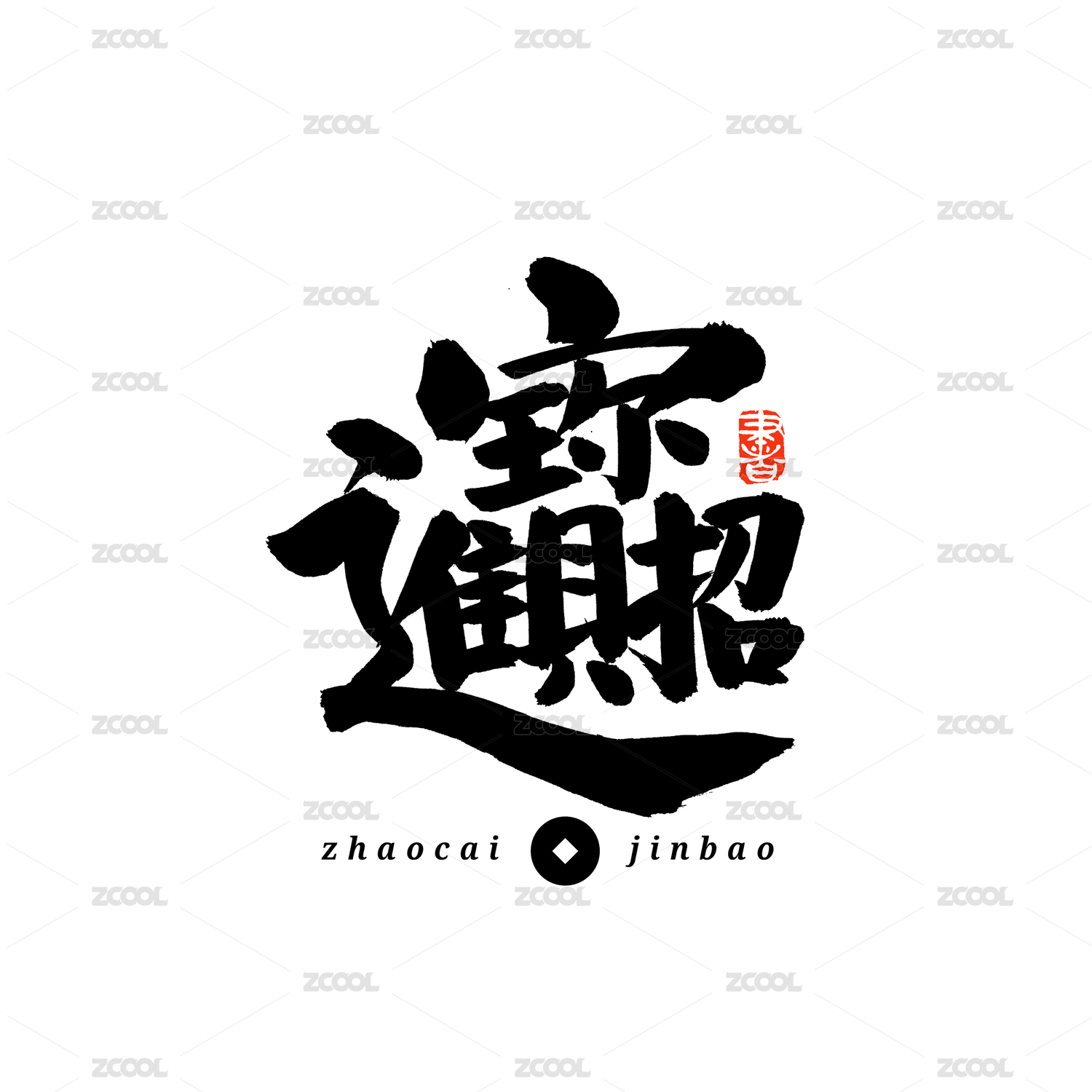
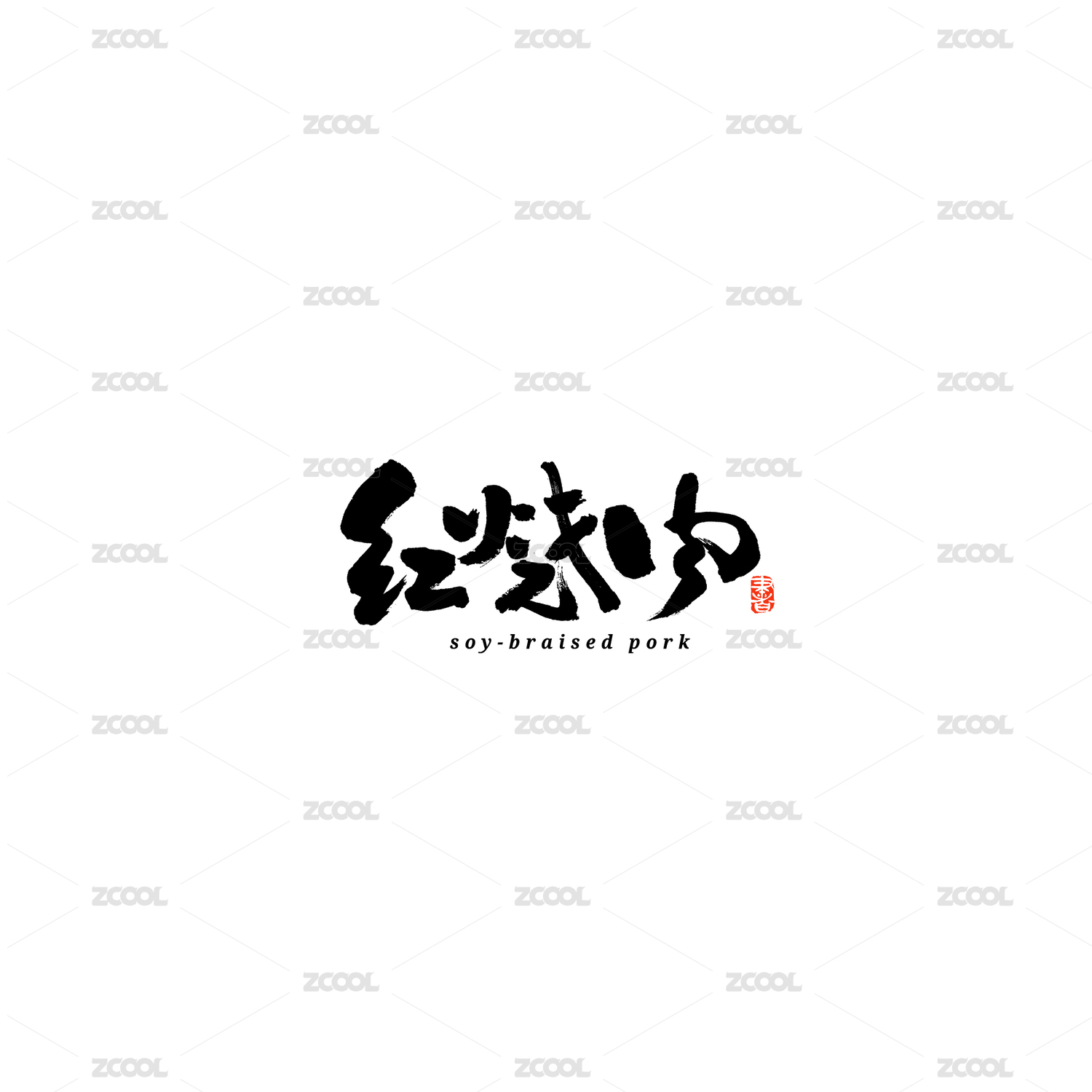
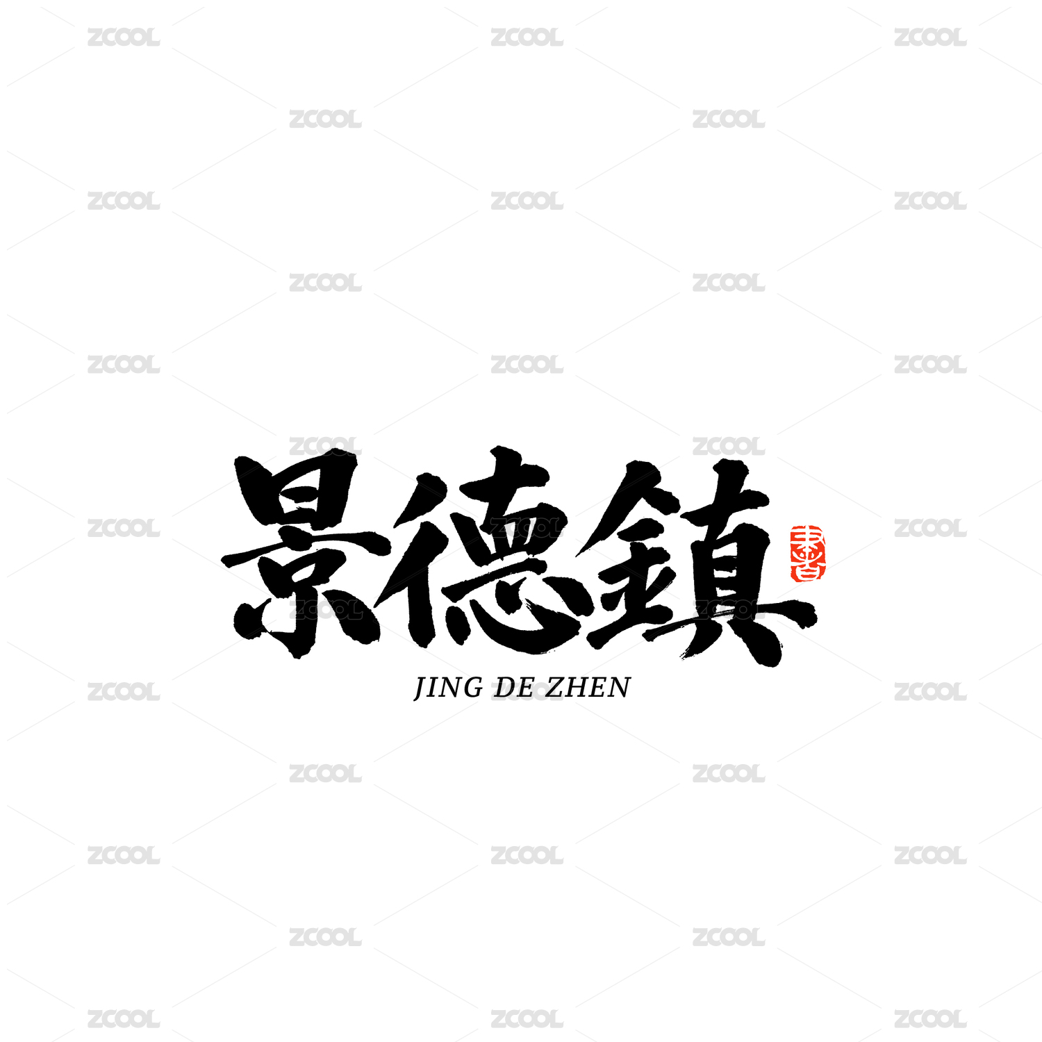
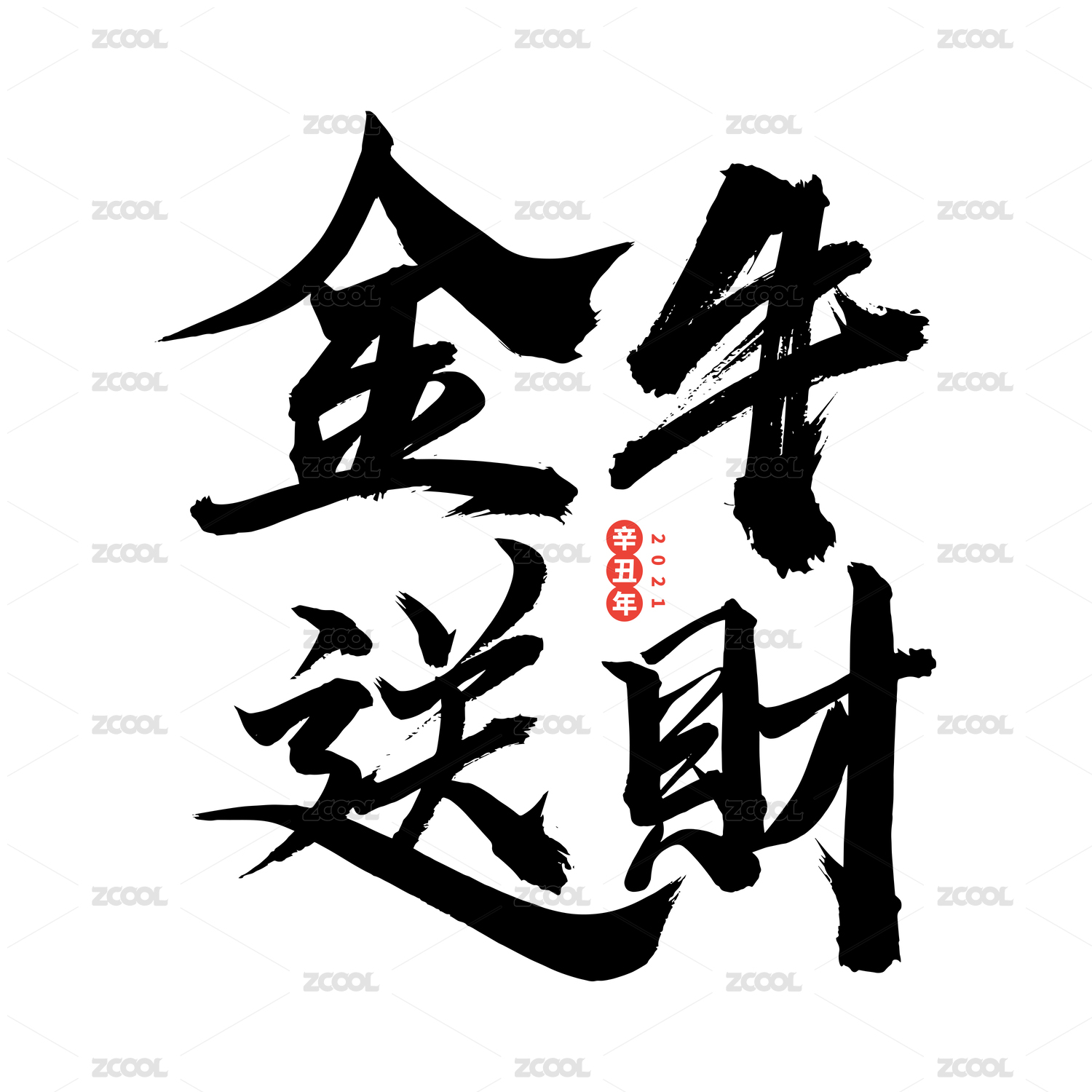
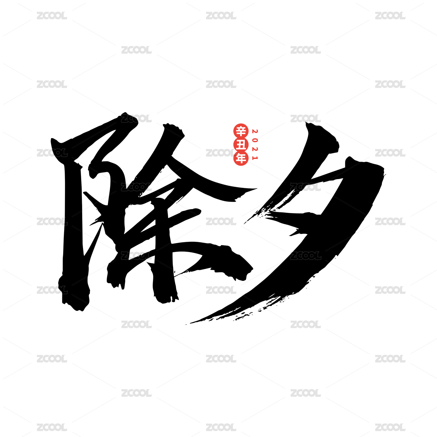
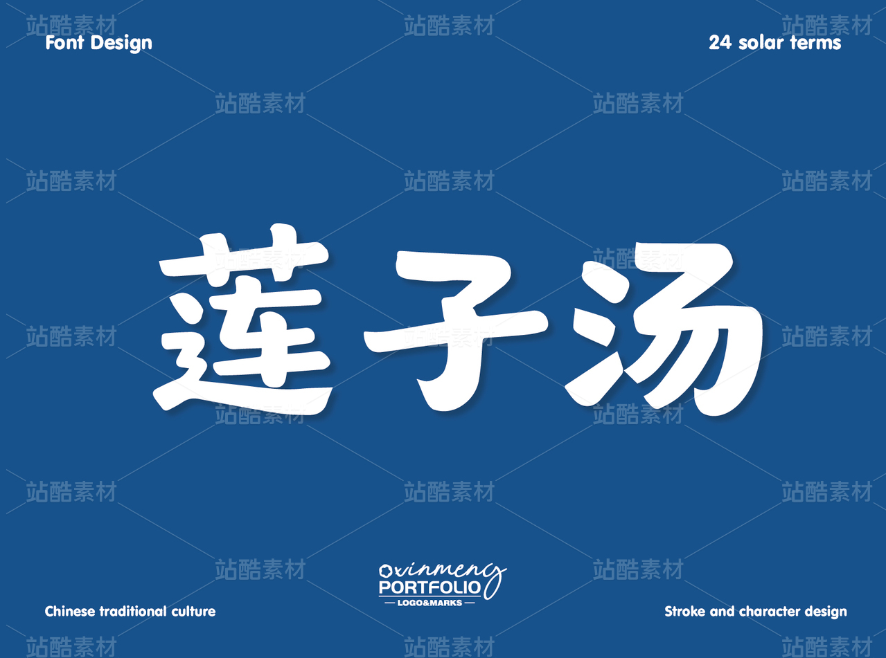
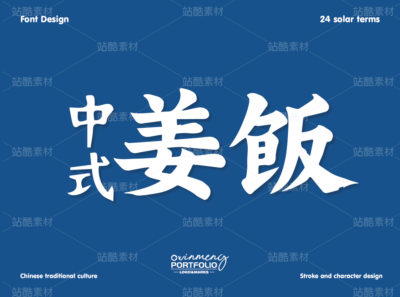
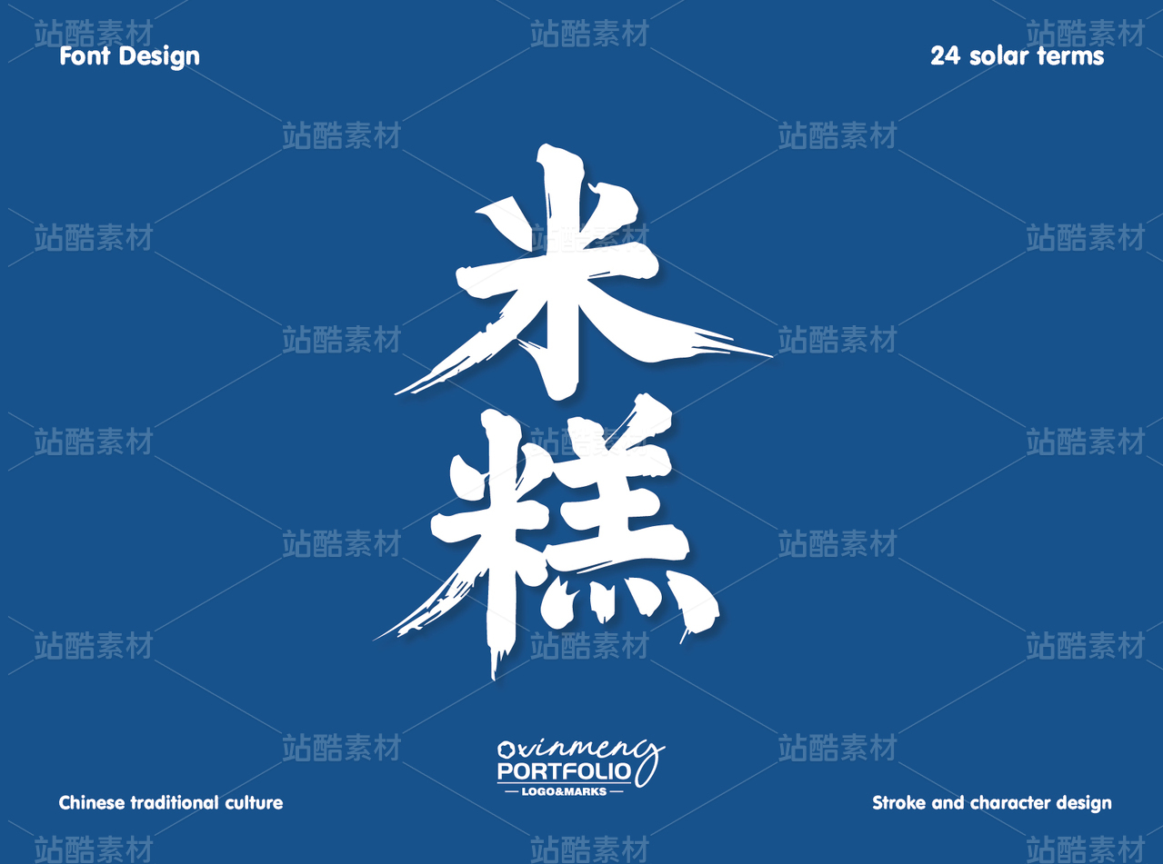
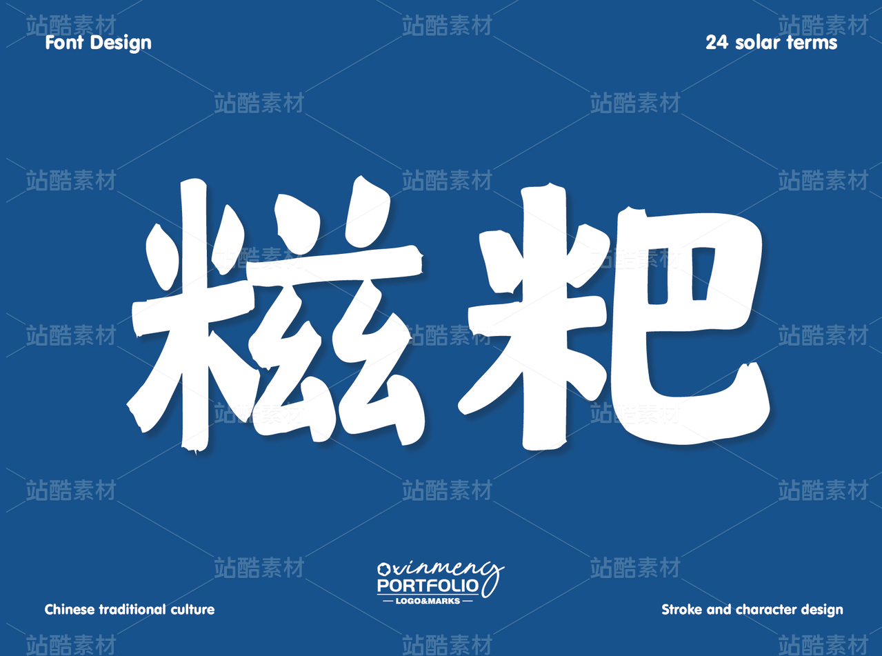
一转眼2020年已经过去,在这岁末之际我挑选了30份字体进行展示总结。对于2021年我希望自己能够在设计上能够更加进步,不断地充实自己提升自己。 在整体颜色搭配选择上受2021最新流行色影响,采用“极致灰”和“亮丽黄”这两个独立颜色进行组合。希望借此对立又相融的色彩组合传递力量和希望的信息。


4
Report
声明
1
Share
相关推荐


in to comment
Add emoji
喜欢TA的作品吗?喜欢就快来夸夸TA吧!
推荐素材


You may like


相关收藏夹


Log in
4Log in and synchronize recommended records
1Log in and add to My Favorites
评论Log in and comment your thoughts
分享Share