温故·知新 汉画像的日常品牌设计

徐州/平面设计师/5年前/537浏览
版权
温故·知新 汉画像的日常品牌设计
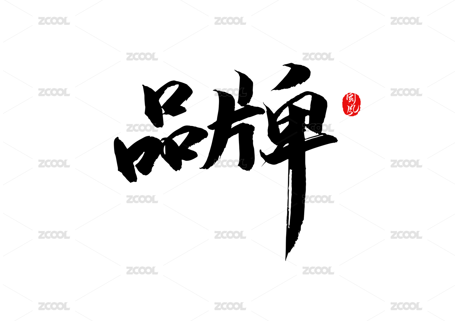
佣悦,yue然于心,yue然于纸,yue然于器。品牌标准字采用手写字体,保留大量笔触,古朴典雅,字形放松舒展,符合汉代轻松、昂扬、愉悦的社会氛围。
标准色从中国传统色中寻找灵感,选取了具有意象的松石绿、赭石红、鱼肚白、古铜金四色,其中,松石绿和赭石红饱和度较低,在品牌中作为对比色出现;鱼肚白和古铜金为金属色,作为搭配使用。


3
Report
声明
14
Share
相关推荐


in to comment
Add emoji
喜欢TA的作品吗?喜欢就快来夸夸TA吧!
推荐素材


You may like


相关收藏夹


Log in
3Log in and synchronize recommended records
14Log in and add to My Favorites
评论Log in and comment your thoughts
分享Share