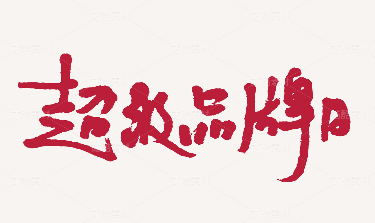
SHINERO / 宣柔(二)

宁波/平面设计师/5年前/7740浏览
版权
SHINERO / 宣柔(二)
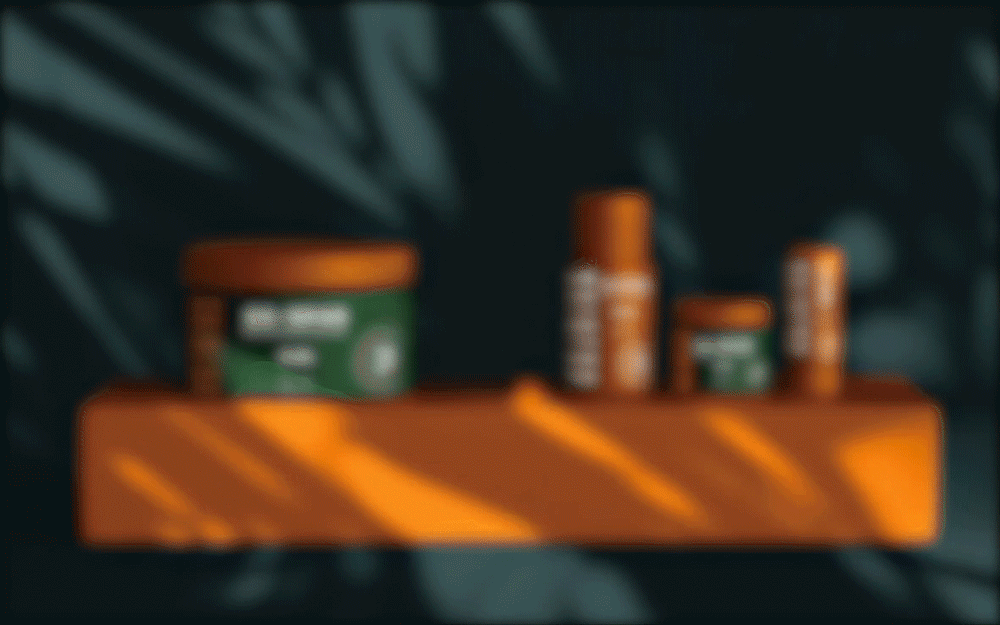
天然纯粹
让头发回归自然
_
使用墨绿作为整体调性,橙色点缀,贯穿整个品牌,它带着生命的张力从自然中来,明度低却不会过于晦暗,反倒带有一丝贵气;绿色代表健康、自然,与品牌契合,让头发回归自然,舒展最好的姿态。
Use dark green as the whole tonality, orange embellishment, throughout the whole brand, it comes from nature with the tension of life, low lightness but not too dark, but with a trace of noble spirit; green represents health, nature, fit with the brand, let the hair return to nature, stretch the best posture.
_


简约大气
低调高雅
_
整体Logo柔和简单,提取英文字母“S”“R”,组合形式简约大气,与宣柔的理念契合,简单纯粹,只为给你最好的柔顺。
The overall logo is soft and simple. The English letters "s" and "R" are extracted. The combination form is simple and atmospheric, which is consistent with the concept of xuanrou. It is simple and pure, just to give you the best flexibility.
-


59
Report
声明
134
Share
相关推荐


in to comment
Add emoji
喜欢TA的作品吗?喜欢就快来夸夸TA吧!
推荐素材


You may like


相关收藏夹


Log in
59Log in and synchronize recommended records
99+Log in and add to My Favorites
评论Log in and comment your thoughts
分享Share