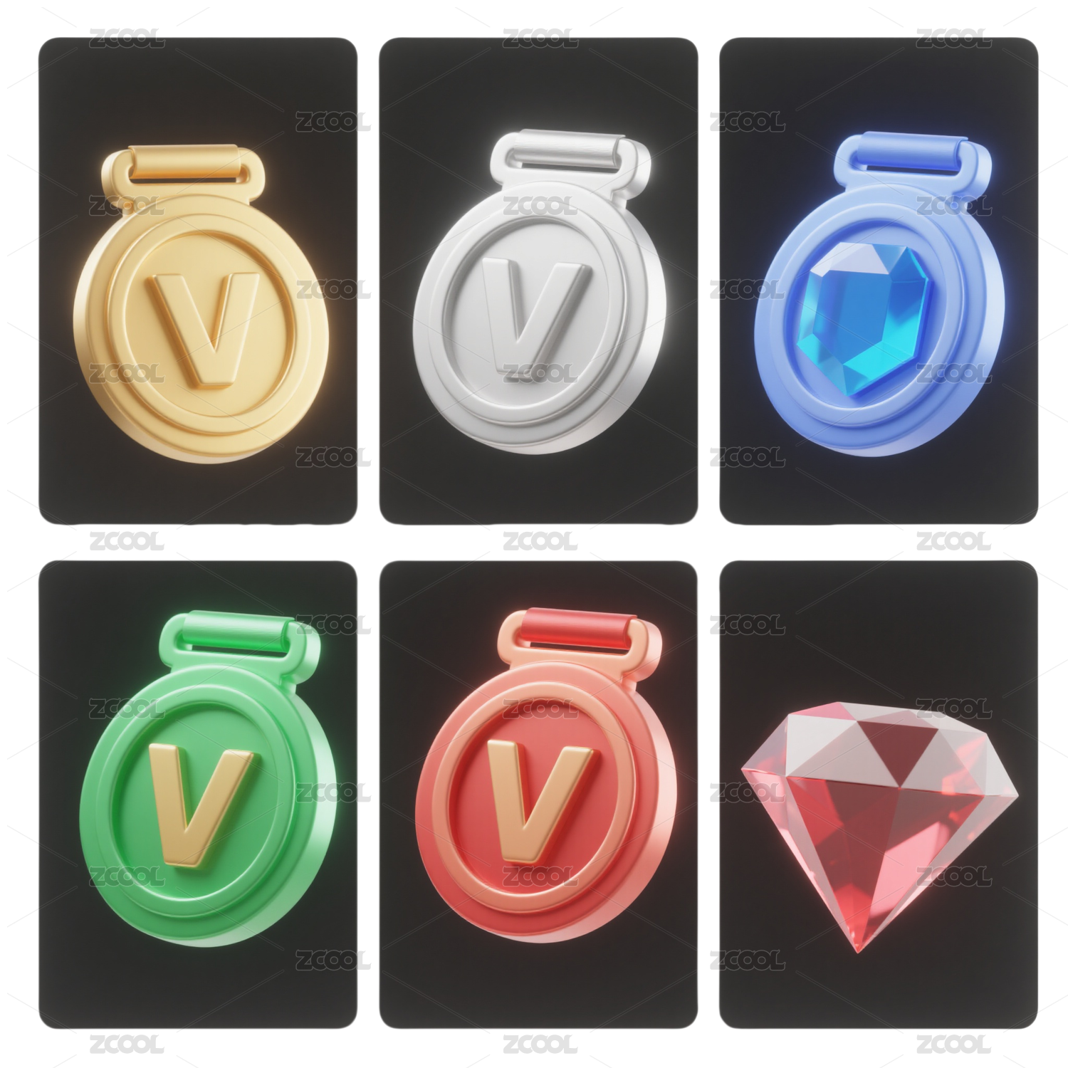
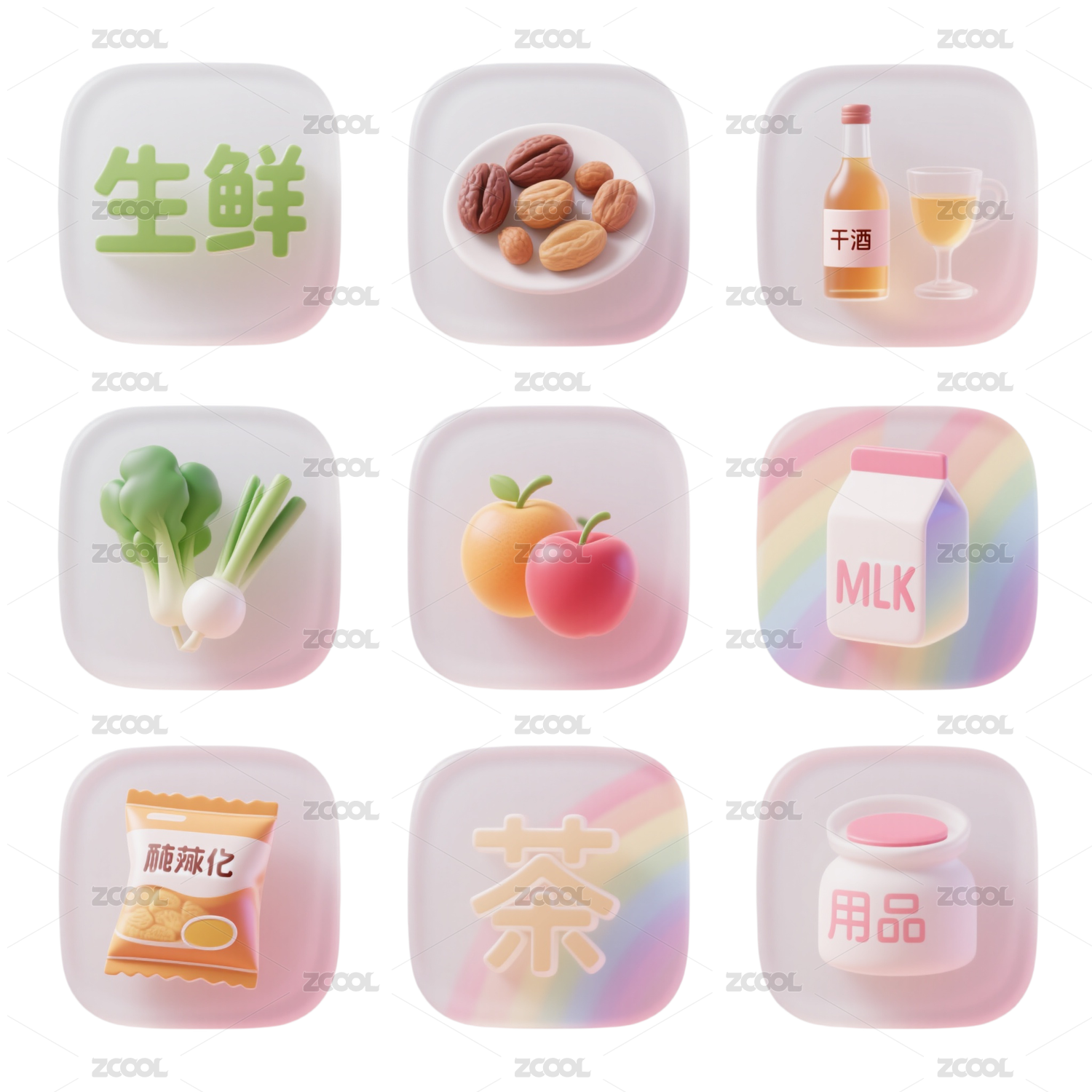
一组小图标设计

北京/设计爱好者/6年前/9667浏览
版权
一组小图标设计
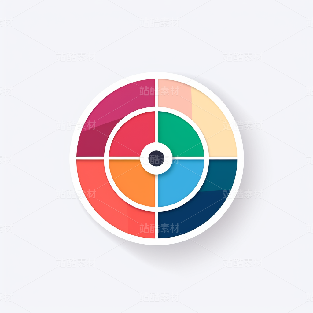
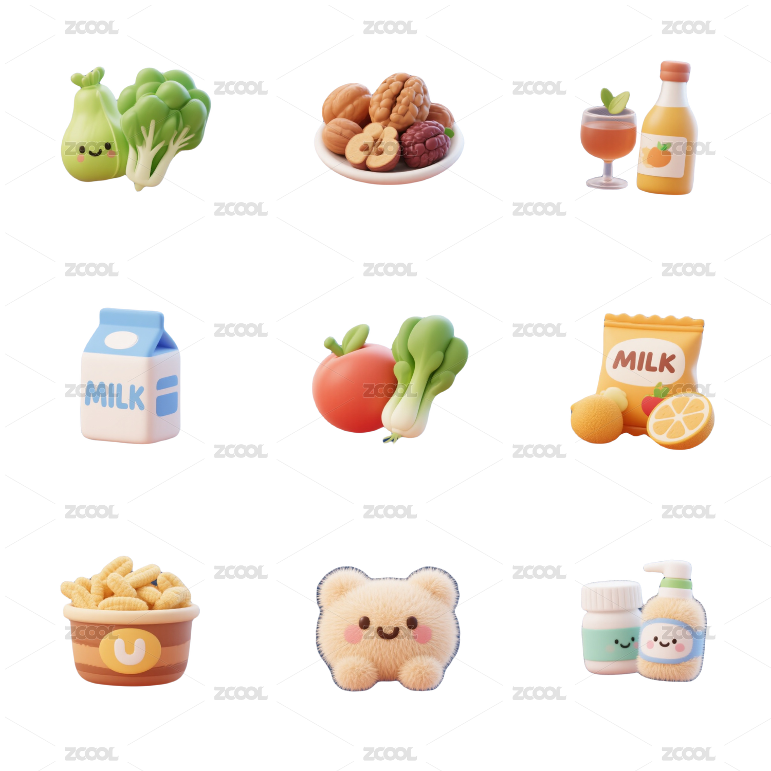
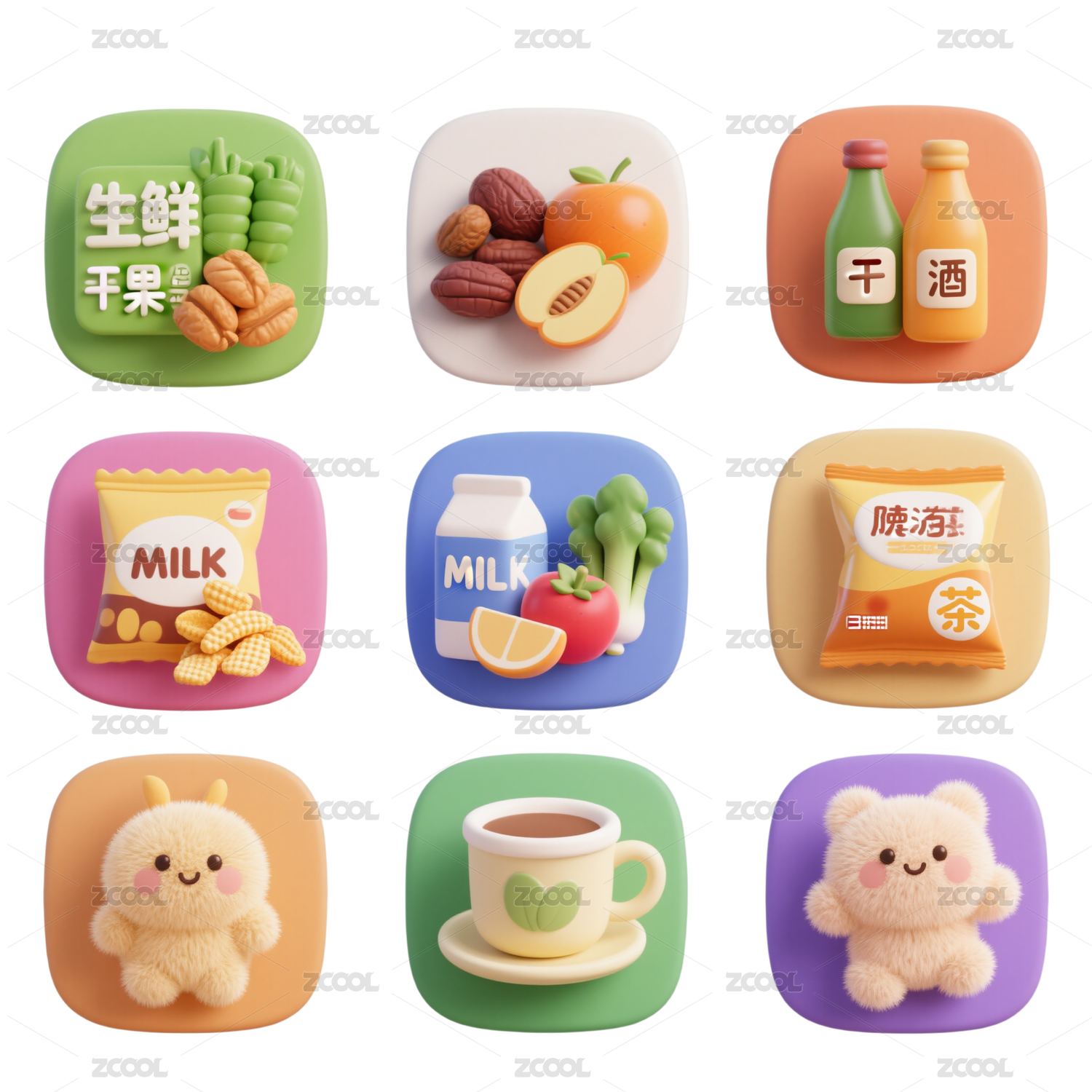
2019年渐变色流行了一整年,那么2020年双色渐变设计依然持续是一个大趋势,因为单一的色调无法满足产品所需,双色调图标的特点就是色彩对比鲜明,青春活力,这种相比单色调图标,更适合应用于一些主流偏年轻化产品
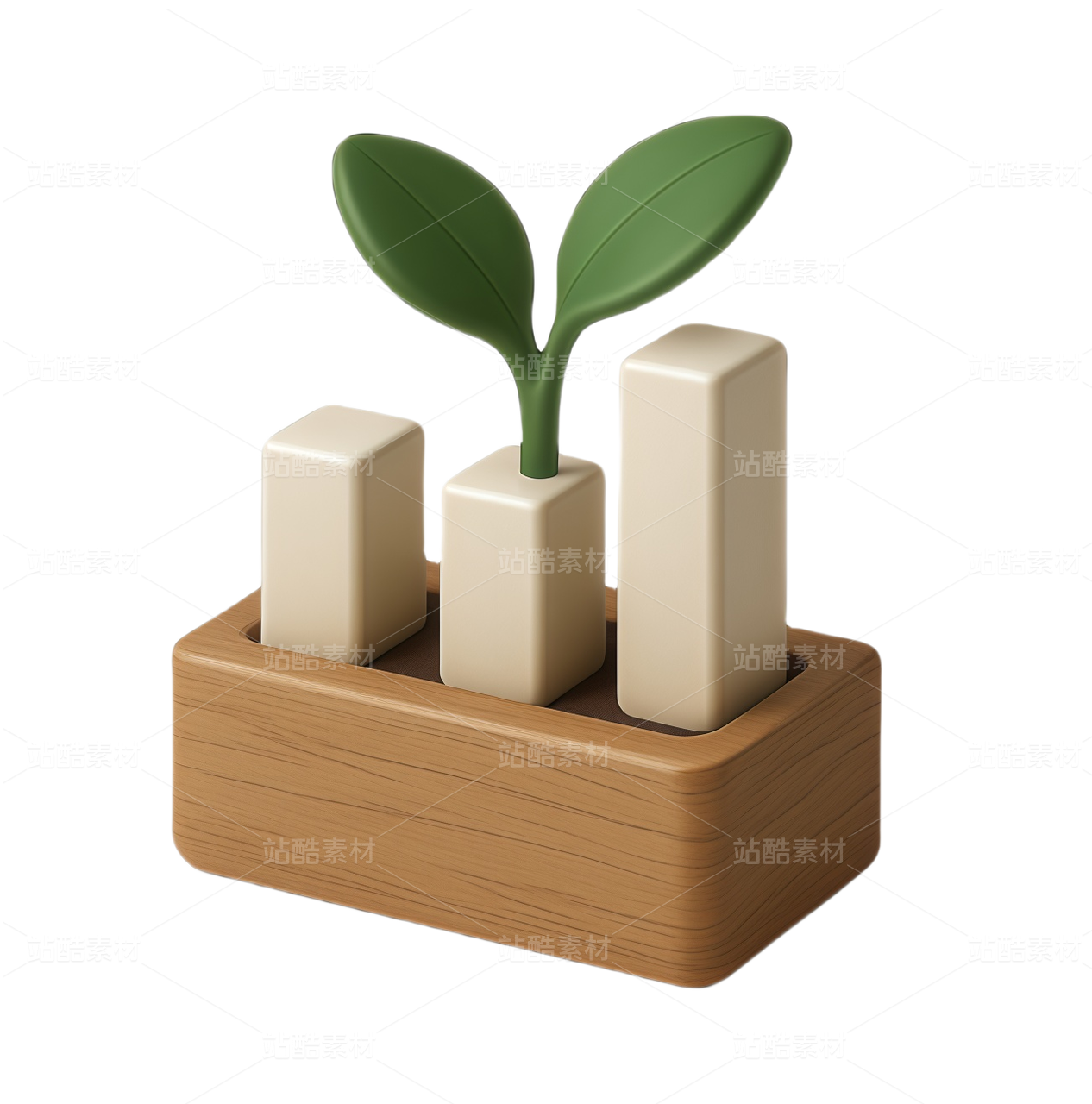
因此设计师还可以通过设计色彩打动用户,提升产品竞争力,工具化产品也可以使用这样有层次的图标不过使用时,需要对色彩进行克制使用
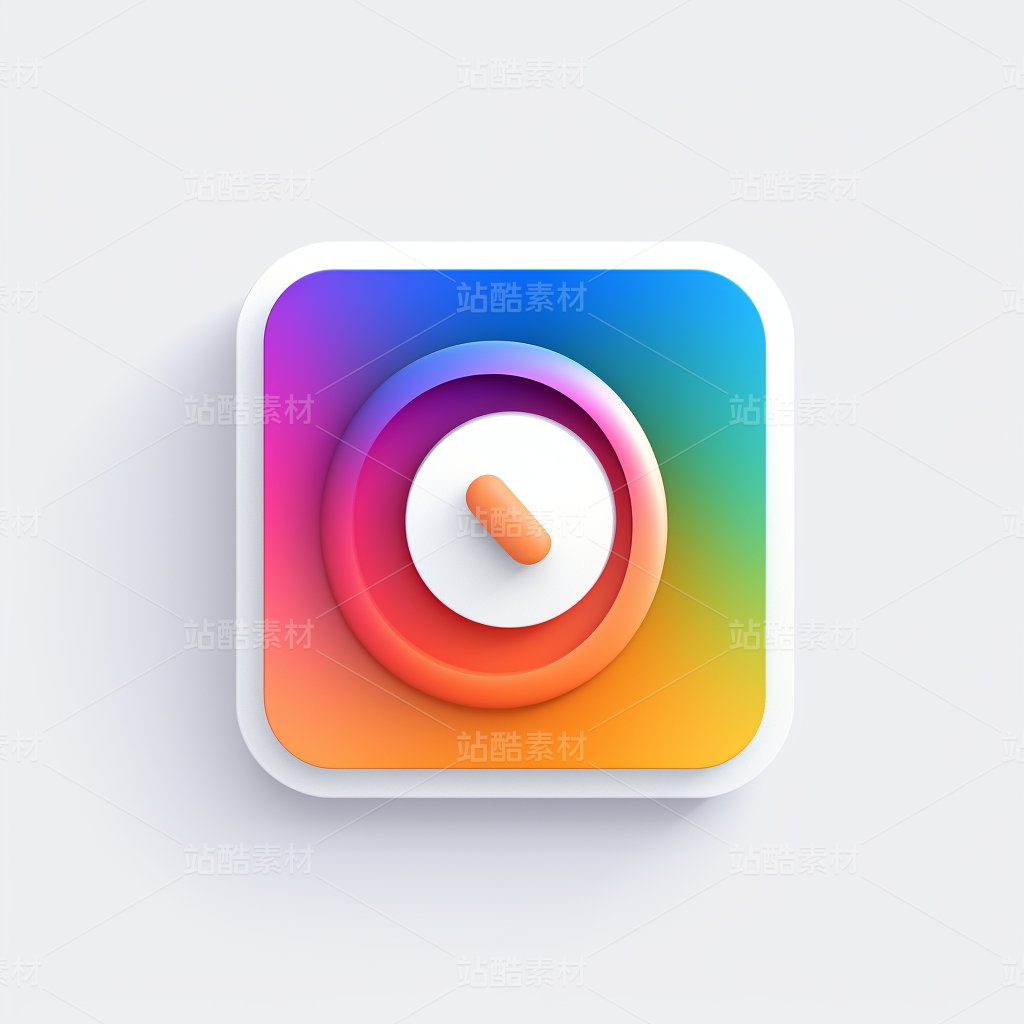
因此,如果您希望自己的设计界面脱颖而出,可以去大胆的使用双色调色彩
In 2019, gradient color has been popular for a whole year, so the two-color gradient design in 2020 will continue to be a major trend, because a single color can not meet the needs of products. The characteristics of two-color icon are bright color contrast and youthful vitality. Compared with single tone icon, it is more suitable for some mainstream younger products;
Therefore, designers can also move users through the design of color, improve the competitiveness of products, tool products can also use such hierarchical icon, but when using, need to restrain the use of color.
Therefore, if you want your design interface to stand out, you can boldly use two tone colors.
设计者:满孝峰
时 间:2020/06/06


86
举报
声明
192
分享
相关推荐


评论你的想法~
表情
喜欢TA的作品吗?喜欢就快来夸夸TA吧!
推荐素材


你可能喜欢


相关收藏夹


登录注册
86登录即可同步推荐记录哦
99+登录即可加入我的收藏
评论登录即可评论想法
分享分享