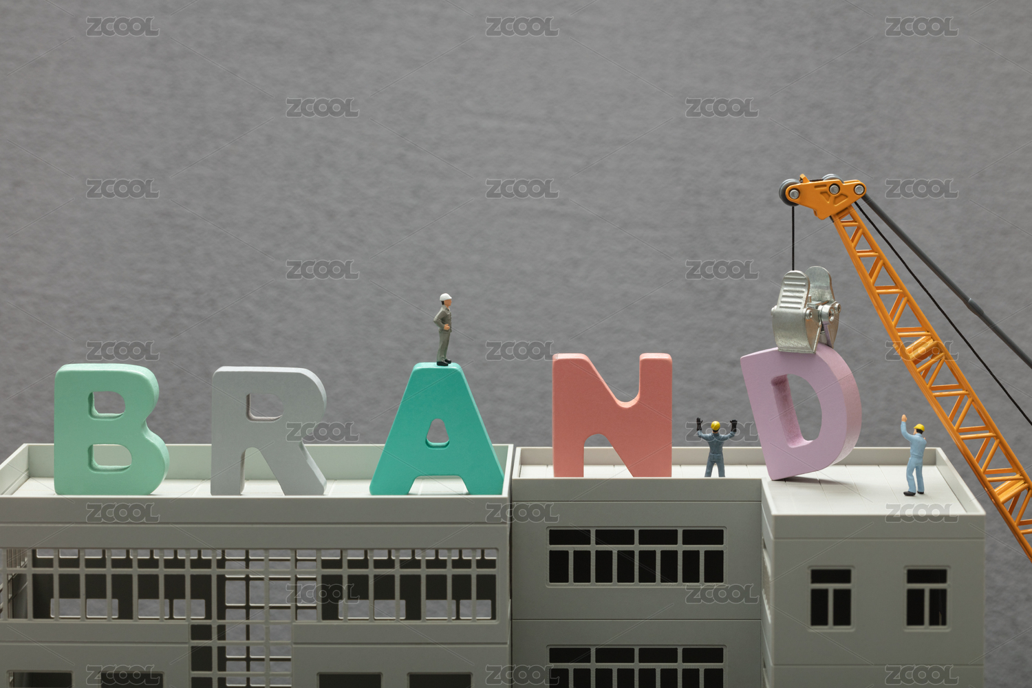
微甜苏打 WINEMA SODA - 品牌VI设计


重庆/平面设计师/5年前/18718浏览
版权
微甜苏打 WINEMA SODA - 品牌VI设计


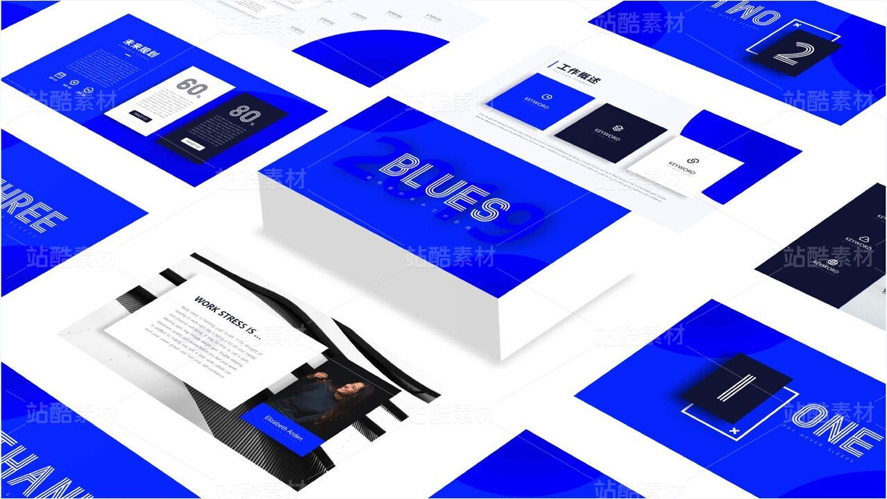
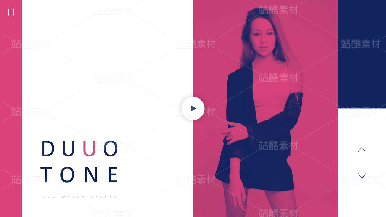
微甜苏打是一个原创新式苏打饮品品牌。品牌设计试图描绘炎炎夏日中饮一杯冰苏打的美妙瞬间——清爽的活力分子充满每一个细胞,仿佛带你潜入微甜苏打的海洋,如此不可抗拒。标识外轮廓与一杯冒气泡的苏打水杯融合,从图形直观的传达品牌属性。品牌主体色为清爽的蓝与白,在物料中适量融入撞色——粉色,使品牌更具年轻感与视觉冲击力的一体性。
WINEMA SODA is an original new style soda drink shop. Its brand LOGO design describes the wonderful moment of drinking a cup of light sweet cold soda——refreshing and active molecule fulfill every of your cell, just like you dive in the light sweet sea of light sweet soda. How irresistible! The outline of the LOGO is coincide with a cup of refreshing soda, showing the nature of this brand directly through this figure. The main colors of this brank are blue and white, both are very clean. We properly add pink into the materials to make the brand more attractive and unitized.
WINEMA SODA is an original new style soda drink shop. Its brand LOGO design describes the wonderful moment of drinking a cup of light sweet cold soda——refreshing and active molecule fulfill every of your cell, just like you dive in the light sweet sea of light sweet soda. How irresistible! The outline of the LOGO is coincide with a cup of refreshing soda, showing the nature of this brand directly through this figure. The main colors of this brank are blue and white, both are very clean. We properly add pink into the materials to make the brand more attractive and unitized.


287
创作信息
Report
声明
643
Share
相关推荐


in to comment
Add emoji
喜欢TA的作品吗?喜欢就快来夸夸TA吧!
推荐素材


You may like


相关收藏夹


Log in
99+Log in and synchronize recommended records
99+Log in and add to My Favorites
评论Log in and comment your thoughts
分享Share