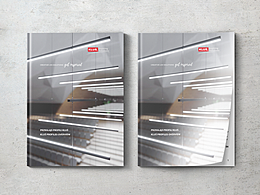
尔漫照明品牌定位 / 规划 / 形象LOGO VI设计 画册包装

中山/艺术工作者/6年前/1363浏览
版权
尔漫照明品牌定位 / 规划 / 形象LOGO VI设计 画册包装
尔漫照明品牌设计策划
项目概况 Introduction
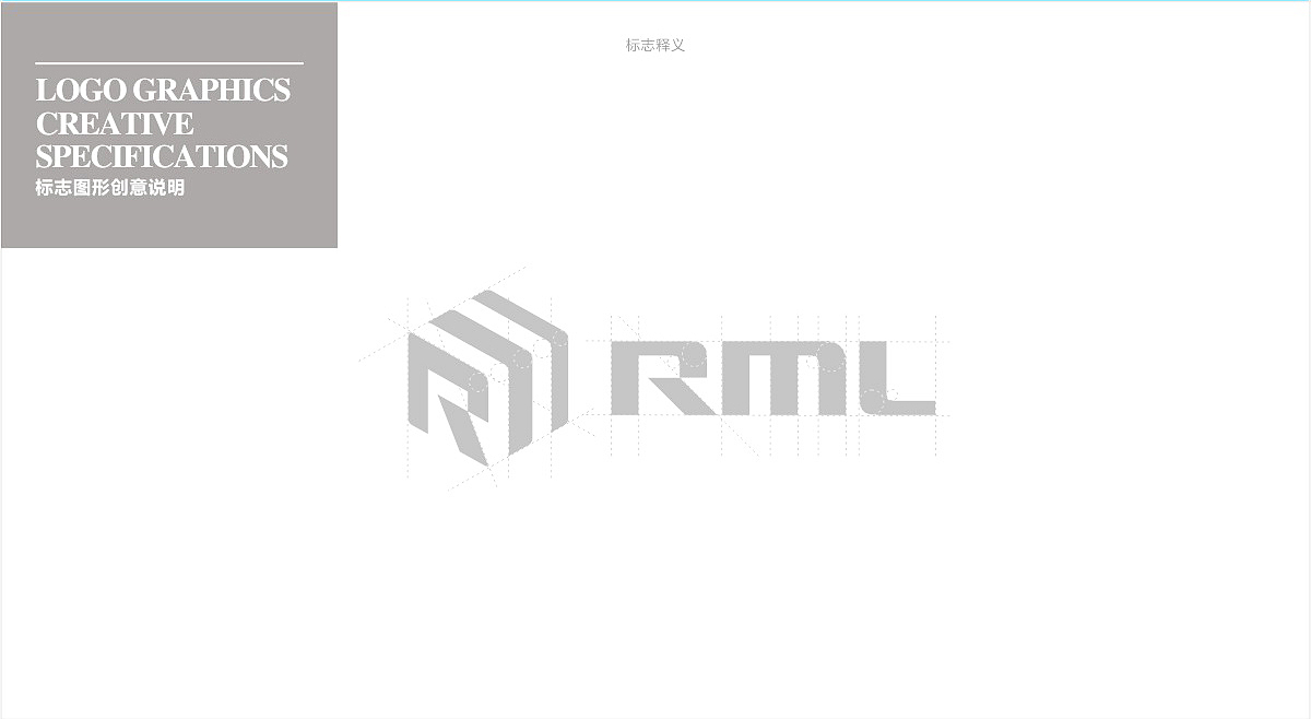
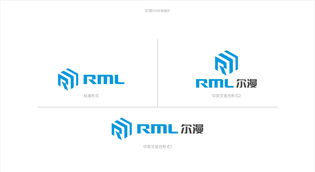
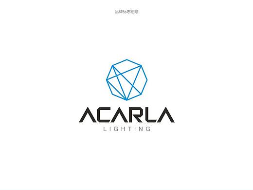
标志设计主要以六角形开头,品牌英文字母“R”和钻石为创意元素,
通过字母“R”巧妙的设计使得表现出美丽图形的深层含义,其中融入了
代表优质钻石造型,这符合首尔曼品牌:“质量来自细节”
企业理念。 标志整体视觉亮点,令人难忘,易于传播企业品牌形象。 英国字体
细节优雅,圆润饱满而又坚硬,图形标志回声非常好,整体标识严谨,谦虚大方,
精细的表现油腻,充分体现了商务专业,国际品牌形象。
Logo design mainly hexagonal shape at the beginning of the brand English letter "R" and diamond for creative elements,By the letters "R" clever design makes showing there is a deep meaning of beautyGraphics, which incorporates
Representative of excellent quality diamond shape, which is in line with Seoul Man brand: "Quality from the details," theCorporate philosophy. Mark overall visual highlight, memorable,Easy to spread the corporate brand image. Britain FontDetails elegant, rounded saturated yet rigid, very good echo of graphic signs, logos overall rigorous, modest and generous,Fine performance Greasy, fully reflects the business professional, international brand image.
客户:尔漫照明
项目:品牌定位 / 规划 / 形象LOGO VI设计 画册包装







1
举报
声明
11
分享
相关推荐









评论你的想法~
表情
喜欢TA的作品吗?喜欢就快来夸夸TA吧!
推荐素材









你可能喜欢











相关收藏夹












登录注册
1登录即可同步推荐记录哦
11登录即可加入我的收藏
评论登录即可评论想法
分享分享