祁印品牌形象设计

长沙/平面设计师/8年前/12807浏览
版权
祁印品牌形象设计
-
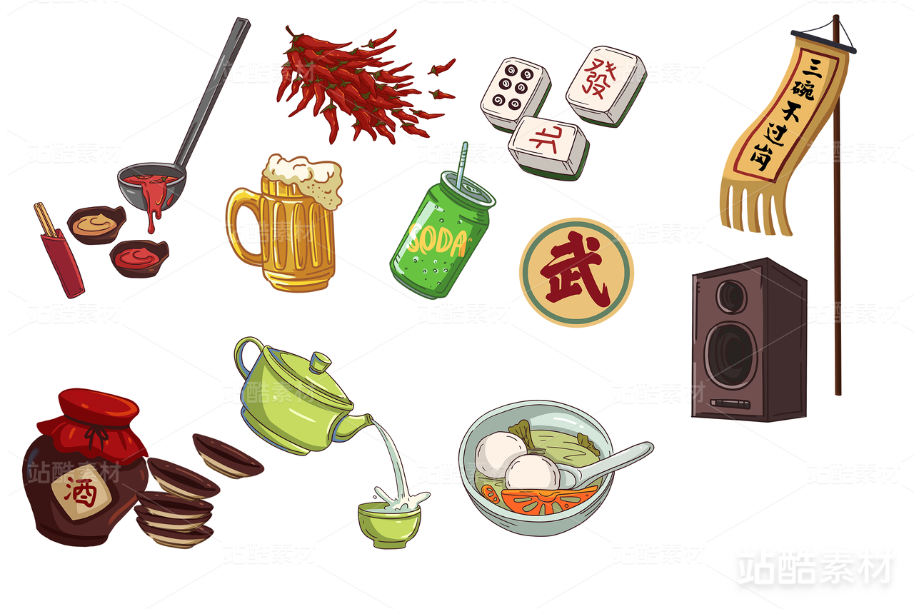
祁门,中国历史名茶。印,通常表示印章、印记。两者之间的共通性:古老、文化,符合产品形象。
标志以古老的茶壶为主体元素、直接突出行业属性,配合两个小茶杯,将原本单一枯燥的茶壶转化成了品茶、喝茶的视觉符号。加之中文字体设计,整体显得古风古韵,茶的调性很足。
同时,相比同行的一些标志,我们提取的概念并契合品牌内涵的全新视觉符号为品牌应用和传播提供了无限的可能,形成了极具代表性和识别性的品牌视觉。
-
Tips, famous Chinese tea history. Prints usually indicate seals and imprints. The commonality between the two: ancient, cultural, and product image.
The logo takes the ancient teapot as the main element, directly highlights the industry attributes, and cooperates with two small teacups to transform the original single boring teapot into a visual symbol for drinking tea and drinking tea. In addition to the Chinese font design, the overall appearance of antiquity ancient rhyme, the tone of tea is very full.
At the same time, compared with some of its counterparts, the new visual symbols that we have extracted and which are consistent with the brand's connotation have provided infinite possibilities for the brand application and dissemination, resulting in a highly representative and recognizable brand vision.


138
举报
声明
395
分享
相关推荐


评论你的想法~
表情
喜欢TA的作品吗?喜欢就快来夸夸TA吧!
推荐素材


你可能喜欢


相关收藏夹


登录注册
99+登录即可同步推荐记录哦
99+登录即可加入我的收藏
评论登录即可评论想法
分享分享