博研科技BOYAN LOGO设计

南京/平面设计师/8年前/818浏览
版权
博研科技BOYAN LOGO设计
-1-
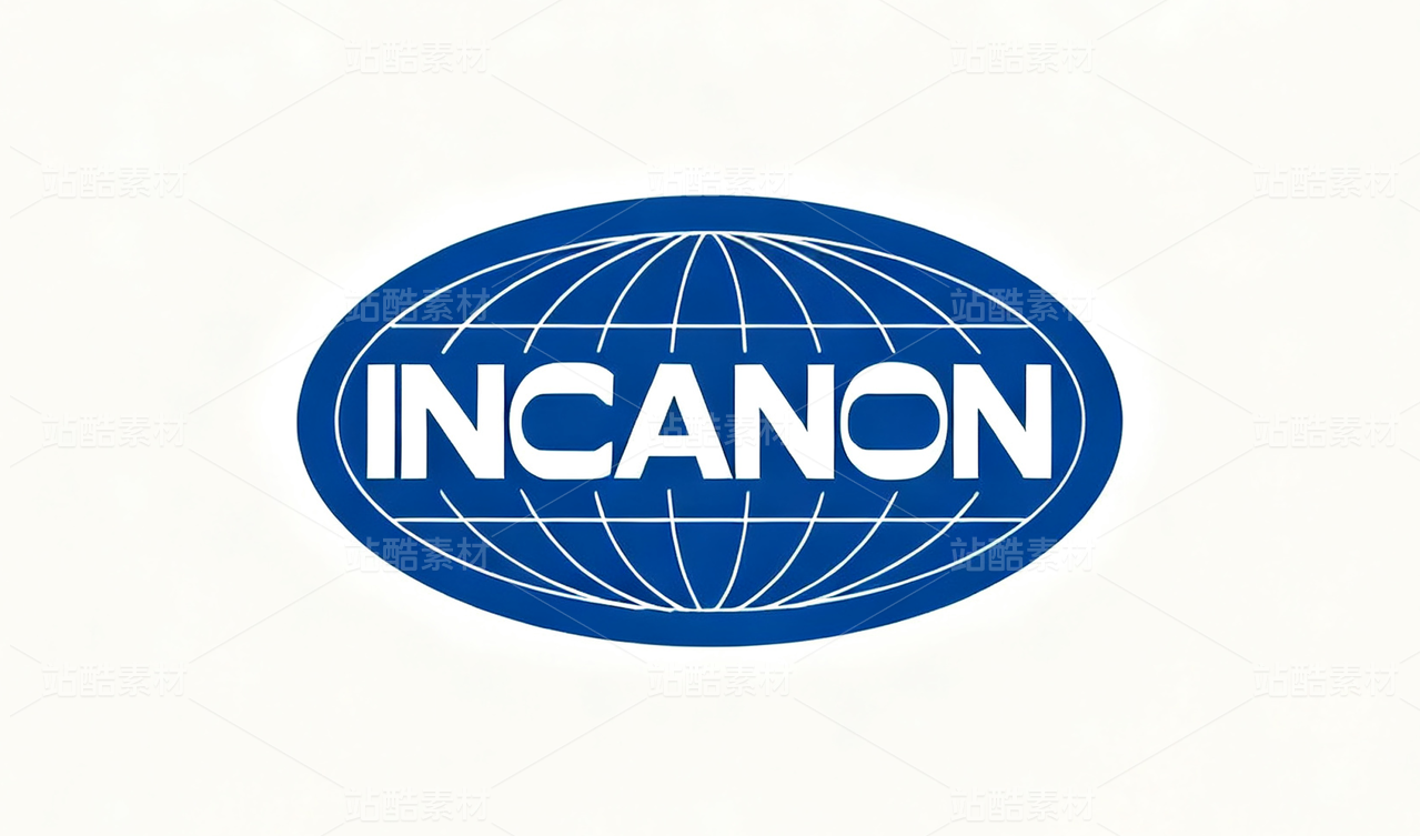
通过对企业发展,行业定位以及业务形态的了解,此款logo的设计定位是主以字母为主,中文名利为辅,突出logo的品牌感观,创造性和技术性。
Through the development of enterprises, industry positioning and business understanding of the form, this logo logo design is the main letter to the letterMain, Chinese fame and fortune supplement, highlight the logo of the brand sense, creativity and technical.
-2-
logo形体:B和Y两个字母相辅相成,形志似轨道一般,预示着企业% 展畅通阻,飞速前进。通过设计技巧,使BY的形态更似手势OK和数字八,表现出企业的服务理念越来越好,公司未来的“发发发”趋势,也体现了企业欣欣向荣,蓬勃发展的好气象。
Logo body: B and Y two letters complement each other, shaped like a track in general, indicates that the enterprise% show smooth resistance, rapid progress. Through the design skills, so that BY shape more like gestures OK and digital eight, showing the company's service concept is getting better and better, the company's future "hair issue" trend, but also reflects the thriving business, flourishing good weather.
-3-
logo颜色:此款logo采用蓝色为主色调,搭配了灰色。稳重大气,影显有力。蓝色代
表了活跃,奋进,积极向上的正能量,预示着企业文化的超前和进取。让人眼前一亮,
加深了对企业文化的更深层的了解。
Logo color: this logo with blue color, with a gray. Steady atmosphere, the film was strong. Blue generationTable active, progressive, positive positive energy, indicates that the corporate culture ahead and enterprising. Let people shines,Deepened a deeper understanding of corporate culture.


13
举报
声明
19
分享
相关推荐


评论你的想法~
表情
喜欢TA的作品吗?喜欢就快来夸夸TA吧!
推荐素材


你可能喜欢


相关收藏夹


登录注册
13登录即可同步推荐记录哦
19登录即可加入我的收藏
评论登录即可评论想法
分享分享