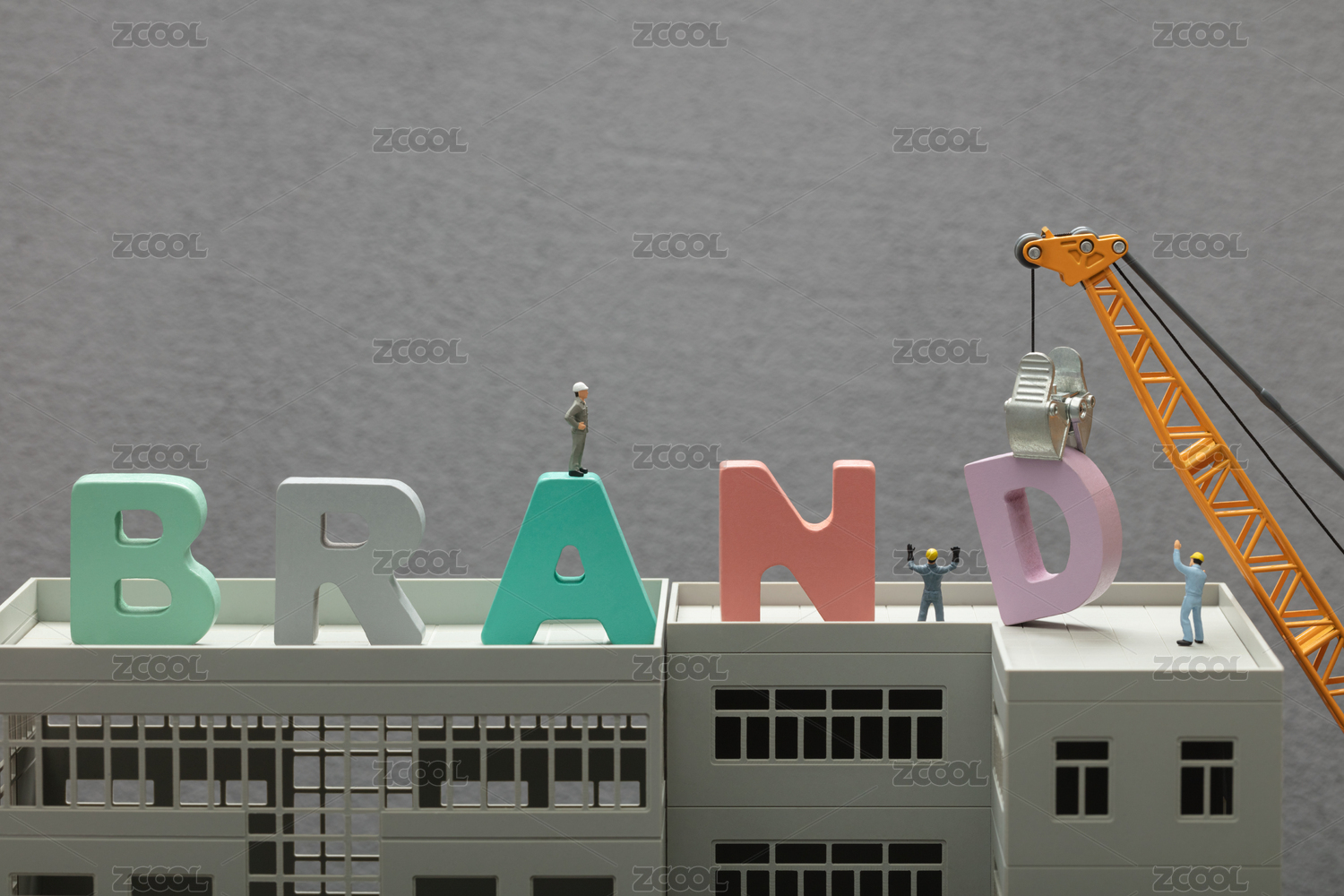
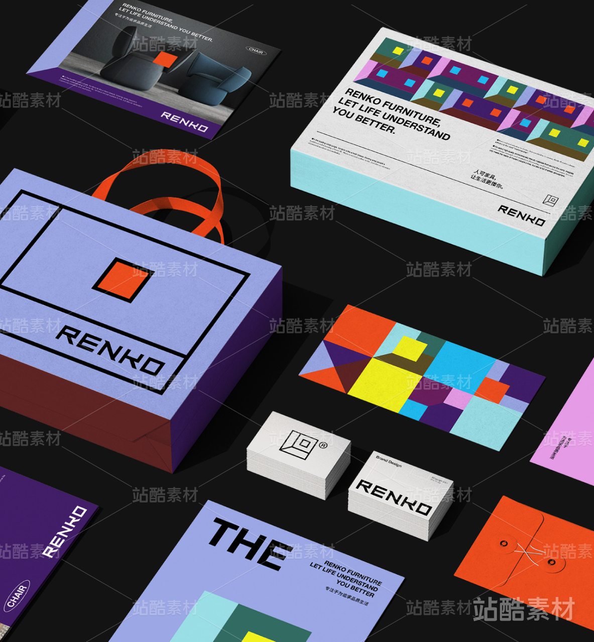
UI Branding Design


上海/设计爱好者/9年前/10245浏览
版权
UI Branding Design
Project Background
项目背景
As a company grows, it needs to respond to market changes, even in the transitions in mindset of the founder. The branding of the company needs to adapt and visually reposition itself to both business partners and consumers. This Shanghai based company has pivoted to the art industry, doing art buying, curating, exhibitions, residency programs, artists related events and collaborations.
Interestingly, the client has a different take on what art means relative to prevailing perceptions in the China market. They believe art should be accessible to everyone, regardless of age, social status, and career background. Not only for the rich and social elites. Hence UI came into being. Part of the old entity FRUIT, and placing special emphasis on this relationship and interface between, you, I and Art.
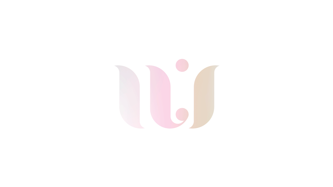
Presenting UI.
随着业务的发展、市场的改变、企业家不同人生阶段的感悟,一家公司会有转型的需求,品牌就随之重塑。客户目前在上海经营艺术相关业务,艺术品采购,策展,艺术家驻地合作项目等。
但对于艺术,尤其相对于中国这个大环境,客户有着与众不同的理解——艺术不应该有距离感,更不是有钱人才能欣赏涉及的玩意儿;艺术应该走出去接近人,无论年龄、阶层、行业。所以就有了 UI 这个名字和概念。UI 还是公司原名字 FRUIT 的一部分,而且希望在视觉呈现上焕然一新。
我们很开心介绍 UI。


Design Rationale
设计思路
The Art of U & I.
Visually, we want to express the relationship, this literal space, between you and I. Setting the brand element apart we place content in the middle. This treatment made multiple posters into a series, and brochures into contiguous pages. And this can be done ad infinitum.
Tone and manner wise, we took special care to balance the relationship between colour and white space. We meant to present a quiet confidence.
你我之间的艺术。
这是最核心的理念。在视觉呈现上,这个“之间”是最关键的,所以我们把内容放在logo品牌符号中间。这个运用有个意外的惊喜:它能够无限延伸,让海报有了系列感,折页有了贯穿。
在调性上,我们小心平衡了色彩和空白的关系。采用的渐变色是淡雅的,表现一种内敛的自信。


Like a person, a company grows, adapts, changes. Branding design needs to cater for that possibility too. The three colour tones were meant to roughly correspond to Art, Design, Event, three potential core offerings. Or it might not. And that's ok.
Branding design is a vessel, encapsulating a founder's vision, within the existing visual parameters of an industry.
Just like the shifting colours below, UI promises to become so much more. And that's our best wishes.
就像一个人,一家公司会成长,随环境改变。品牌设计也不应该是一个句号,我们需要在设计里预留这些会出现的种种可能。目前三种配色,可能会变成未来[艺术,活动,设计]三个核心业务板块。如果未来的发展不是如此,它们依然是协调、适用的。
品牌设计是一个载体,在一个行业内的符号语言里承载了企业家的愿景。
就像下面绽放的颜色,UI 的未来也会是如此绚丽。这是我们最诚恳的祝福。
116
Report
声明
110
Share
相关推荐


in to comment
Add emoji
喜欢TA的作品吗?喜欢就快来夸夸TA吧!
推荐素材


You may like


相关收藏夹


Log in
99+Log in and synchronize recommended records
99+Log in and add to My Favorites
评论Log in and comment your thoughts
分享Share