楠言网络logo设计

Shanghai/UI designer/9 years ago /502浏览
版权
楠言网络logo设计
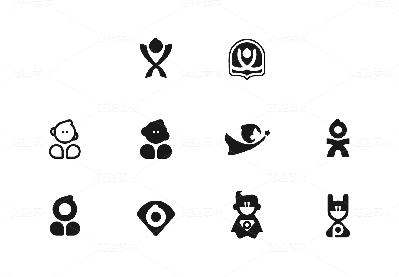
为朋友做的楠言网络标志设计,纸上打了很多草稿,原本想把logo释义为一棵吉祥楠树,但是会容易被受众理解成为保健品或者绿植企业
“楠言”取谐音为“lion”,更符合一个网络公司的初始形象。
对比呆萌的狮子,威武型的狮子更有信任感,更可靠
狮子是暖色系,但是单纯的暖色系过于金属化和强硬,添加黄色和蓝色,更显亲切。
另外一种设计方案,取自“楠”的首字母“N”,一半+一半拼合而成,通过这种契合感,传达一种合作和亲密关系。


6
创作信息
Report
声明
2
Share
相关推荐


in to comment
Add emoji
喜欢TA的作品吗?喜欢就快来夸夸TA吧!
推荐素材


You may like


相关收藏夹


Log in
6Log in and synchronize recommended records
2Log in and add to My Favorites
评论Log in and comment your thoughts
分享Share