一场与健康对话的品牌升级 | 五谷磨房品牌形象及包装设计


五谷磨房品牌形象及益生元包装推广设计

品牌背景
五谷磨房食品集团有限公司,作为天然食补谷物行业的领导品牌,在全国两百多座重点城市2000多家大型超市设立品牌直营专柜,2014年,荣获“年度市民最喜爱的快消品牌”荣誉称号。


面临问题
由于品牌个性弱,视觉传达不明显,没有自身应有的品牌独特印记。因此,为了更好地与消费者沟通,增强品牌魅力,传递品牌健康、天然、诚信、关爱的品牌价值理念,需要有全新的品牌形象以及包装设计来承载品牌背后的理念。


品牌形象设计理念
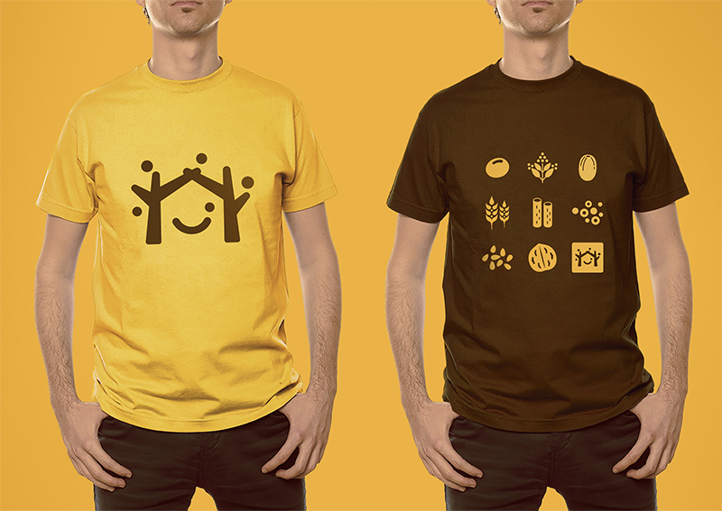
为解决五谷磨房原有品牌形象面临的问题,全新的logo采用图形标加中文字的组合形式,Logo的整体设计简单而富有亲和力。品牌形象设计由五颗谷粒以及两棵枝丫相连的树围绕着微笑的符号展开,如同父母牵手为家人搭起一个充满欢乐的家,传递的是关爱与呵护的品牌愿景,同时也寓意着企业的不断成长,以及“以人为本”的经营理念。




产品包装升级
随着品牌形象的更新,五谷磨房的明星产品“益元八珍”包装也全面升级,更名为“植物益生元八珍”,为了更好地将五谷“天然、健康、养元、产品材料多元化”的概念与设计相结合,包装画面采用健康天然的五谷原材料,搭配绿色生态的颜色组合,使包装整体视觉呈现清新自然,终端陈列上与周边产品相比,色彩突出,品牌整体调性表现充分。益元八珍产品新包装一经上市,月销售额突破3000万元,并赢得一致好评。


五谷伴侣
五谷伴侣作为搭配食用产品,设计思路以展现“原料新鲜健康、口感丰富美味”为主,通过增强整个系列的食欲感来提升消费者购买量。在视觉表现上,形成固定的构图属式,整体包装风格延续益元八珍清新自然的风格。


五谷专研系列
“五谷专研系列”主要针对年轻女性做的一款高端产品,画面以粉色为主,衬托年轻女性对美的高度追求,同时原材料的视觉处理也表现极为精致,与产品本身定位高度契合。


春节礼盒装
“春节礼盒装”以迎合中国传统春节气氛而设计,整体画面设计也以烘托原材料的健康天然为主,同时增加礼盒元素的设计,使其节日氛围更为凸显。


食材原料包
“食材原料包”主要采用透明食材材质,目的是为了更大面积向消费者展示原材料。综合谷物色彩特征,外包装色彩与谷物色系保持相对一致性,同时运用品牌图标的元素构图,使其更具整体性。


空间精品展柜设计


Brand Image of WU GU MO FANG and Packaging Design of Prebiotics
Brand Background
As a brand leader in natural dietetic grain business, WU GU MO FANG has established more than two thousand stores in around two hundred cities nationally. In 2014, it won the title of “Citizen’s Most Favorite Fast Moving Consumer Good.”
Challenges
Due to the weak brand characteristics and the unclear visual communication, the brand lacks its unique quality. Therefore, in order to better communicate with the consumers, to increase the brand attraction, to deliver the brand value of health, nature, honesty and care, a new brand image and a series of packaging designs are needed to inherit the ideas behind.
Design Principles of the Brand Image
To overcome the challenges that the current brand image faces, the new logo is concise, welcoming and approachable, combining an icon and Chinese characters. The brand image consists of five seeds of grain and a smiling face embraced by two branches, as if parents hold up a joyful house for the family. It delivers a branding vision of love and care, implying the continuous growth of the company and the management philosophy of “human-oriented.”
Product Packaging Upgrade
Along with the upgrade of the brand image, the star product of WU GU MO FANG - Yi Yuan Ba Zhen - improves its version, renamed “Natural Prebiotics & Grains.” To better incorporate the design with the concept of “Nature, Health, Nutrients and the Variety of Product Ingredients,” the packaging makes use of the five natural grain ingredients, together with the ecological color of green. The packaging shows a vision of freshness and nature. Comparing to the neighboring goods on the product shelf, the packaging color stands out and the brand tonality is fully expressed. After “Natural Prebiotics & Grains” came into market with its new packaging, the monthly sales reached 30 million RMB, and won unanimous praise.
Grain-Mates
Grain-Mates are to be mixed with other grain products. The thoughts of the design reflect the main concept of “healthy ingredients and pleasant taste.” It aims to increase the purchase amount by improving the appetite it appears. On visual performance, it creates a solid composition and continues the fresh and natural style of Yi Yuan Ba Zhen’s packaging.
WU GU Special
“WU GU Special” is a series of high-end products designed mainly for young women. The packaging uses a pink color tone to imply their pursuit of beauty. At the same time, the visual effects of the raw ingredients are extremely delicate, corresponding to the product positioning.
Spring Festival Gift Set
“Spring Festival Gift Set” is designed to celebrate the traditional Chinese Spring Festival. The graphic design sets the natural healthy feeling with raw ingredients. It also uses gift sets as components to highlight the atmosphere of holiday.
Ingredient Pack
“Ingredient Pack” uses transparent packaging to deliver the quality of the raw materials to consumers. Apply the colors and features of the grain, the packaging preserves the same color tone. Some of the elements from the brand icons are also integrated within the packaging to complete the entire design.
本文为靳刘高设计原创
如需转载,请联系后台
更多资讯可关注
微信公众号 / 新浪微博同名
@靳刘高设计