2017-2018年国际标志趋势 | 2017-2018 logo trends
在这个后工业时代,各种咨询技术产品都迭代得如此之快,我们只有掌握最新的动态,最能掌握主动权和话语权!
点击OMG设计,关注这个以中国、日本、台湾、香港设计为主导,网罗亚洲最具禅宗美学的案例,以品牌、餐饮、包装、建筑、服装、视频美学案例为主,每天学习一些,汲取美学涵养/ 《OMG設計》每日推送亚洲最新的设计艺术值得你欣赏关注。
这是第十五届“LogoLounge趋势报告”,而且在过去十五年里,一切都没有改变。
当然,这份报告的深度越来越强大,因为这个详尽的评估包括去年向LogoLounge.com提交的超过25,000个标志的字面评估。
今年的趋势并不是作为我们去年注意到的事情的延续和演变的一个启示 - 这不是一件坏事。我在今年的标志中注意到了三个设计基准:
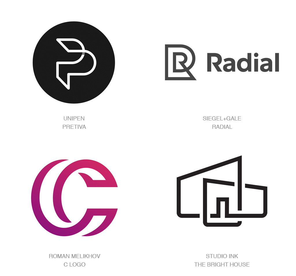
去年,简约统治了这个栖息地,而且依然如此。我们还是在这个时期出来,说摆锤几乎没有动摇。简单的形状,线条,类型和形式可以收敛或独奏,以创建易于解释的坚实,持久的标记。如果有什么,我们开始看到一些上升,更多地关注去年我们正在看的那些真正简单的元素。
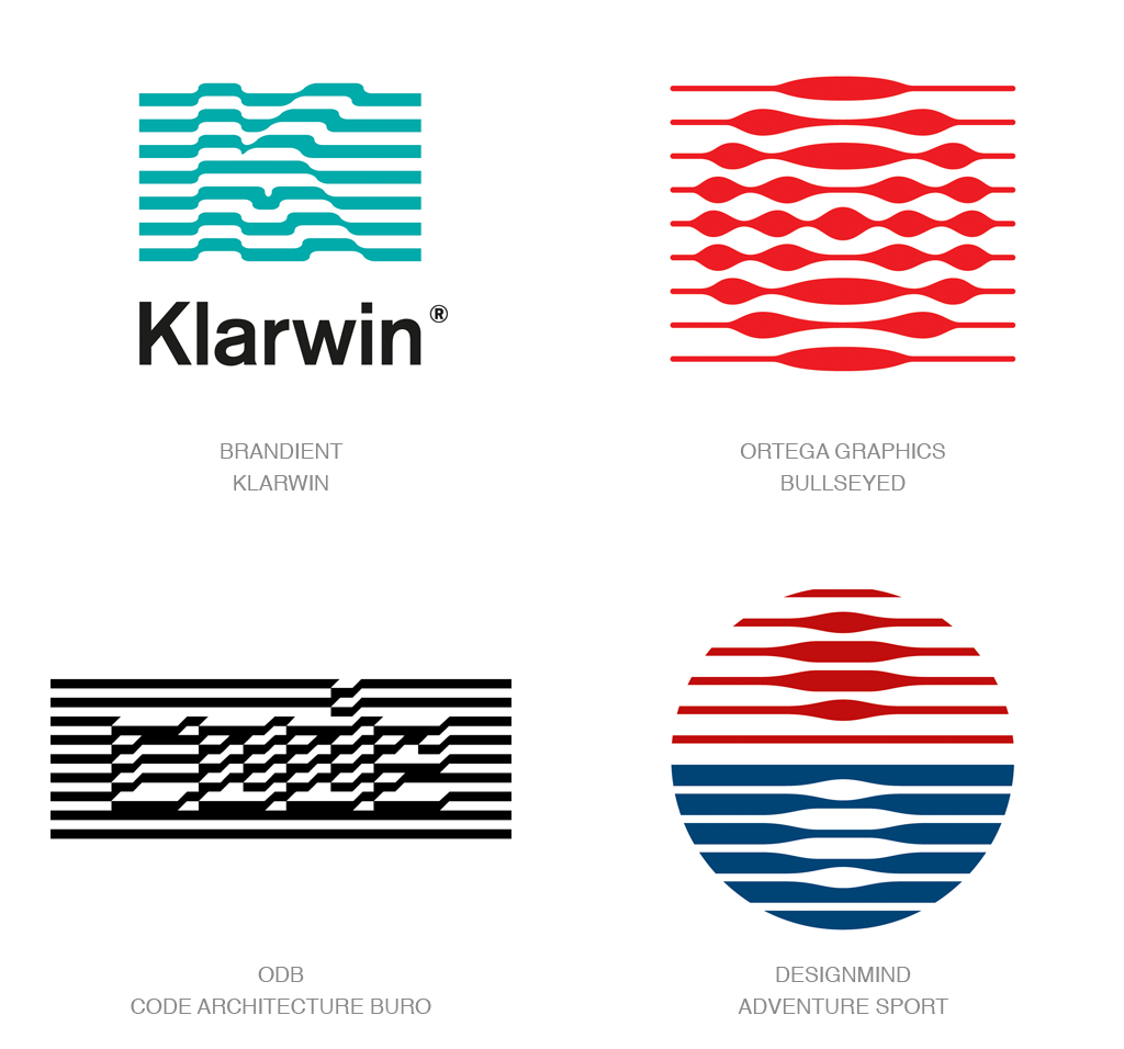
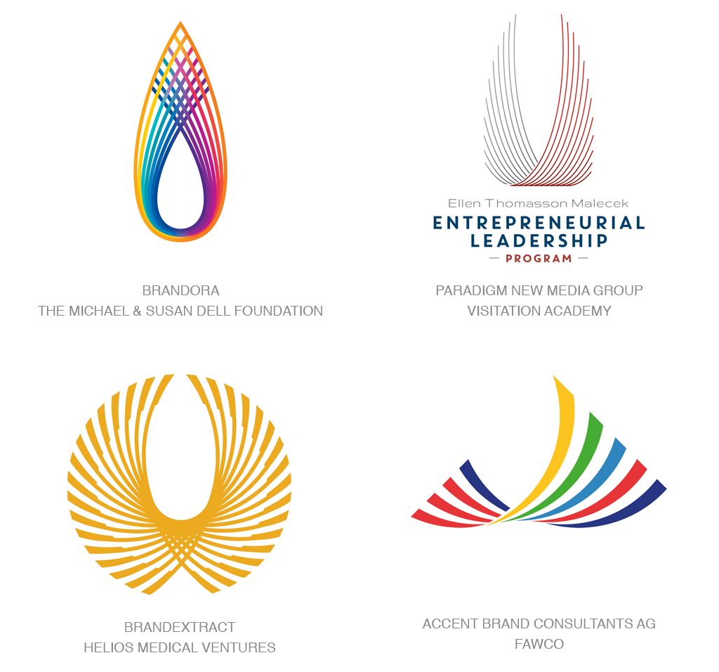
条纹已经出现了大量的丰富,被用于同心圆,字母和图案,以表示运动,如人字纹,曲折和波浪。
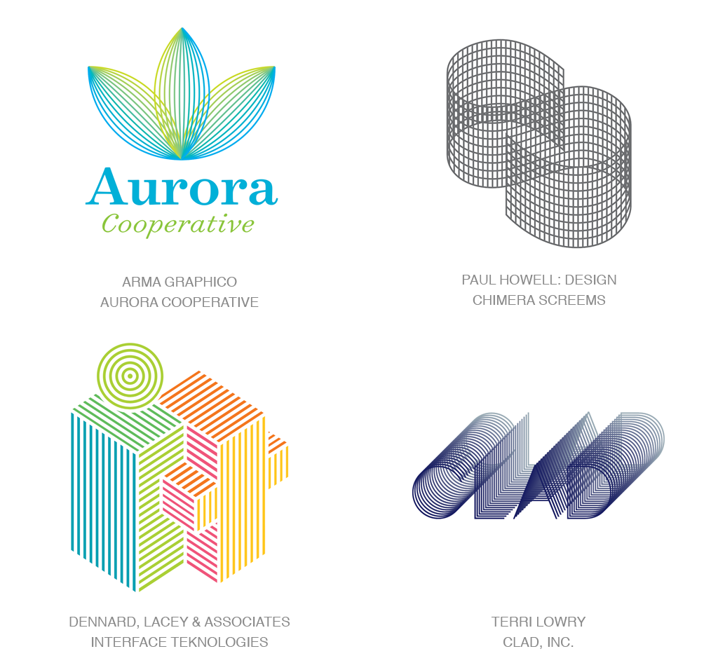
几何真的来了。通常使用单分子形成多维标志的几何形状和形式是普遍的。
当您开始思考趋势时,它必须是一个真正相关的,有用的工具,让设计师继续使用它十年。透明度和单晶是一些由于持续发展而长期存在的趋势。每次我觉得他们死了,他们继续发芽;他们推出新的根源,还有别的东西绽放。这很酷,因为它显示了设计师没有自满。他们试图找到新的方法推动它,这是应该发生的。例如,Michael Bierut和Pentagram通过回到纯粹的透明覆盖层并摆脱了中间的条纹元素来改变了MasterCard标志。通过放置一个圆圈,你会看到强度增加。对我来说,这是十年前我可以轻而易举地报道的一个趋势,但现在它更复杂,带来了新的相关性。
我们还会在电影,广告,电视节目和其他媒体的其他设计领域,如时尚,耗材,运动图形等方面。将这些领域的概念转移到身份设计中并不罕见。例如,苹果目前正在为苹果贴纸运行商业广告。它基本上是一个准备的表情,是苹果独有的。他们聘请了一系列设计师和插画师来创建这些苹果贴纸。当你看着他们,你可以看到他们将如何转化为身份设计。在同一个商业广告中,您会注意到苹果标志的动画与彩色系列的高色度的颜色,从苹果的中间爆发。我们很快会看到很快翻译成标志设计。
另外发生的一个事情就是在波尔卡圆点,波浪线,棋子,条纹和其他图案等旋转场中进行交易的标志。设计者将它们放置为静止图像或偶尔使用动画将图像移入和移出标记内部。这不是一个新的想法,而是随着牵引而回来。
这是我们开始看到使用无人机作为设计元素的标志的第一年。这很有趣,但可能很短暂。我想象,无论是好是坏,我们会看到更多的这个,因为无人机变得越来越主流,就像游戏控制器在短暂的时间内成为一个设计工程。
引起我注意的其他事情,但还没有为趋势标签做好准备:
轨道上有小球的轨道。想到原子卫星环。
高度几何的动物,由圆形和正方形和其他简单的几何构成
Monoline标志出现在柔和的色彩上
消耗痕迹四五个小笔画从顶部出来表现出压力或努力。
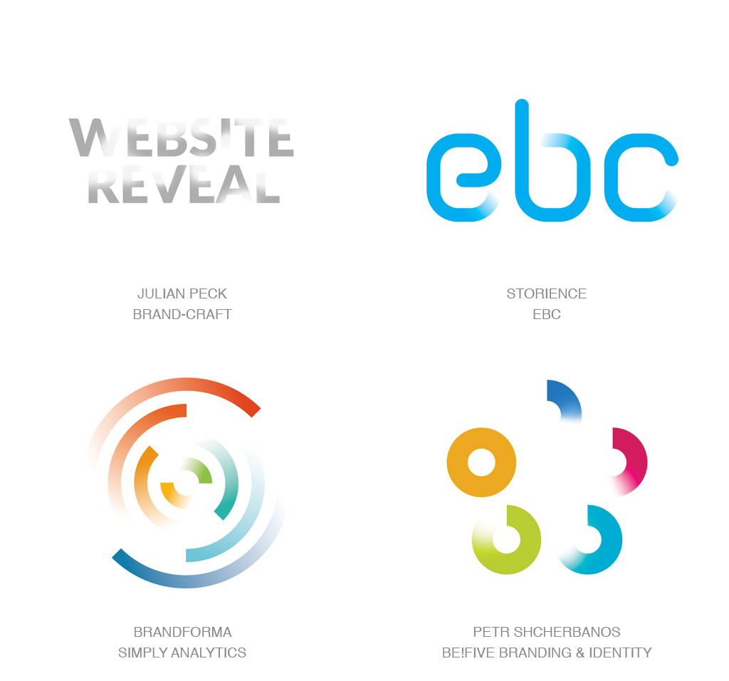
步骤,这是去年“Ombré”趋势的连续体,除了使用渐变色彩而不是元素。
胖线。我们以前看到的很多真正薄的单晶材料正在放一些,并且采用更少的线。
I can’t believe it, but this is the 15th LogoLounge Trend Report, and nothing yet everything has changed in the last decade and a half.
Certainly, the depth of this report has grown more robust as this exhaustive review included the literal evaluation of just better than 25,000 logos submitted over the last year to LogoLounge.com. In addition, we continue to review all major brand identity shifts of note introduced worldwide. If it happened during the last 12 months, it hit our Trend Report radar.
We usually look for nuances or progressions of past trends to try and identify where things are going. Trend cycles that used to run in 30-year chunks are now cycling through at half that rate, if not less. As designers, we’re burning through ideas rapidly, and we’re learning that there’s a cap to all of this— there are a limited number of ideas out there, which is why we see things that peaked ten years ago coming back, but with a fresh coat of paint.
This year’s trends weren’t so much a revelation as a continuation and evolution of things we noticed last year — which isn’t a bad thing. There are three design baselines I noticed in this year’s crop of logos:
Last year, simplicity ruled the roost, and it still does. We’re still coming out of that period, and it’d be fair to say that the pendulum has barely moved. Simple shapes, lines, type, and forms either converged or played solo to create solid, lasting marks that are easily interpreted. If anything, we’re starting to see a bit of an upswing with more attention given to those really simple elements that we were looking at last year.
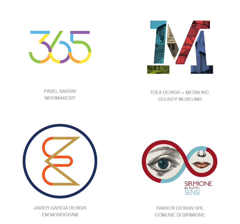
Stripes have appeared in massive abundance, being used in concentric circles, letterforms, and patterns to indicate movement, like chevrons, zig zags, and waves.
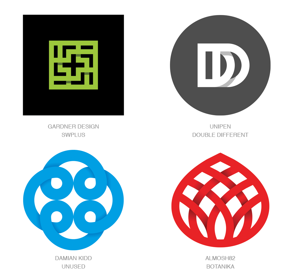
Geometry is really coming in to play. Geometric shapes and forms that create multidimensional logos, often using monolines, were prevalent.
打破阴影 | Shadow Breaks
渐变色 | Fades
raising color | 颜色上升
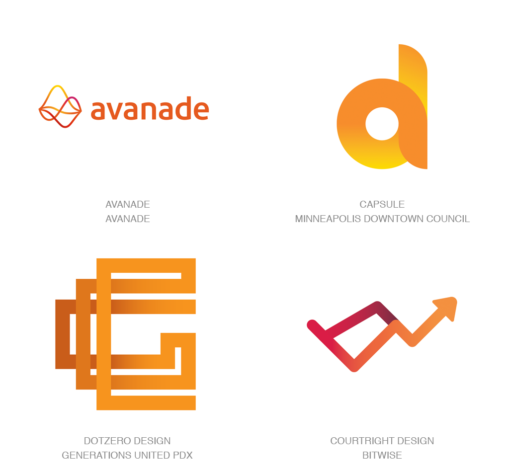
简单 | simplicity
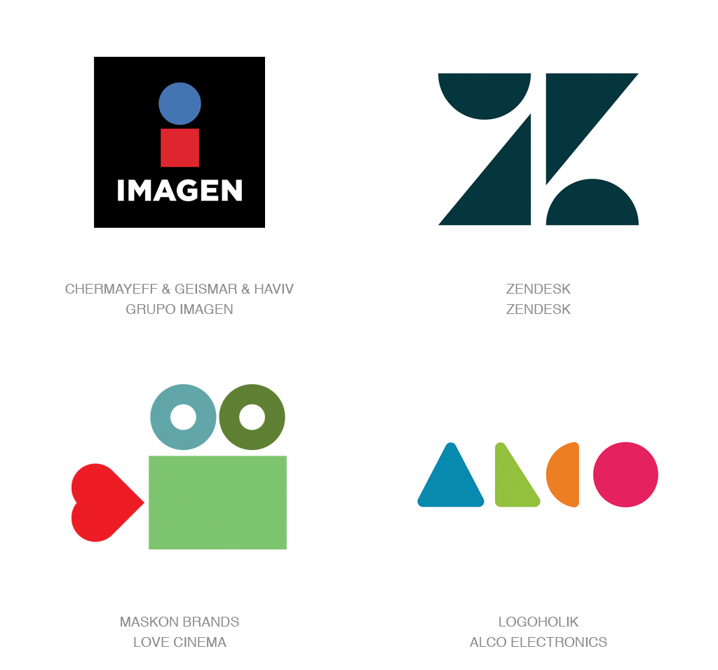
简单叠加 | Simple Overlays
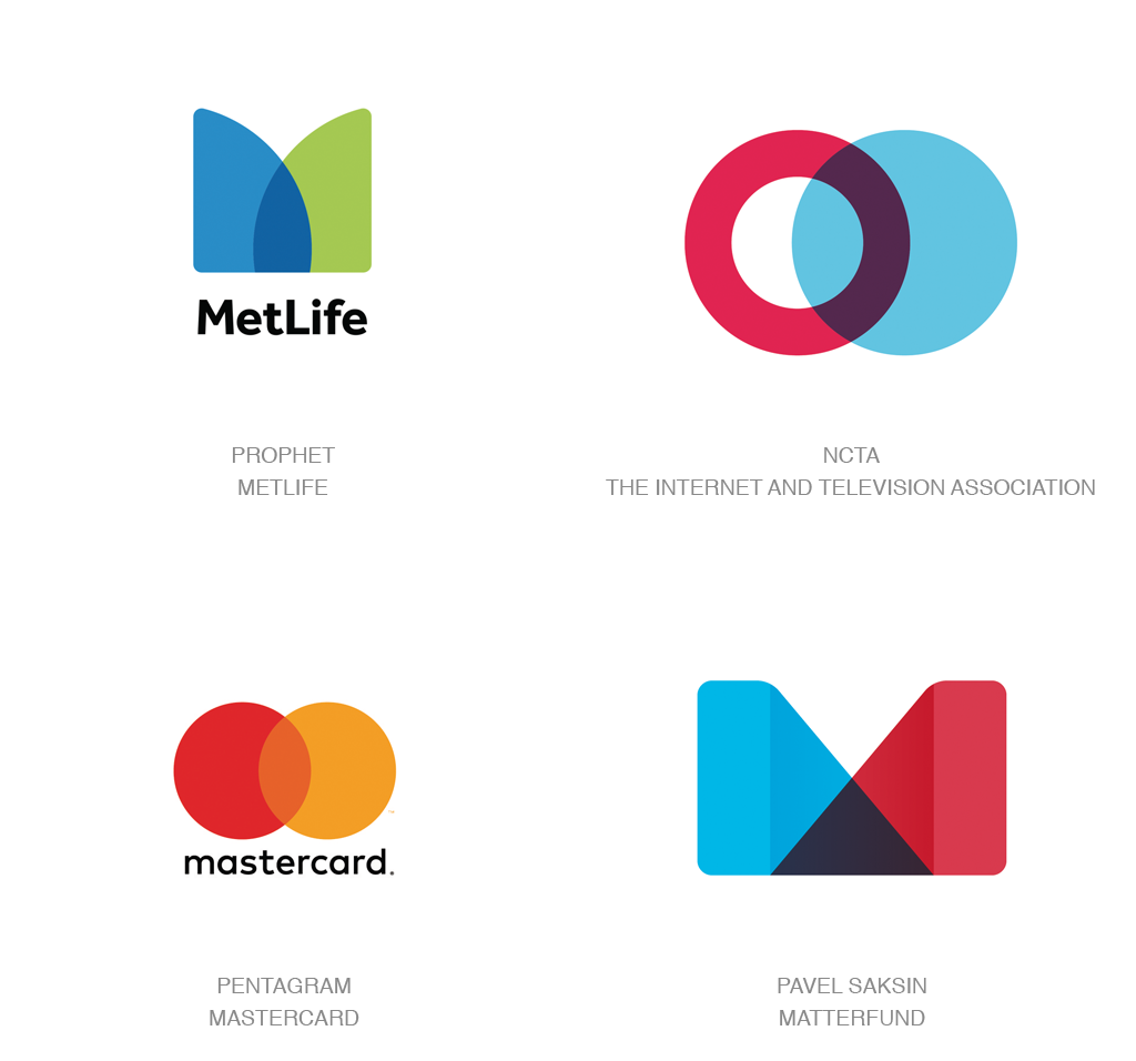
多中心 | MultiCentric
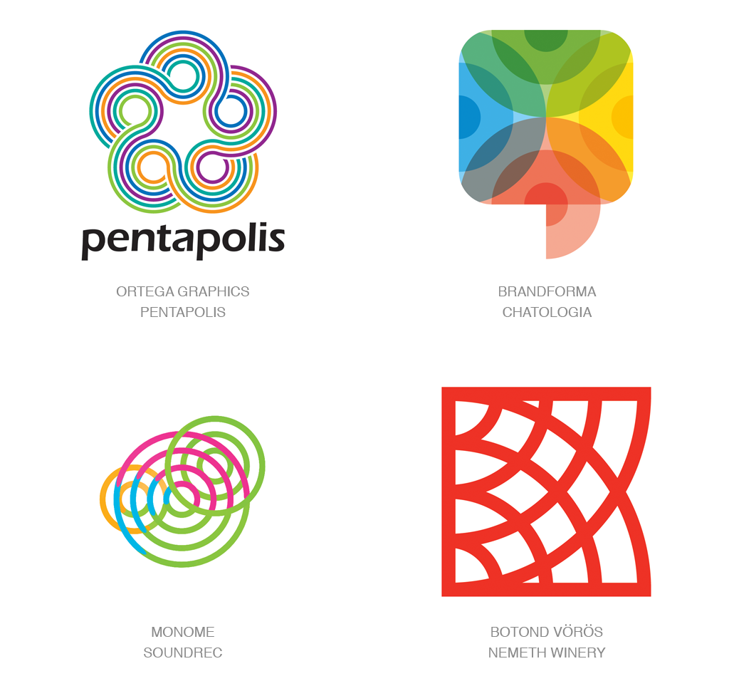
Ellipses | 省略号
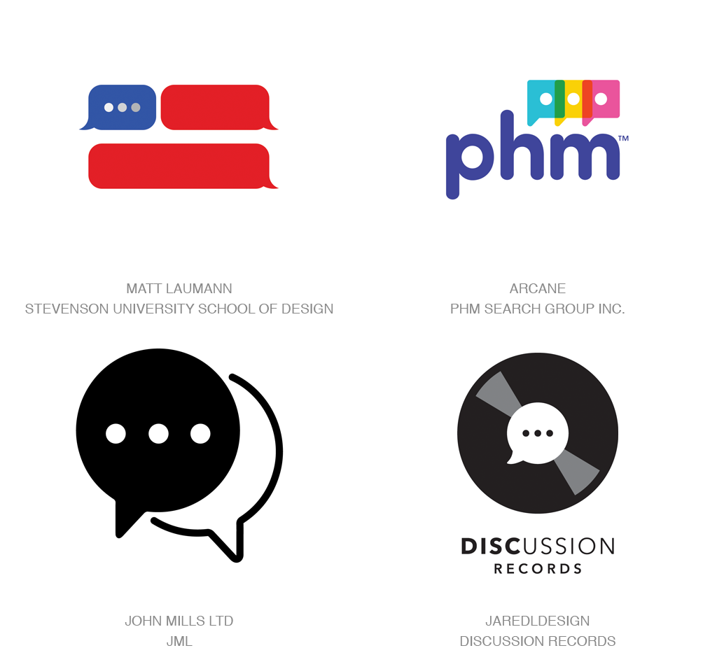
Text Boxes | 文本框
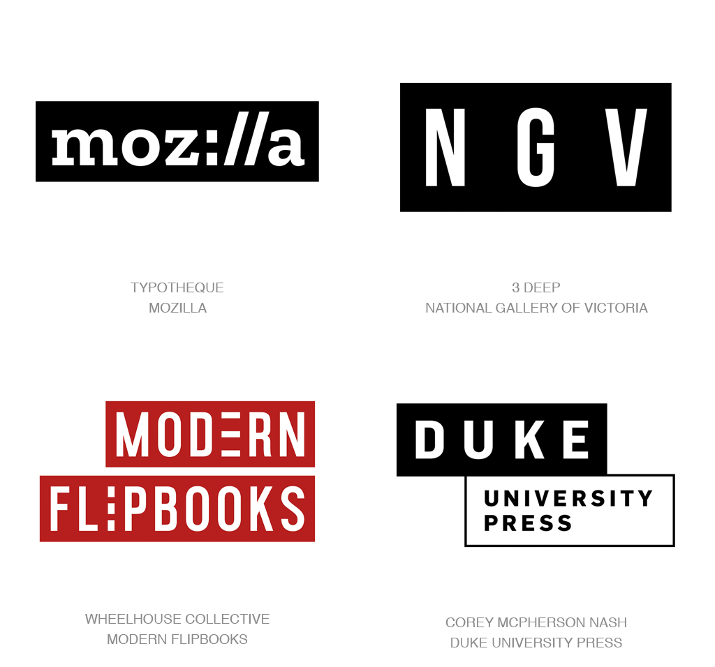
yin yang | 阴阳
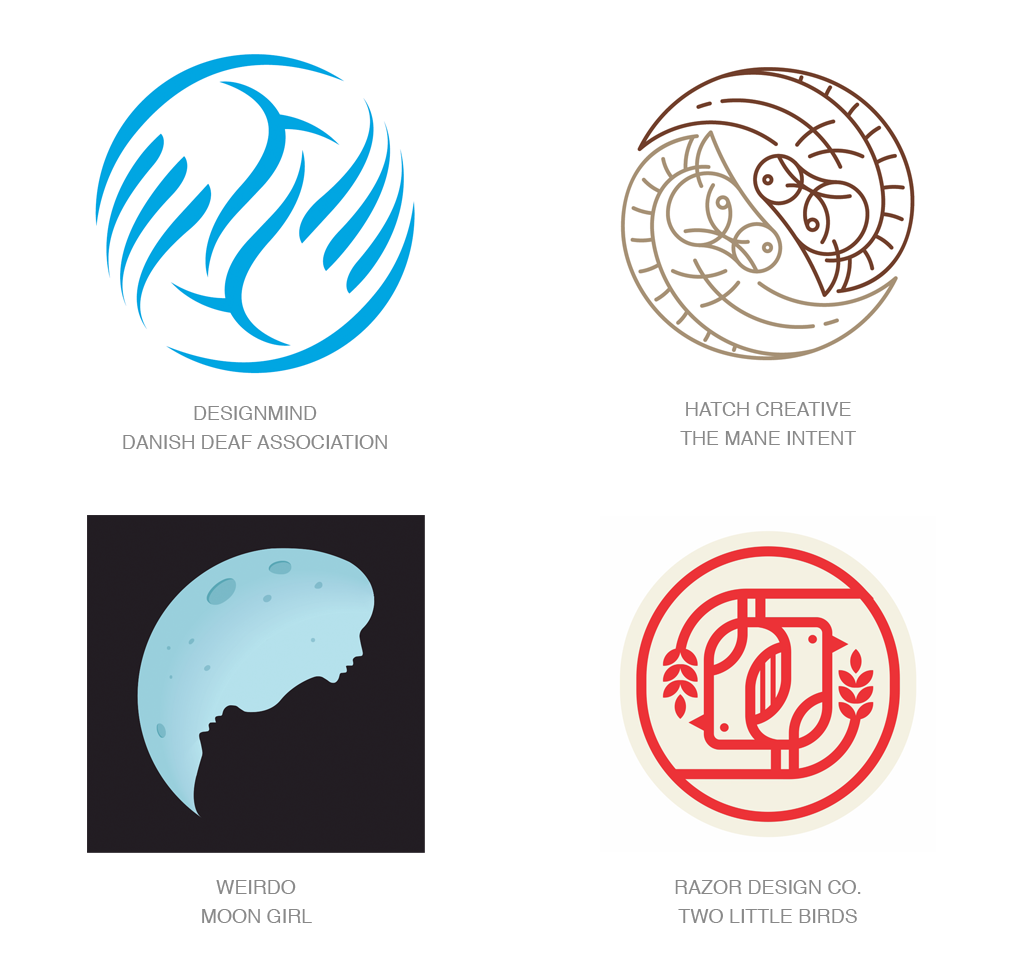
Pasta Bends | 面弯
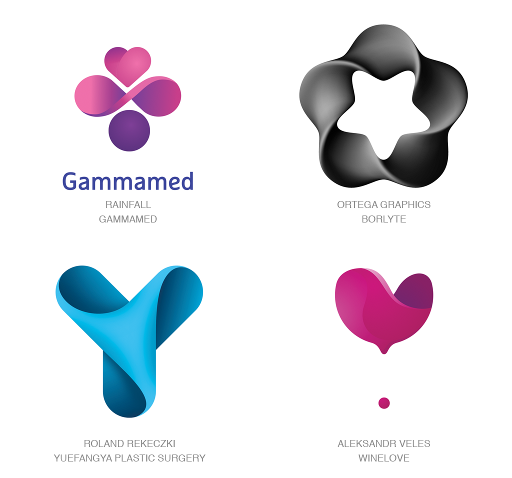
Wrapped | 包裹
Micro Lines | 微线
Doubles | 双叠
Wings | 翅膀
Color Split | 颜色分割
关注禅宗美学《OMG設計》微信公众号/每日推送 亚洲 最新的设计艺术欣赏