【外文翻译】系统图标设计指南

翻译自 Google Material Design 官方指南,直接挑干货,有能力的同学建议看英文原版。
设计原则 / Design principles
使用较粗的几何线条。
图标独特的品质依赖于对称性与一致性,且须兼顾鲜明和简洁。
Shapes are bold and geometric.
Symmetry and consistency of shapes give the icons a unique quality, while keeping them simple and bold.


简洁 直观


可操作 一致
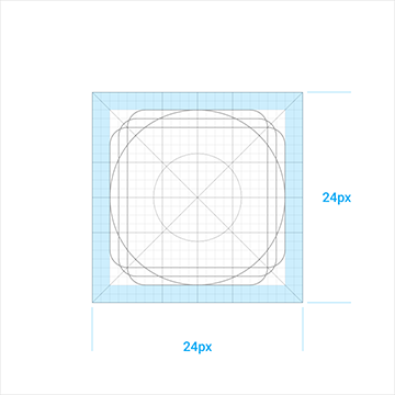
网格、比例与尺寸 / Grid, proportion, and size
DP单位网格 / DP unit grid
系统图标以 24dp 的尺寸显示,当创建图标时,以能够 100% 的精确像素缩放设计图标是非常重要的。
System icons are displayed at 24dp. When creating icons, it's important to design at 100% scale for pixel-perfect accuracy.
When the mouse and keyboard are the primary input methods, measurements may be condensed to accommodate denser layouts.
For dense layouts on desktop, icons can be scaled down to 20dp.

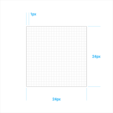
100% 缩放 800% 缩放
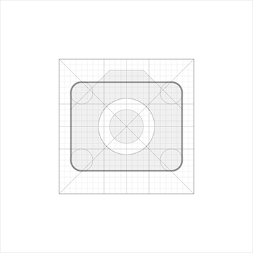
图标网格 / Icon grid
图标网格已经形成一致的标准,且建立起统一元素放置的规范。此标准化带来了一个富有弹性而连贯的系统。
The icon grid has been developed to facilitate consistency and establish a clear set of rules for the positioning of graphic elements.
This standardization results in a flexible but coherent system.
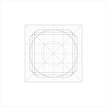
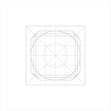
图标网格 关键线
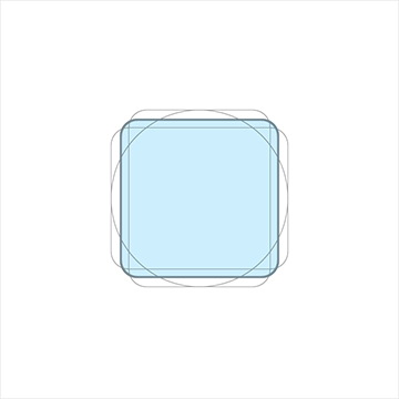
内容区域 / Content area
内容应该保持在活动区域以内。
The content of an icon should remain inside of the live area.

活动区域 / Live area 留白区域 / Padding
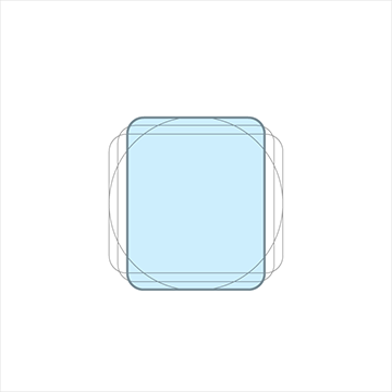
关键线形状 / Keyline shapes
关键线形状是网格的基础,通过关键线,即可保持系统图标的一致性。
Keyline shapes are the foundation of the grid.
By using these core shapes as guidelines, you can maintain a consistent visual proportion throughout the system icons.
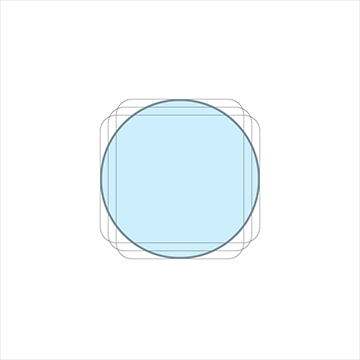
方形 宽&高:18 dp 圆形 直径:20 dp
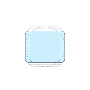
竖直矩形 高:20 dp, 宽:16 dp 水平矩形 高:16 dp, 宽:20 dp
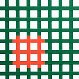
几何 / Geometry
我们为这几种特定的关键线制定了预设规则:圆形线、方形线、矩形线、正交线和对角线。
这个通用且简洁的元素调板形成的目的是统一 Google 系统图标和规范它们在网格上的布置。
Preset standards have been determined for specific keylines: circle, square, rectangle, orthogonals, and diagonals.
This small palette of universal and simple elements has been developed to unify Google system icons and systemize their placement on the icon grid.

构造 合成
系统图标剖析
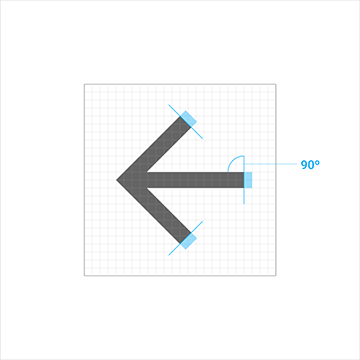
角
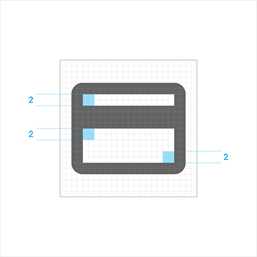
一致的圆角半径(2px)是统一全系列系统图标的关键,不要修改它。
图标内部的角应为直角,也不要修改它。
Consistent corner radiuses are key to unifying the overall system icon family.
A 2dp corner radius is used on the silhouette form of the icon. Do not round the corners of strokes (shapes 2dp wide or less).
Interior corners should be square. Do not round the corners of interior shapes.
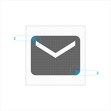
外部的角 内部的角
笔触
一致的画笔宽度(2px)也是统一全系列系统图标的关键,请在内外部的边角上保持使用2px的宽度。
Consistent stroke weights are key to unifying the overall system icon family.
Maintain a 2dp width for all stroke instances, including curves, angles, and both interior and exterior strokes.
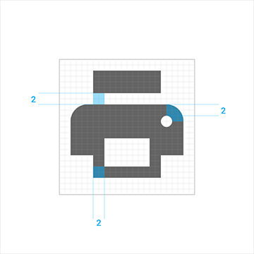
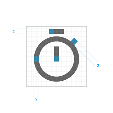
一致性 曲线和角
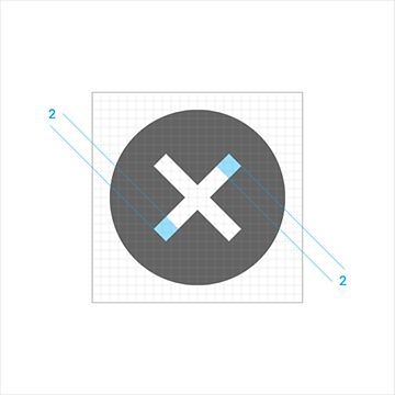
笔触端点 内部角

![]()