【外文翻译】产品图标设计指南

翻译自 Google Material Design 官方指南,直接挑干货,有能力的同学建议看英文原版。
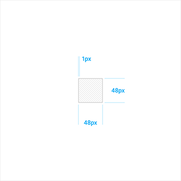
产品图标-图标网格-关键线形状 (单位: dp) / Product icons - Product icon grid - Keyline shapes
关键线的形状是网格的基础。利用这些核心形状做为向导,可让所有相关产品的图标保持一致的视觉比例。
Keyline shapes are the foundation of the grid. By using these core shapes as guidelines, you can maintain a consistent visual proportion across related product icons.
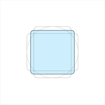
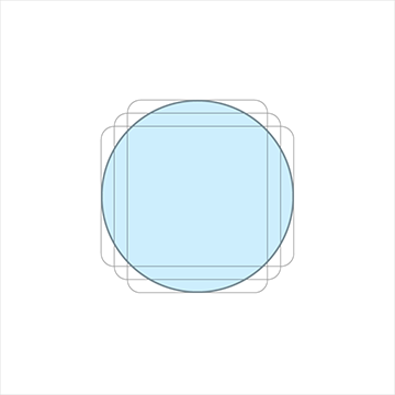
方形 高&宽: 152 圆形 直径: 176
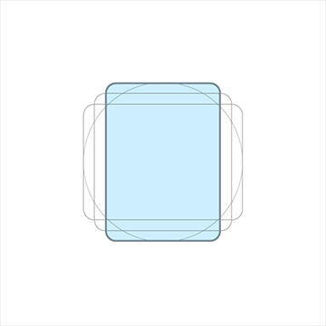
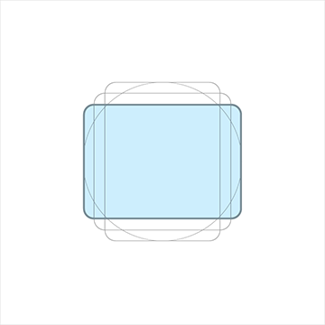
竖直矩形 高:176 宽:128 水平矩形 高:128 宽:176
DP 单位网格 / DP unit grid
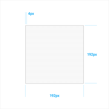
1:1 单元网格 4:1 单元网格
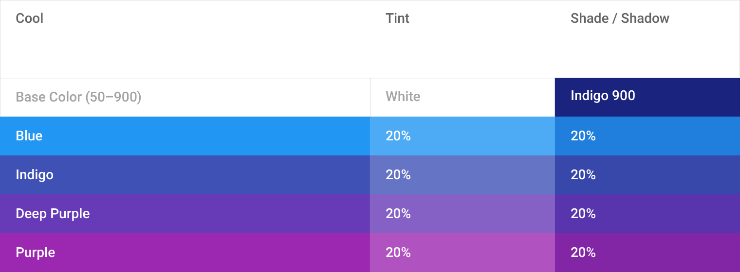
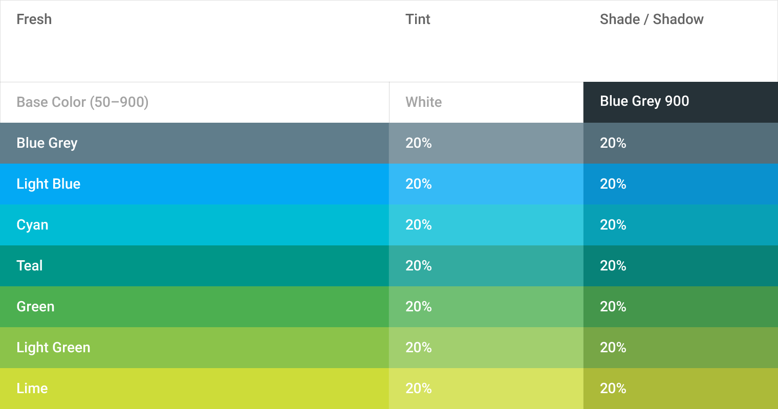
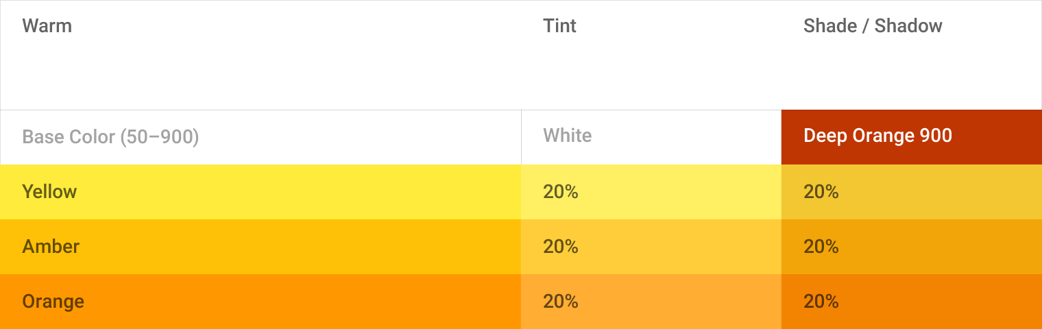
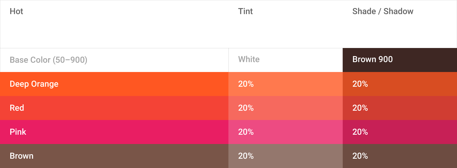
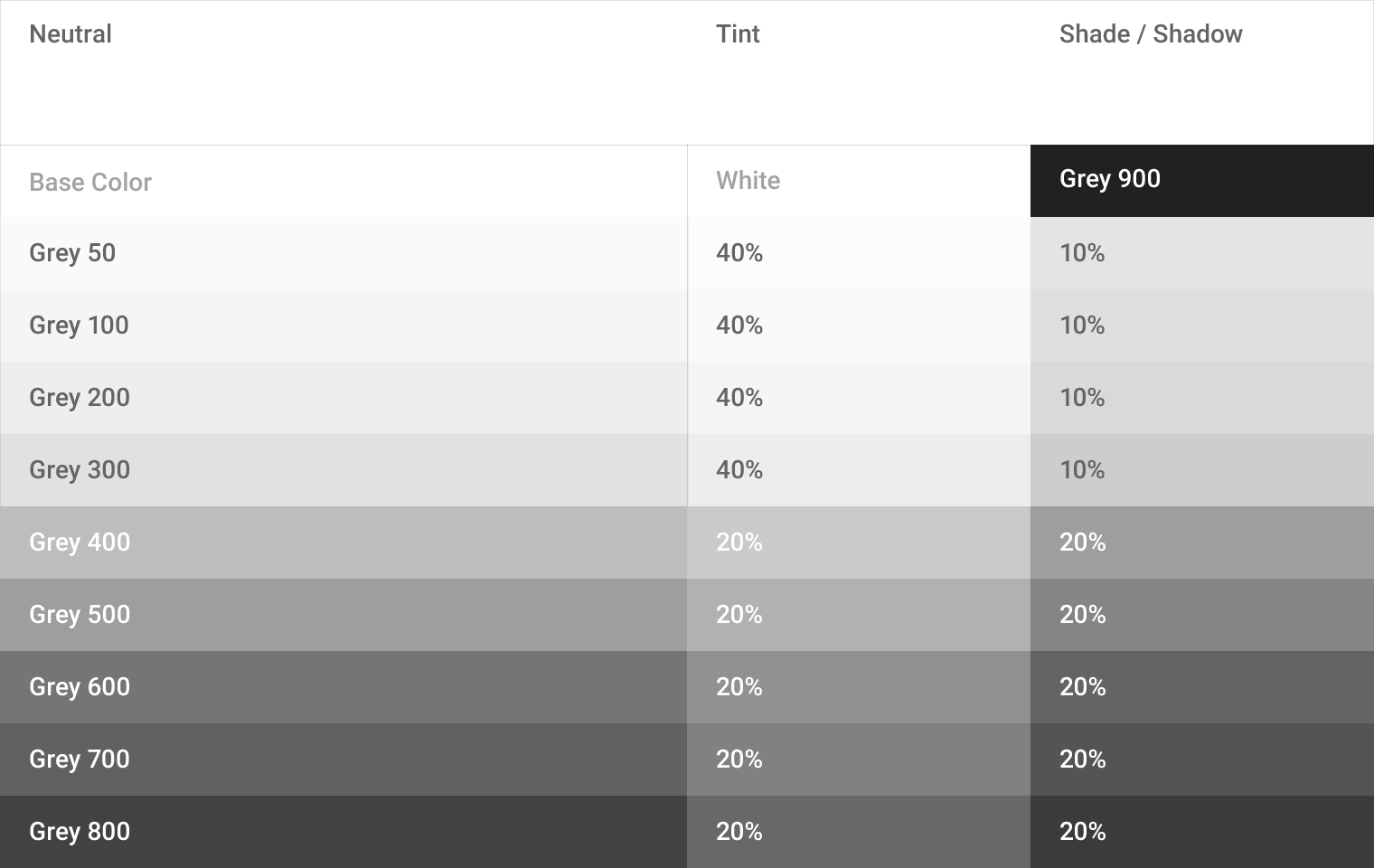
参考颜色,暗度和阴影值 / Tint, shade, and shadow values
产品图标模式 / Product icon patterns
颜色 / Color
让色彩平铺在平面上,不要装饰边角和阴影。
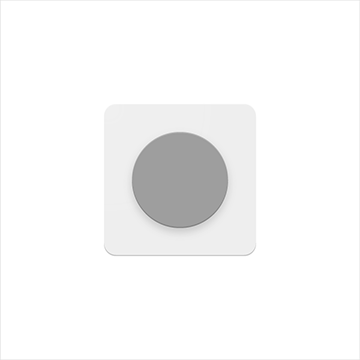
可取 不可取
图层 / Layer
每层元素都有深度,边角和阴影,当心元素层级不要太多,图标太过复杂会丧失重点。
Layered paper elements create depth, having edges and shadows.
Be cautious with the quantity of overlapping surfaces.
Having too many complicates the icon and lacks focus.
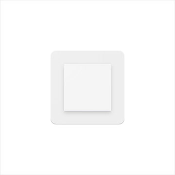

可取 不可取
提升 / Elevate
提升一个关键元素到背景的上方,使其成为关注重点。不要让提升的元素被切分。
Elevating a key material element atop a simple background silhouette focuses attention to the center.
Don’t crop elevated material elements within another shape.


可取 不可取
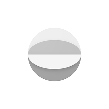
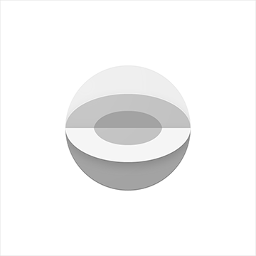
划线 / Score
划线可以制造层次感而不破坏图形。划线应放在对称中心。不要用多条划线或是偏离中心。
Scored material elements have the illusion of depth without losing their geometric form.
Scores should be centered on symmetrical shapes.
Don’t use multiple scores, or position a score off-center.


可取 不可取
折叠 / Fold
被伸拉的折叠元素会更加立体,但斑点色应避免使用,会导致关键元素扭曲改变。
Folded material elements are skewed, having greater dimension.
Spot colors should be avoided, so as to avoid altering or misrepresenting key elements.
可取 不可取
重叠 / Overlap
重叠的元素创造出独特的剪影,但边缘和阴影仅限于轮廓的内部。不要使用超过两个以上的重叠,会导致图标太复杂,缺乏重点。
Overlapped material elements create unique silhouettes. All elements, edges, and shadows are confined to the interior of the silhouette.
Don’t exceed more than two overlaps. Having too many complicates the icon and lacks focus.


可取 不可取
手风琴 / Accordion
手风琴式折叠的元素由两个折叠的元素相接而成,用来增加单个元素的尺寸。不要使用超过两个以上的手风琴式折叠,会导致图标太复杂,缺乏重点。
Accordion folded material elements are adjoined by a connecting fold, used to add dimension to a single material element.
Don’t exceed more than two accordion folds. Having too many complicates the icon and lacks focus


可取 不可取
扭曲 / Distort
产品图标应保持原有几何形状,永远不要扭曲,旋转它。
Product icons should never be distorted or transformed.
Elements should remain in their geometric form, and not be skewed, rotated, bowed, warped, or bent.
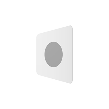
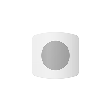
不可取 不可取