设计原则| iOS 人机交互指南解析

关于iOS人机界面指南(Human Interface Guidelines,简称HIG)和Ant Design的设计语言的解读
最近两个月一直在研究iOS人机界面指南(Human Interface Guidelines,简称HIG)和Ant Design的设计语言。
起因是因为团队内部设计师比较多,不同的设计师负责不同的业务,
各设计师想法又不一样,所以导致同一个产品的同类控件交互规则却不一致。
为了达到产品交互方式规范统一,提升设计和开发效率的目的。充分了解交互设计规范是很有必要的。
读完之后醍醐灌顶,脑袋里面之前模模糊糊的一些东西突然一下变得格外清晰。
因为HIG是全英文的,语言表达上也比较偏技术,
本着科学严谨的态度,我找了个脾气好的开发小哥哥一起讨论研究后,
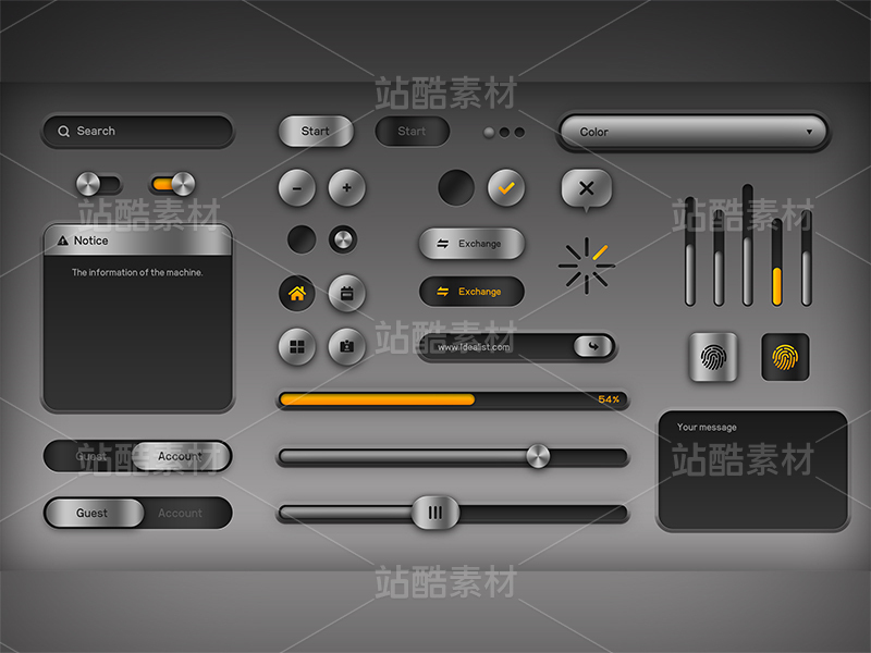
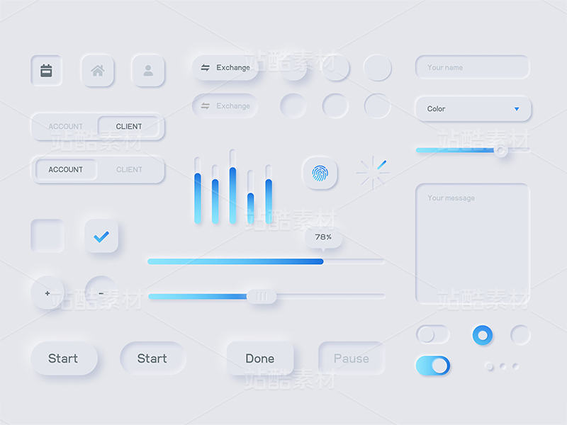
整理了一份比较简单易懂,图文并茂(并不)的交互指南;
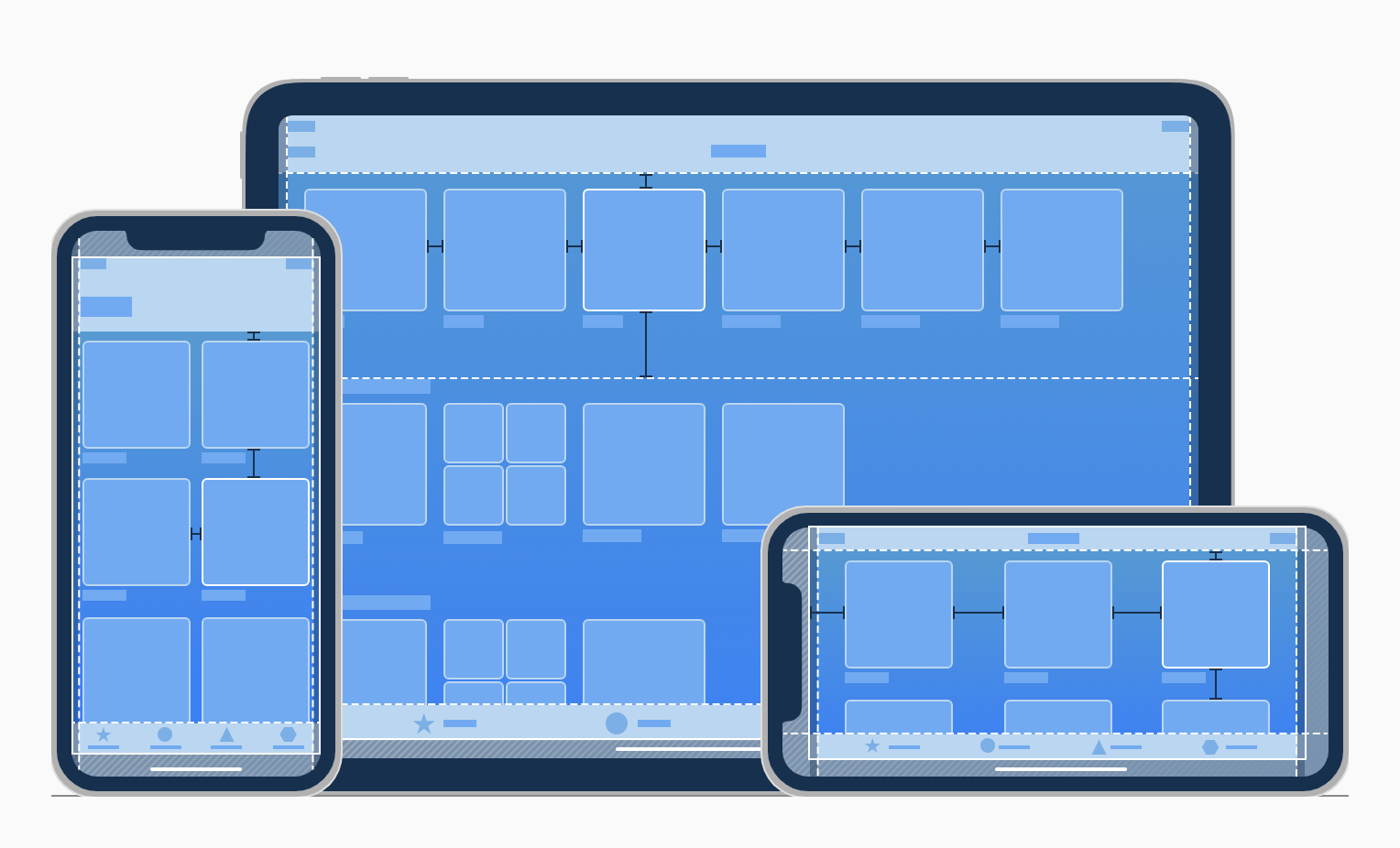
内容包含交互设计原则、界面布局、导航、数据录入、数据展示、操作反馈六个部分;
由于内容偏多,后面我将分批次的分享出来。
友情提示:官方规范仅供参考,不必完全遵守,整个分享过程中,我也会把主流产品中没有遵守的点标记出来,具体要怎么去设计,大家视实际情况而定哈~
放一段原文你们感受一下...
iOS Design Themes
As an app designer, you have the opportunity to deliver an extraordinary product that rises to the top of the App Store charts. To do so, you'll need to meet high expectations for quality and functionality.
Three primary themes differentiate iOS from other platforms:
Clarity. Throughout the system, text is legible at every size, icons are precise and lucid, adornments are subtle and appropriate, and a sharpened focus on functionality motivates the design. Negative space, color, fonts, graphics, and interface elements subtly highlight important content and convey interactivity.
Deference. Fluid motion and a crisp, beautiful interface help people understand and interact with content while never competing with it. Content typically fills the entire screen, while translucency and blurring often hint at more. Minimal use of bezels, gradients, and drop shadows keep the interface light and airy, while ensuring that content is paramount.
Depth. Distinct visual layers and realistic motion convey hierarchy, impart vitality, and facilitate understanding. Touch and discoverability heighten delight and enable access to functionality and additional content without losing context. Transitions provide a sense of depth as you navigate through content.
我总结了一下...
想要设计一款优秀的APP产品,最好遵守以下几个点:
三大主题:
六大原则:
1、Aesthetic Integrity.审美完整性:
视觉表现和交互行为与其功能相整合。
比如:功能性应用比较适合通过标准化的控件和可预知的交互行为,来保持用户的专注性;
2、Consistency.一致性:
界面元素风格统一,交互原则统一


